The Local newsletter is your free, daily guide to life in Colorado. For locals, by locals.
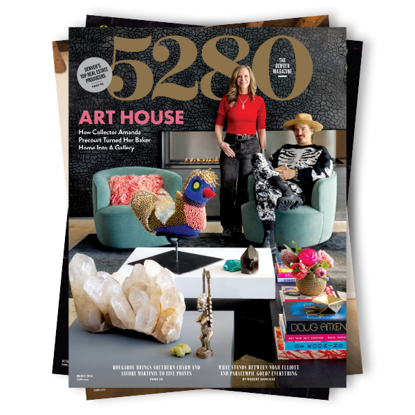
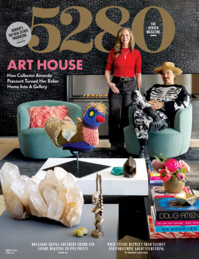
This month marks our first print redesign in five years, and if you haven’t had a chance to see the issue, by all means head to local newsstands (Tattered Cover, Safeway, King Soopers, Whole Foods, Sprouts, and Walgreens), pick up a copy, and meet the new 5280. This redesign was spearheaded by art director Dave McKenna, who wonderfully reimagined 5280 to better reflect the city of Denver and the state of Colorado, both of which are undergoing a time of immense change. As I wrote in a note that accompanies the magazine’s print issue, readers aren’t always interested in the minutia of magazine redesigns; however, I did want to provide a brief guide to some of the things we’ve done to update and improve your experience with 5280.


- The first thing you may notice is that we’ve subtly altered the logo. Each of the numbers in “5280” has been tweaked slightly by designer Jim Parkinson to be a little more balanced and to have a bit more character. Bonus points for anyone who can point out which number got the biggest facelift.
- We are using an entirely new suite of typefaces that, while thoroughly modern, also convey a classic, authentic feel we hope mirrors life in the Mile High City. Our primary body text, Caslon, happened to be Benjamin Franklin’s favorite font.

We have created several new pages, tweaked others, and altered some of our sections:
- Our new “Dialogue” page will consist of my editor’s note and a summary of the feedback we’re receiving from you, our readers, via letters, online comments, and social media.
- The “Behind The Stories” page gives you a quick peek into the making of each issue by highlighting some of the writers and artists whose work you’ll find in the following pages and by sharing interesting—and often quirky—factoids about the making of the magazine.
- The section that opens the magazine has been renamed “Compass” and will serve as your guide to important news and personalities in Denver and Colorado each month. Subsequent sections include “Culture”—in which we’ll cover arts, entertainment, style, and more—and “Adventure,” a new section we’ve created to better reflect the active lives of Mile High City residents.
- We have moved our signature food coverage to the front of the magazine, where it’s easier to find. You can still access our restaurant listings, as well as our calendar, toward the back of the magazine.
These are the big things; we’ve also made many other smaller changes throughout the magazine. We hope you will enjoy this new incarnation of 5280 as much as we do—and stay tuned for an entirely new 5280.com, coming soon. As always, don’t hesitate to let us know what you think.
—Geoff Van Dyke
Editorial Director


