The Local newsletter is your free, daily guide to life in Colorado. For locals, by locals.
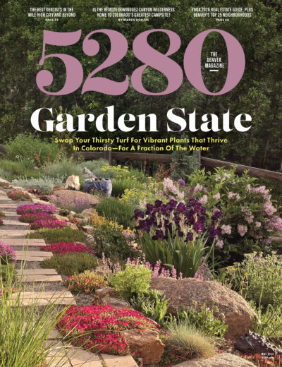
Magazine redesigns are endeavors editors and designers like to talk about—a lot—and they tend to assume their readers are as interested in the minutia as they are. I am under no such illusion, but I would like to say a few words about the redesigned issue you hold in your hands. The impetus for this face-lift came a couple of years ago when I proposed simplifying the magazine’s look to better reflect Denver’s laid-back lifestyle; to take advantage of a medium in which words, photography, and art come together so beautifully; and to provide our readers with more of a lean-back experience. What started as a few words in a memo served as a jumping-off point for art director Dave McKenna, who has masterfully reimagined what 5280 can, and should, look like. What does that mean for you? You can read about several specific changes we’ve made on our new “Behind The Stories” page (page 24), but what I want to emphasize here is that our primary goal with this redesign was to make reading 5280 each month a more enlightening, engaging, and entertaining experience. We wanted to better reflect this dynamic city and state in which we live, and we worked to create a magazine that would encourage you to seek out your favorite chair, grab your beverage of choice, and lose yourself in stories that matter to Coloradans. I hope you enjoy this issue as much as we’ve enjoyed putting it together.


