The Local newsletter is your free, daily guide to life in Colorado. For locals, by locals.
The Color Guru
Eric Mandil, principal designer and architect, Mandil Inc.

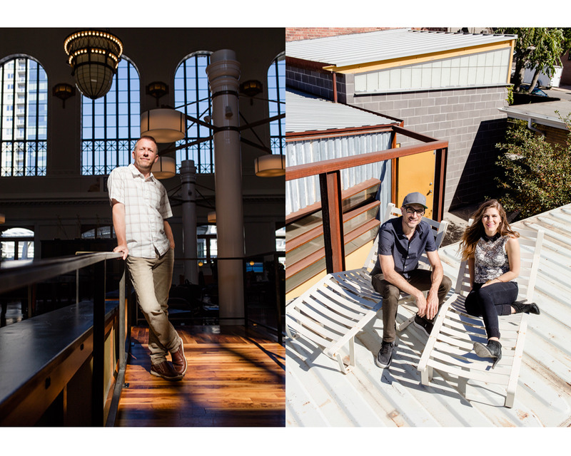
—Eric Mandil inside his architecture and design firm offices in Lincoln Park
Some architects champion local materials and building styles; Eric Mandil champions local colors. Using classic hues that complement the Colorado landscape, the designer-architect curates palettes that will look as stylish in 20 years as they do today.
Give us some of your best color tips for Colorado.
Because we have such intense sunshine here and intense light bleaches out color, we can deal with more saturated colors than someplace dark and moody. Alternatively, it’s best not to use stark white on a home’s exterior because it’s so harsh. Go with cream instead, which comes off as white.
What’s up with our current obsession with grays?
It’s safe. People are pinning it on Pinterest and Houzz, so it’s become a trend, and [concerns about resale potential] keep people from doing unique things. Gray can be beautiful, but in Denver it should be more of a warm, weathered gray (such as Sherwin-Williams’ Ethereal Mood) than a chilly battleship gray.
What’s a good alternative?
We’re turning to taupe-y brown. I call it brown-bag brown. It’s a warmer neutral.
What’s the secret to a timeless color scheme?
Use a flavorful neutral as a connector throughout the home: a warm butter, camel, gray, taupe, or off-white. Then in the various destination rooms— whether it’s a bedroom, powder room, or laundry room—use pops of color. Stay with classic colors that are grayed back, and go bold with ephemeral things like throws and pillows.
If you could banish one color from Denver, what would it be?
That really bright taxicab yellow on buildings. It’s fine for a handbag, but it’s way, way too in-your-face on a large scale.
Which colors are you bringing inside right now?
Oxblood Merlot, dark pistachio green or dark blue, deep charcoal—rich, saturated colors that have a smoky, calm energy to them. You want to be in those classic colors every day. They don’t get old.
The Space Maker
Christie zumBrunnen, design director, Trio Environments

—Christie zumBrunnen at the Ratio Beerworks taproom in RiNo
In 2010, after working as an interior designer in California for a decade, Christie zumBrunnen and her husband, Jason, decided to pursue the Colorado dream: move to the Mile High City and open a brewery. Today, Denverites have zumBrunnen to thank not only for the bright, modern taproom she designed for Ratio Beerworks (where Jason is the head brewer), but also for the urban edge she brings to many of the city’s large residential developments.
What’s one of your Denver design pet peeves—something you wish we’d just stop doing already?
I think we can move away from having mountains attached to everything. We all get it: We’re near the mountains, and that does make Denver very cool. But it doesn’t need to be Denver’s identity. We can be a little more creative with our general look.
You work on a lot of apartment complexes. What are developers getting right? And wrong?
What they’re doing right is creating office spaces and conference rooms within residential buildings, recognizing that there are a ton of people who work from home. The thing that some developers have not really grasped is the importance of ground-level retail. With people trying to stay out of their cars as much as possible, that has to be considered.
What goes into creating a taproom that inspires a second round?
Part of the challenge is that brewers have to spend most of their budgets on equipment, so they’ve run out of money by the time they get to design. But the furniture layout is one of the biggest drivers of how people interact in your space. Community tables are a good way to force people to sit together.
OK, work with us here: What are the parallels between brewing beer and design?
There are only four main ingredients in beer, but in order to stand out, you have to be pretty creative with the recipe development. It’s the same with design: We’re given a space, and we have to figure out how to work materials, fixtures, and furniture into it. In both, you have to work within your parameters.
How do you and your husband work together?
He’s a chemical engineer by education, so anything design-related he runs by me. And then I leave the brewing up to him. I don’t get in the way of that.
You just enjoy the results.
Exactly.
The Urban Planner
Ken Schroeppel, blogger and professor

—Ken Schroeppel inside Union Station’s Great Hall
Ken Schroeppel believes in a more pedestrian-friendly Denver, a vision he advocates through his blogs, denverinfill.com and denverurbanism.com (and also by grooming future urban planners as a professor at the University of Colorado Denver). Part catalog of development projects, part forum on city planning, Schroeppel’s websites champion infill building—whereby housing, shops, and restaurants replace parking lots and dead zones to create a more vibrant city.
Is Denver overbuilding?
No, we’re not overbuilding. In fact, we’re underbuilding, because we know there’s a demand for tens of thousands of housing units, particularly affordable housing units. In order for Denver to continue to be a great place, we need the city to be available to people of all incomes.
How do we do that?
It is a challenge. The impetus for most developers is to try to develop to the highest price point the market will bear. That’s why virtually every project that’s being developed right now is “luxury.” We need developers who are willing to build market-rate housing with the intent of it being as affordable as possible. Separately, we also need more subsidized affordable housing.
Let’s talk about background buildings—those office and condo buildings that make up our neighborhoods without standing out. What makes a good one?
It doesn’t need to be jaw-droppingly awesome, but it does need to have good urban form. Architects and developers should consider: Does it fit contextually within the area? Does it use high-quality materials? And probably most critically, how does it handle the ground floor?
Tell us more.
The ground floor is where a building contributes to the public realm. Too often people look at renderings of buildings and see them as art objects to critique. But that’s not how we experience buildings in the city; we experience them from a near distance as pedestrians and passersby. That’s what counts.
The Power Couple
Megan Hudacky, principal designer, CKY Design, and David Larabee, co-owner and furniture maker, DoubleButter

—David Larabee and Megan Hudacky doing some rooftop lounging above DoubleButter’s studio in Baker
David Larabee has been making slick, modern furniture for the past 15 years—since before it was a trendy gig. Megan Hudacky, an interior designer, is a leading voice in the design community who creates spaces with surprising details and bold style. Together, the husband-and-wife duo make each other’s work—and local design—better. (And they laugh a lot while doing it.)
What’s exciting you about Denver design right now?
David: I’m most excited about infill in the urban core and the emphasis on transit. Denver’s felt center-less, or at least less centered than other great cities in the country, and we’re finally filling in.
Megan: A lot more small, beautiful design shops have opened, such as Ironwood and Hazel & Dewey.
…and vexing you?
Megan: You see so many restaurants where the design is minimal—it’s not minimal in the sense that that’s what they’re going for, but because the design budget is small. I’d appreciate if people put more money into furniture and design to stand out.
David: What irks me is the overplay of salvaged and repurposed materials: that old-timey distressed barn-wood look. To me, it’s just a new “faux” style; there’s nothing authentic about it. I don’t mind reusing materials, but you can still machine them and turn them into a new object.
What’s it like to be married to someone who lives for design, too?
Megan: I think it’s fun. We both think about design 24 hours a day, so it’s nice to be able to get David’s opinion because it’ll be a different perspective from mine, even though in the end most likely we’ll agree.
David: I would agree with that. Occasionally, though, you do bump up against some hard truths. It’s like you think you’ve had a hip, stylish haircut your whole life, and then you marry a hairdresser and realize you actually have a mullet.
If the two of you could collaborate on a design project, what would it be?
Megan: We keep talking about the mountain property we want to get. When we moved into our current home, David had already renovated part of it, so it’d be fun to collaborate on an entire home together.
David: I was going to say a baby, but I guess a cabin would be nice.
The Modernist
Michael Moore, founder and design principal, Tres Birds Workshop

—Michael Moore at Boulder’s new Alpine Modern Shop & Coffee Bar, which he designed
For architect Michael Moore, “modern architecture” is more about a design mentality than an aesthetic preference. He approaches design from the inside out, creating spaces that support people’s everyday lives, use straightforward, local materials, and open to the best living room of all: the Colorado outdoors.
Why are we collectively obsessed with modern design in Denver?
It’s open-ended—you can reinvent yourself within it. If you’re living in a colonial house, you’re locked into segregated rooms. But I don’t see Denver as being specifically modern in terms of architecture. We’ve got some great modern buildings, like the Museum of Contemporary Art Denver and the Clyfford Still Museum, but there hasn’t been much modern housing other than older midcentury houses.
What about the crop of new apartment buildings?
They’re square and blocky, but they’re not modern. That’s just maxing out square footage and volume. There’s a time and a place for it, though. We asked for density, and we’re getting it, and I’d much rather see high-density development in the city than spreading out into farmland and open space.
What’s a better way to achieve density in the city, then?
Our best shot at creating sustainable density is to rework underused buildings by changing their uses and creatively repurposing them.
What do people want out of their homes these days?
More people are isolated in their workplaces because of computers, so when they’re not working, they want connection to other people and to nature. Our homes and public places have to provide that or we’ll be unhappy.
How can they do that?
By offering a place to put your bike so it doesn’t get weathered or stolen and a place to grow food nearby so you can check on it every day; by offering easy options for living outside and ways to use water so there are secondary and tertiary uses for it. We have to rethink how buildings function in order to do all of that.
How do you know when “modern” is good?
When you see the real nature of materials, not layers of wrapping. When you see the structure and can tell how the roof is held up. When what you see is what you get.
The Progressive Preservationist
Annie Levinsky, executive director, Historic Denver

—Annie Levinsky outside the 117-year-old Temple Emanuel building (now the Denver Community Church) in North Capitol Hill
A Colorado native who grew up near downtown, Annie Levinsky calls the city center her “stomping ground”—and she’s worked to protect her turf as the director of Historic Denver since 2009. Yet for a preservationist, Levinsky’s outlook is surprisingly future-oriented: Building great, timeless architecture today, she believes, is just as important for Denver as reclaiming buildings from the past.
The Mile High City is going through a growth spurt. How do we get past the awkward teenager stage?
It’s important that we know what makes Denver Denver. For us at Historic Denver, it’s not just about preserving a few buildings here and there, but also asking how we can create new buildings that reflect this time and place in a way that’s different from other cities.
What’s an example of one of those oh-so-Denver traits?
Brick and masonry shaped the architecture of the city—and not by accident. There weren’t a lot of trees here in the 1870s, so people used stone and clay to build the city. That rich orangey-red brick is our most traditional color. It’s not something you see in other cities, even other cities in Colorado.
Where else does Denver’s historic legacy shine through?
The city used to operate a network of streetcars that ran through central Denver for around 70 years, starting in the late 19th century. Of course the streetcar no longer runs, but we still have the little commercial districts that grew up around the stops. They’re pocketed all over the place—32nd Avenue and Lowell Boulevard, 12th Avenue and Madison Street, South Pearl, anywhere the streetcar stopped.
Tell us a juicy story about a building we associate with Denver’s history.
In the Prohibition years, as the oral history goes, there was a tunnel between the Brown Palace and the Navarre Building across the street. The waiters would go through the tunnel to get liquor and bring it back in teapots to serve at the Brown Palace.
Neighborhood to watch?
It’ll be really interesting to see what happens to the character of RiNo over time. There have been really great reuses of historic buildings—projects like Bindery on Blake—adjacent to new buildings that feel formulaic. They don’t have the authentic industrial quality that is present in the neighborhood.
The Tastemakers
Rob McGowan and Ben Olson, co-founders, Fin Art Co.

—Ben Olson (left) and Rob McGowan at their design studio in Baker
There’s a common ingredient in many of Denver’s best new restaurants: furniture and design by Rob McGowan and Ben Olson. Childhood friends who taught themselves to make furniture post-college, the Fin Art Co. founders handcraft custom pieces, produce their own industrial-modern line, and help define the look of commercial spaces like Bar Fausto, Dos Santos, and Blueprint Bar.
What separates a forgettable restaurant from one that keeps you coming back?
Rob: It’s really important to create a transformative experience so when people walk in off the street they feel like they’re entering a different world—a 1950s garage or something. You see spaces that get halfway there but don’t really create that suspension of disbelief. You also want to have a few conversation pieces so even if people don’t remember the name of the restaurant, they might call it “that place with the crazy light fixture.”
What carries a restaurant more—the ambience or the menu?
Ben: You could have the most amazing food served out of a shack or the crappiest food served in an amazing place, and none of that works. They really go hand in hand. For example, for Dos Santos we wanted to do an across-the-border look, but it’s not cheap street food. We had to make sure the look was gritty yet refined, so the visuals and the menu really complement each other.
Walk us through one of your restaurant concepts.
Rob: Bar Fausto, which opened just over a year ago, is named after Fausto Coppi, the Lance Armstrong of the ’50s. The space is a throwback to midcentury modern Italian cycling, when they would finish the Tour de France and all smoke cigars. It has these big, long stripes of color on the walls that you’d see in old Bianchi ads. You have to find clever ways to do things without being kitschy.
What misconceptions do we have about the life of a furniture maker?
Ben: People get the idea that we’re lying around on hammocks for most of the day and then we go churn out a coffee table. But we’re on our feet every day, putting pieces together, moving conference tables up eight stories in a stairwell.
Advice for buying new furniture?
Rob: Buy local and do your research; meet the furniture makers. You can say, “I met the guys, picked out the wood, and helped design it.” It’s like going to the farm and picking your own peaches. It tastes better.
The Pioneer
Jeff Sheppard, principal architect and partner, Roth Sheppard

—Jeff Sheppard inside Cherry Creek’s Cucina Colore, one of many local restaurants he has designed
Jeff Sheppard has strong (and respected) convictions about Denver buildings, and rightfully so: He’s worked as an architect here for nearly four decades and helped design countless Colorado spaces, from the handsomely remodeled Room & Board to restaurants like Izakaya Den to police stations along the Front Range. All these years later, he still believes the buildings of the past are our best guides for the architecture of the future.
What challenge is Denver facing?
Most of Denver’s new construction is apartment buildings, and there’s not a real vested interest in the community when a building is a rental. Developers know the formula: You can build 60 feet high with wood-frame construction and get in and out of there as fast as you can. So cities are becoming all the same. That’s where Denver has fallen short.
How do we course-correct?
We need to be creating architecture that’s more respectful; that says, “I’m in Denver,” and I’m responding to the climate, to our ability to capture light, and to our tradition of materials. Over time, we’ve forgotten about our heritage as a brick town and started using new materials because we like them, not because they’re appropriate.
Zoning makes people’s eyes glaze over. Tell us why we should care.
Step zoning, or incremental zoning, needs to happen so you don’t get a monstrous three-story townhouse next door to a single-family home.
So…is Denver ugly?
I’d say a lot of the new construction is, but overall, there’s enough in the downtown core that remains beautiful—mainly buildings from the past. What makes Denver interesting is the eclectic mix of old and new.
Why is that mix so important?
If you’re walking down the street and you pass old and new buildings working together in an interesting way, it creates a rhythm. For a street to be successful, it must have a mixture of places, spaces, and forms we’re familiar with as well as things that are new and changing. Success lies in not overpowering the memorable with the odd and unrecognizable.
Share a few words of time-won architectural wisdom.
Many times you need to recognize that you don’t have to outdo everything around you. It’s OK to create a background building—one that makes those around it even better. We tried to do that with the Denver Art Museum administration building. Trying to outdo a Libeskind would be the worst thing.

