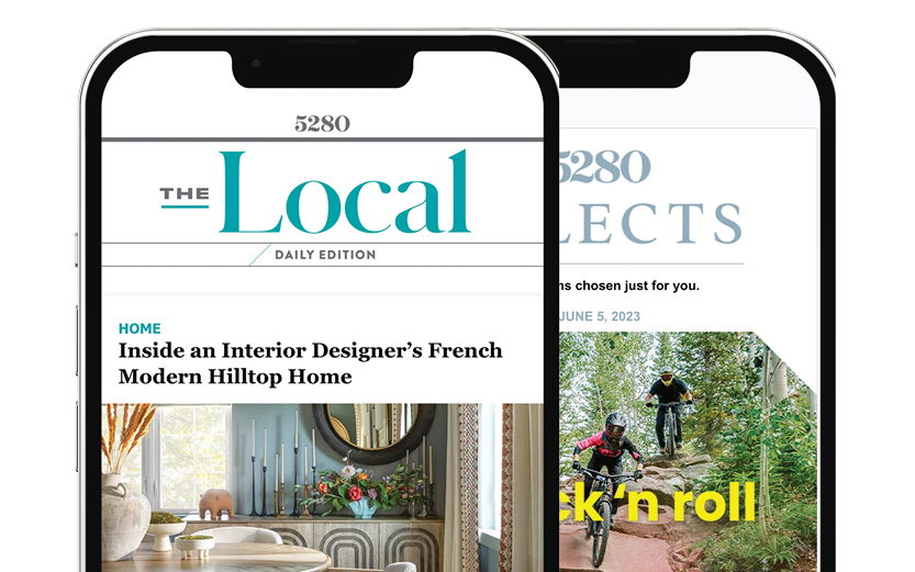
The Local newsletter is your free, daily guide to life in Colorado. For locals, by locals.
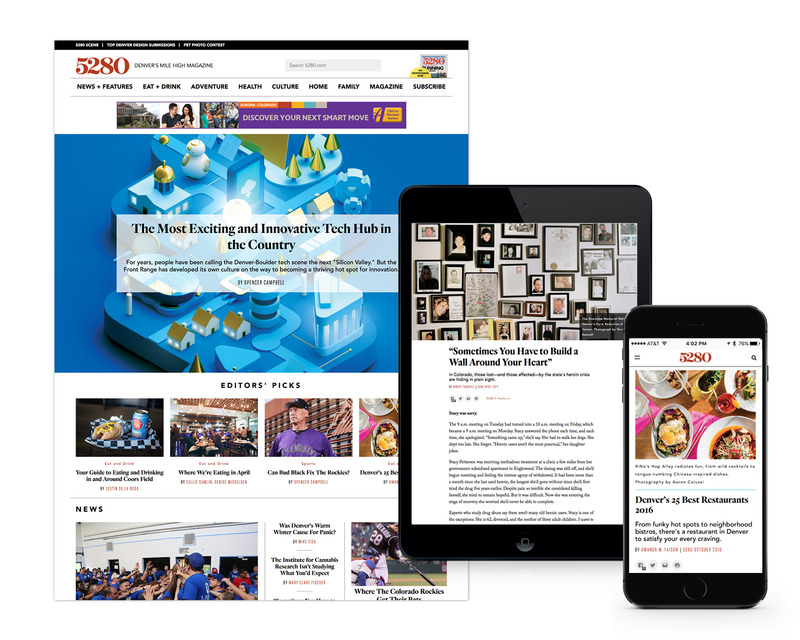
Last week, we quietly unveiled the new and improved 5280.com, a project 1.5 years in the making. With this relaunch, we’ve reimagined every corner of the site—from the article layouts to the fonts to the directories—to bring readers an updated online experience that you can enjoy on any device.
When we set out to recreate our digital presence, we thought about how we could highlight what 5280 does best. We produce exceptional journalism, both in print and online; we have a sharp, sophisticated design; and we highlight beautiful photography. We offer curated directories of the best doctors, dentists, lawyers, restaurants, and events in the Mile High City. And we have 24 years of content for readers to explore, amounting to more than 20,000 articles.

To that end, our primary goal with this overhaul was to reimagine the magazine experience online. You’ll find larger images, less clutter, and an easier overall reading experience (every article is laid out as a single page, with seamless integration of photography and better overall organization). The layout, which was designed in-house by creative services director Kent Odendahl, is simple and allows ample opportunities for us to develop new, innovative features in the (very near) future. To better coordinate with 5280’s print products, we’ve used many of the same fonts that we chose for the print redesign. We’ve also renamed some of our sections—Travel & Outdoors is now Adventure; Dwell is now Home—to offer better continuity between print and digital.
But many of the major improvements happened behind the scenes. Digital developer Scott Cropper painstakingly moved all our content from our previous platform to WordPress, which has allowed us to create a consistent look and feel, while also making the site faster, more reliable, and easier to navigate. Our search functionality and directories have received a significant upgrade, as have our directories.
Other updates include more opportunities for editorial curation, which means we’ll be able to feature more of our award-winning longform journalism on the homepage and throughout the site. Plus, readers will enjoy better connectivity—not only can you effortlessly share our content with your networks, but now it’s also easier than ever to get deeper in the site and to explore articles and learn more about topics that personally interest you.
The best part: This is just the first stop on our journey to create a site that’s perfectly tailored to our audience. We’re already working on developing new features that will continue to improve the 5280.com experience for all users. And we’re eager for your feedback. Please contact us at digital@5280.com with any questions, concerns, or compliments, and we’ll be happy to reply.


