The Local newsletter is your free, daily guide to life in Colorado. For locals, by locals.
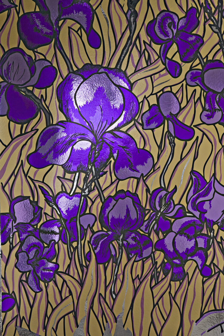
Pantone has declared Ultra Violet as its Color of the Year for 2018; the hue, they say, is a “dramatically provocative and thoughtful purple shade that communicates originality, ingenuity, and visionary thinking that points us towards the future.”
Pantone’s annual pick often sets trends in industries that range from fashion to food to interior design. But if you’re like us, you’re probably wondering how to successfully incorporate such a bold color into your home’s décor. We asked a few local design pros—ones we know aren’t afraid of a little color—to share their tips for conquering Ultra Violet with style. No surprise: They weren’t daunted one bit, and their ideas (below) sound downright doable.
Erika Rundiks and Katie Schroder, Atelier Interior Design
“Everyone looks good in purple, so it is a great color to add to an interior space which is neither masculine or feminine. It contrasts highly with other colors, making it a fabulous accent or general undertone. But there is no reason to be shy: A regal purple velvet would be amazing on any large piece of furniture.
We love seeing Ultra Violet used in a plaid fabric; the pattern can come off as too serious, so having fun colors incorporated makes it more approachable. Or, one our favorite new fabrics is Osborne & Little’s Carnival F7052-04, a sumptuous embroidery that incorporates light and deep purples, emerald green, olive, teal, black, white, and brown. It looks like a magnificent feather. We recently used this fabric to inspire an entire room—even though it was only used on a few pillows. We brought in other solid purples to anchor the palette, and a few neutrals to mellow out the color scheme.”
Megan Moore, Dadō
“Confession: I’m a little biased because violet is my favorite color. Ultra Violet is rich and saturated, and it’s a great option when you’re in need of a color pop. It’s bold, yes, but it’s also from the cool and calming color family. A little goes a long way, so use with restraint. Ultra Violet works well in bedrooms, master bathrooms, and places where a relaxed vibe is key. Bringing this color in through artwork is a great way to create a bright point of interest without a long-term commitment.”
Laura Medicus, Laura Medicus Interiors
“Ultra Violet is a color that is considered outside of normal for most people. Clients of mine who love this color tend to be independent thinkers and confident in who they are. Accents of purple are easy— if you’re up for using this color, go bold with it.
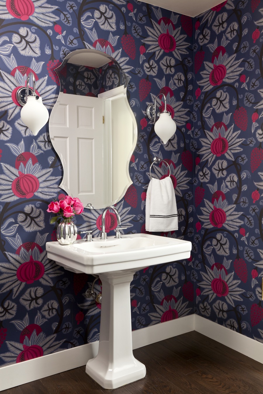
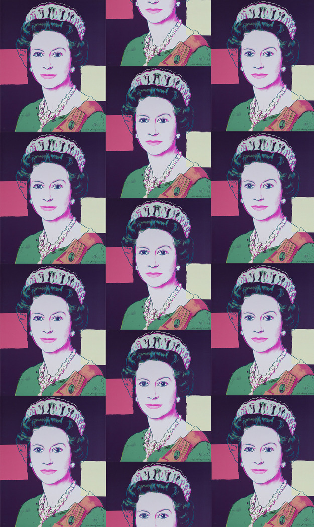
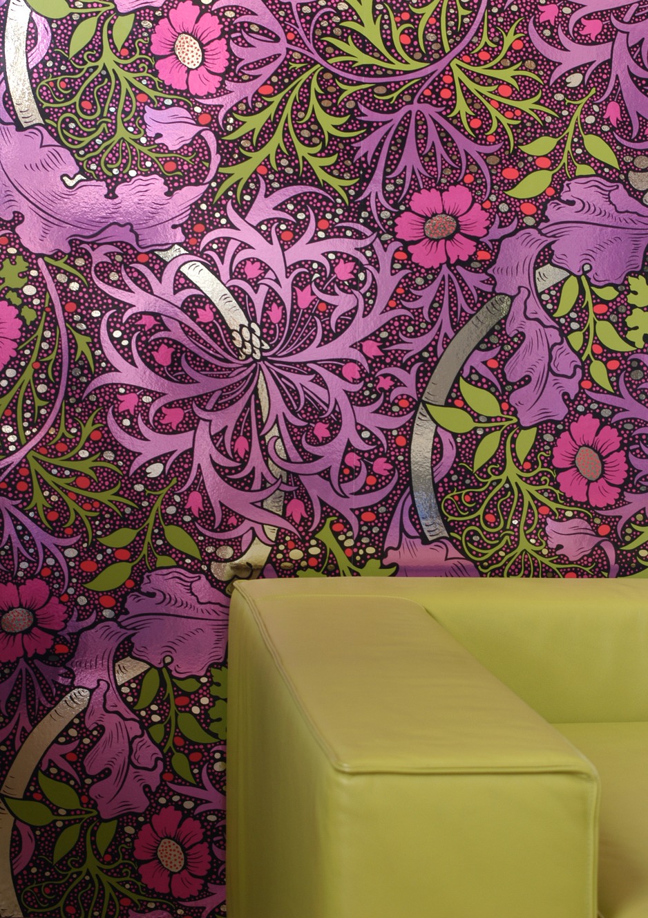
Consider the Kabloom wallpaper in Plum (or Fruit Punch, pictured above) by the awesome, Brooklyn-based Flavor Paper for a rich yet bold, historical pattern that will have an immediate impact. If you’re looking for an edgier vibe, look to Queen Elizabeth in Deep Purple, from Flavor Paper’s Andy Warhol Collection. It is fantastic.”
Erin Iba, Iba Design Associates
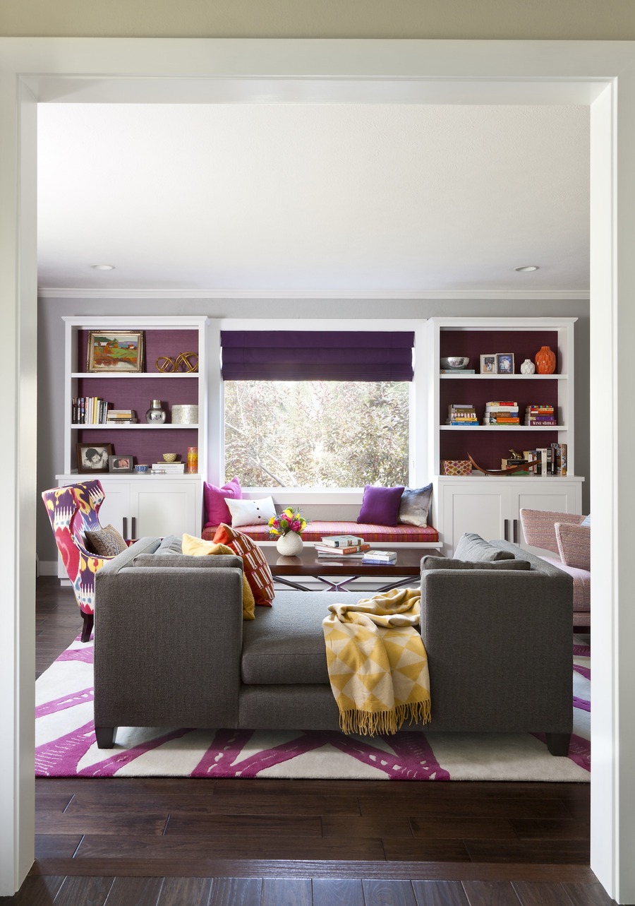
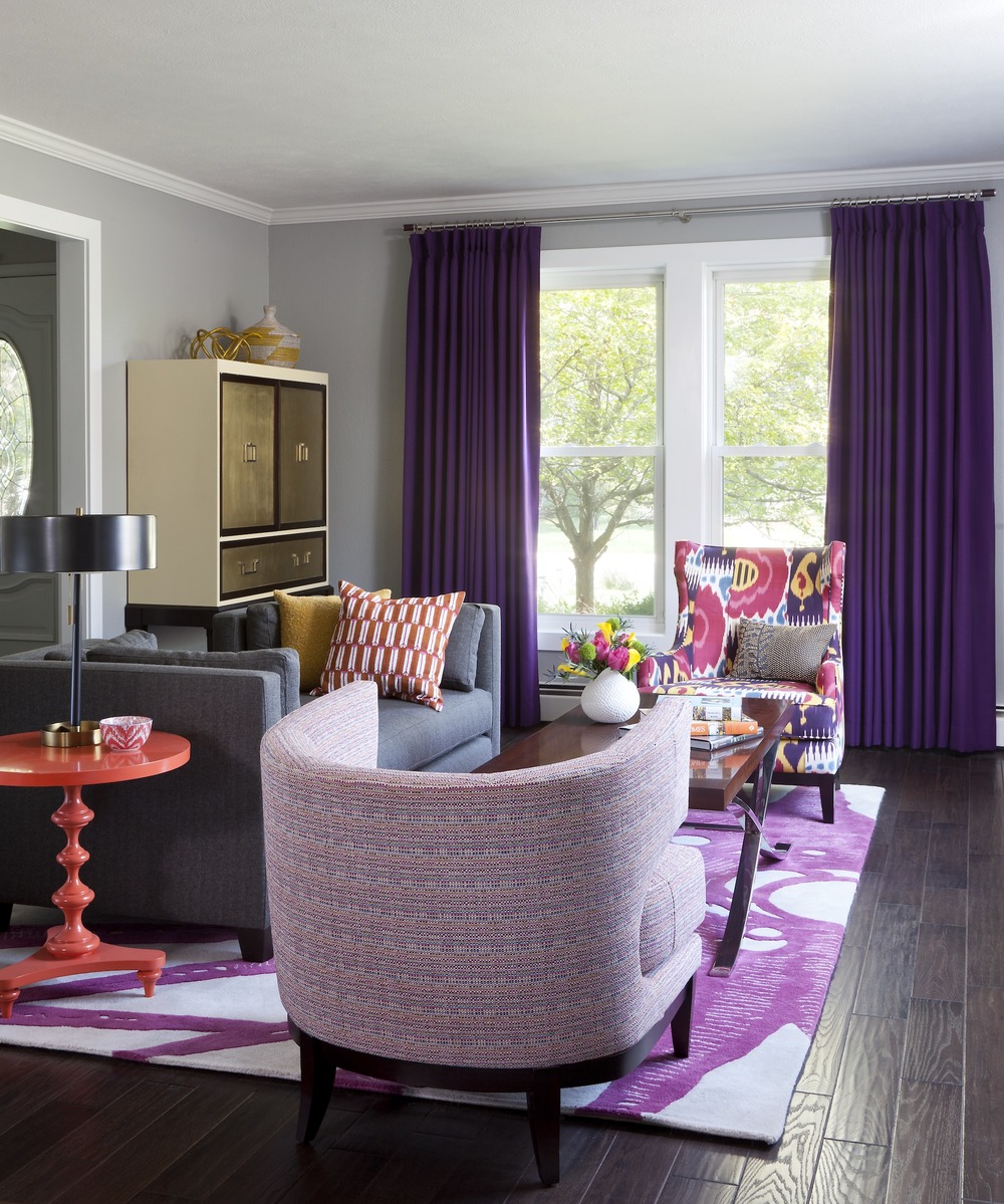
“I love Ultra Violet when used effectively; the trick is to use it as a true neutral (maybe on a large sofa), a playful accent, or layered with similar tonal hues. It can be very grounding when paired with misty gray walls, creamy rugs, and similar hues sprinkled throughout a space. I have used it as piping on crisp, white linens for an antique mahogany four-poster bed, and I have used it very playfully in this living room for clients who love color and pattern.
Try incorporating Ultra Violet with fabrics: Missoni is the best at using violet in a wide range of fun colors, with a very European vibe; this Edelman hair-on-hide is a fabulous way to bring texture in (I see upholstered chairs placed alongside a worn leather sofa); and Madeline Weinrib does a perfect pillow in plum velvet and moody green.”
Andrea Schumacher, Andrea Schumacher Interiors
“Ultra Violet is an intriguing color. It’s soothing yet provocative; heavy with cool tones. I would love to see it applied as a lacquer, either on a dining room ceiling or on built-in bookshelves and the walls of a study. I recommend pairing it with the neutrality of cream and ebony, or, for the more adventurous, with vivid pops of blue and turquoise—velvet would be a perfect texture to contrast with the high-gloss shine of the lacquer.”

