The Local newsletter is your free, daily guide to life in Colorado. For locals, by locals.
When a thirtysomething couple enlisted Duet Design Group co-founder Devon Tobin to help them furnish their new Cherry Hills home, she knew exactly what she was getting into—because she’d worked on their former University Park house as well. This 7,500-square-foot home, however, brought the task of melding the duo’s divergent tastes—she loves a soft, feminine vibe; he leans modern—to a whole new scale. But far from being daunted by the challenge, Tobin credits that tension with making the home so dynamic. “It’s not often that a couple is this kind of polar opposites,” she says. “But they get that their differences are so opposing that the only way to bridge them is to compromise.” We talked to Tobin about balancing styles, delineating comfortable spaces in a large footprint, and taking risks.

5280 Home: What were the couple’s wishes for this house?
Devon Tobin: They wanted a kind of eclectic, luxe feel in an industrial, very livable space—down to the wood floors with natural distressing [to accommodate their] really active dogs. The home is grand, but it’s also cozy.

How did the couple’s divergent styles influence your design?
He prefers modern-industrial, but she likes feminine, shabby-chic style with industrial touches. She loves color; he does not. And they’re aware of these differences: For example, they decided to separate their closets because she said, “I want a pink closet,” and his response was, “I can’t imagine getting ready anywhere worse.”

Did they have strong opinions about other design details?
She’s a great cook, and she knew exactly how she wanted her kitchen laid out; she didn’t need a typical working triangle. I found out later that she was at a dinner where she met [Ina Garten], the Barefoot Contessa, who said, “An ideal kitchen looks like this.” I was like, “That’s where this [approach] came from?!” I love that though, because it ups my game. Also, the homeowner loves exotic granites and marbles—but we didn’t fully waterfall the islands because her husband didn’t want them to feel too extravagant.

It must be difficult to make a house this large feel cozy.
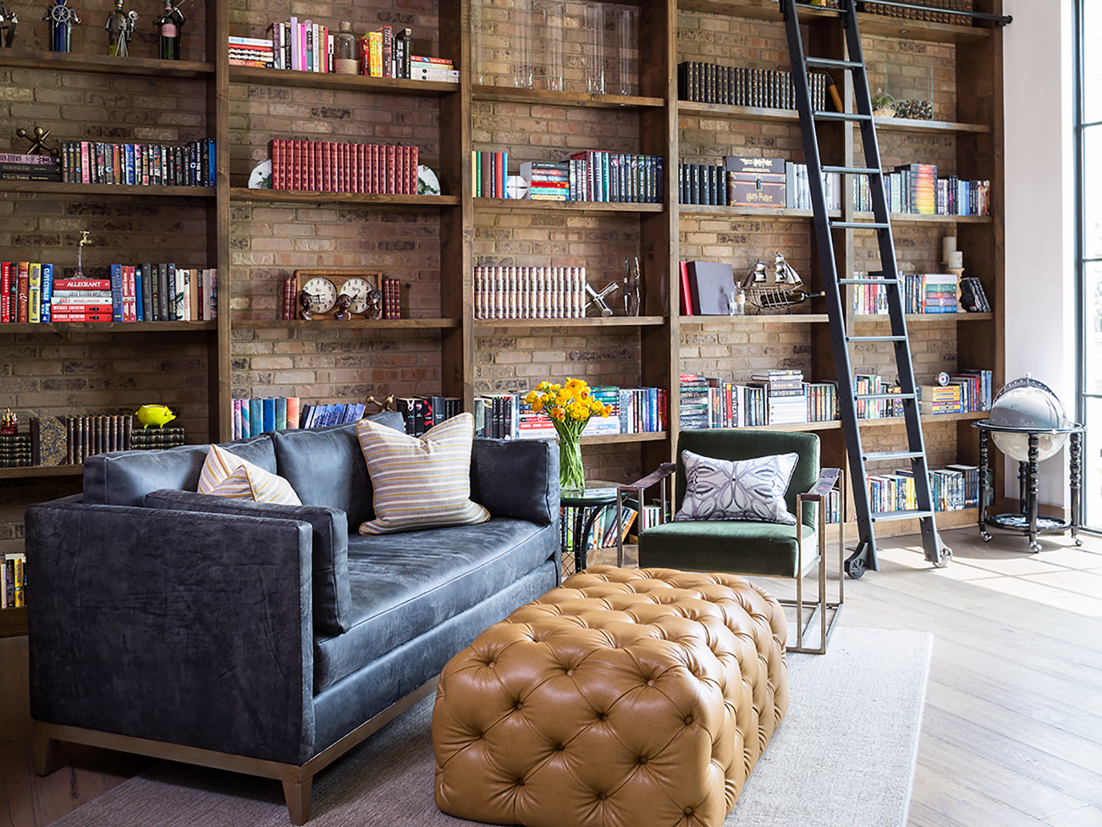
I think it helps that [the structure is] longer—a lot of homes tend to go up, but we were able to span more length. The only room that has major volume is the library; the homeowners are both Harry Potter fanatics, and they wanted a Harry Potter library. You can feel the volume there and in the entry, but everything else takes on a more intimate feel. It didn’t get that open-floorplan treatment.

Why not?
We divided spaces without physically closing them off. The problem [with open floor plans] is that functions bleed [from space to space], and that’s not always what people want. For example, you don’t really want where you’re having cereal to be where you’re having popcorn and watching a movie—which is why I used the fireplace to divide the living room from the breakfast nook.


From the wallpapered ceiling in her craft room to the staggered transition from hardwood to tile in the mudroom, there are some really unique treatments in the home. How fun was that for you?
This was one of those dream projects where I [could take] risks I know are risks. Even in my head, I was like, “I know this works, but it is out there.” This couple was excited to try these ideas—and that’s why you hire designers. We’re supposed to push your level of comfort. I always tell people, “If your stomach is turning a little bit, go with it.”


Design Pros
Architecture: Architectural Workshop
Interior design: Devon Tobin, Duet Design Group
Construction: C4

