The Local newsletter is your free, daily guide to life in Colorado. For locals, by locals.

There are couples who go into business together and couples who take on home-renovation projects together. And then there are those rare and ridiculously brave pairs, like architectural designer John Mattingly and his wife, interior designer Regan Mattingly, who manage to do both—at the same time. The duo are principals at Chalet, a Denver-based architecture, interior design, and construction firm that builds new homes with old souls.
The approach to this stripped-to-the-studs remodel of their 1920s Country Club house was unconventional: Rather than conferring on most design details, they pulled a creative tag-team, with John envisioning the architecture and Regan designing the interiors. In other words, they got out of each other’s way. Here’s how they created their perfect family home—a work of neutral textures, classic millwork, eclectic art, and timeless charm—and survived to tell its story.
5280 Home: We love to hear how owners find their homes. What’s your story?
John: A friend of mine told me this property would be coming up for sale. At the time, we were feeling isolated in another neighborhood where we’d built a bungalow 10 years before.
Regan: When he took me to see it, I was immediately like, “We need to buy this right now.” Initially I was thinking we would just do a minor renovation, and I remember John coming home and saying, “I took it a little further than I thought I was going to.” Everything had been ripped out down to the studs, except for the front of the house.
What inspired that kind of intervention?
John: We both fell in love with the lot, but the house was a train wreck. The scale of it was really strange—it was built in the 1920s—and what would have been the dining room and kitchen were so small. The entry and staircase [to the second floor] were more snug than what I would have drawn from scratch, but I decided that if I designed around them, something interesting would happen. Those features governed the scale of the house. People are charmed by older houses, and what they don’t realize is that they’re charmed by the smaller scale.
The house balances that historic charm you’re describing with a modern feel. How’d you pull that off?
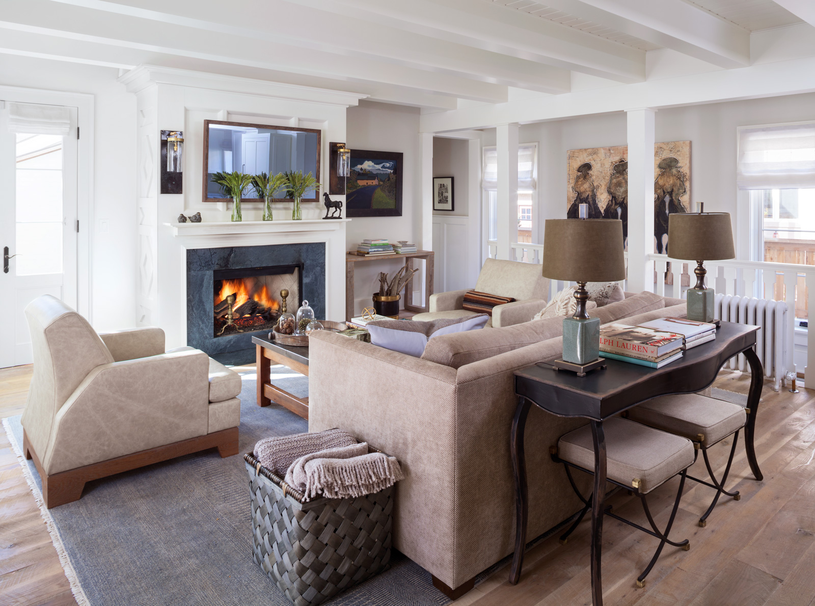
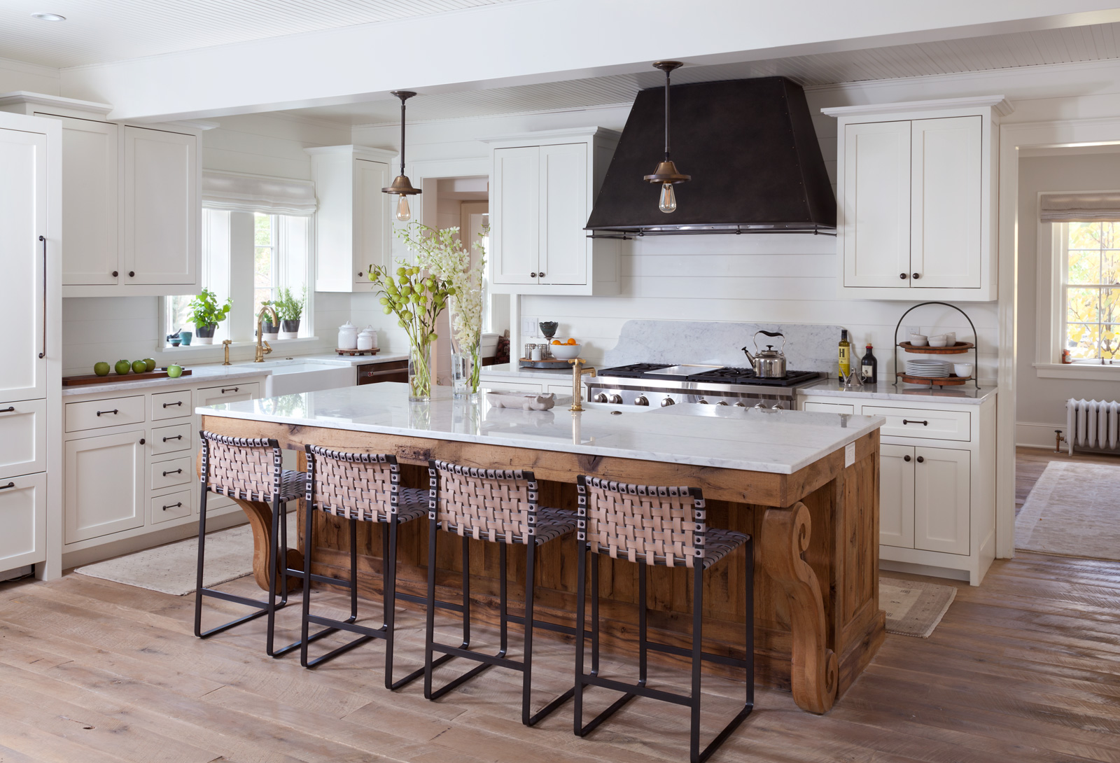
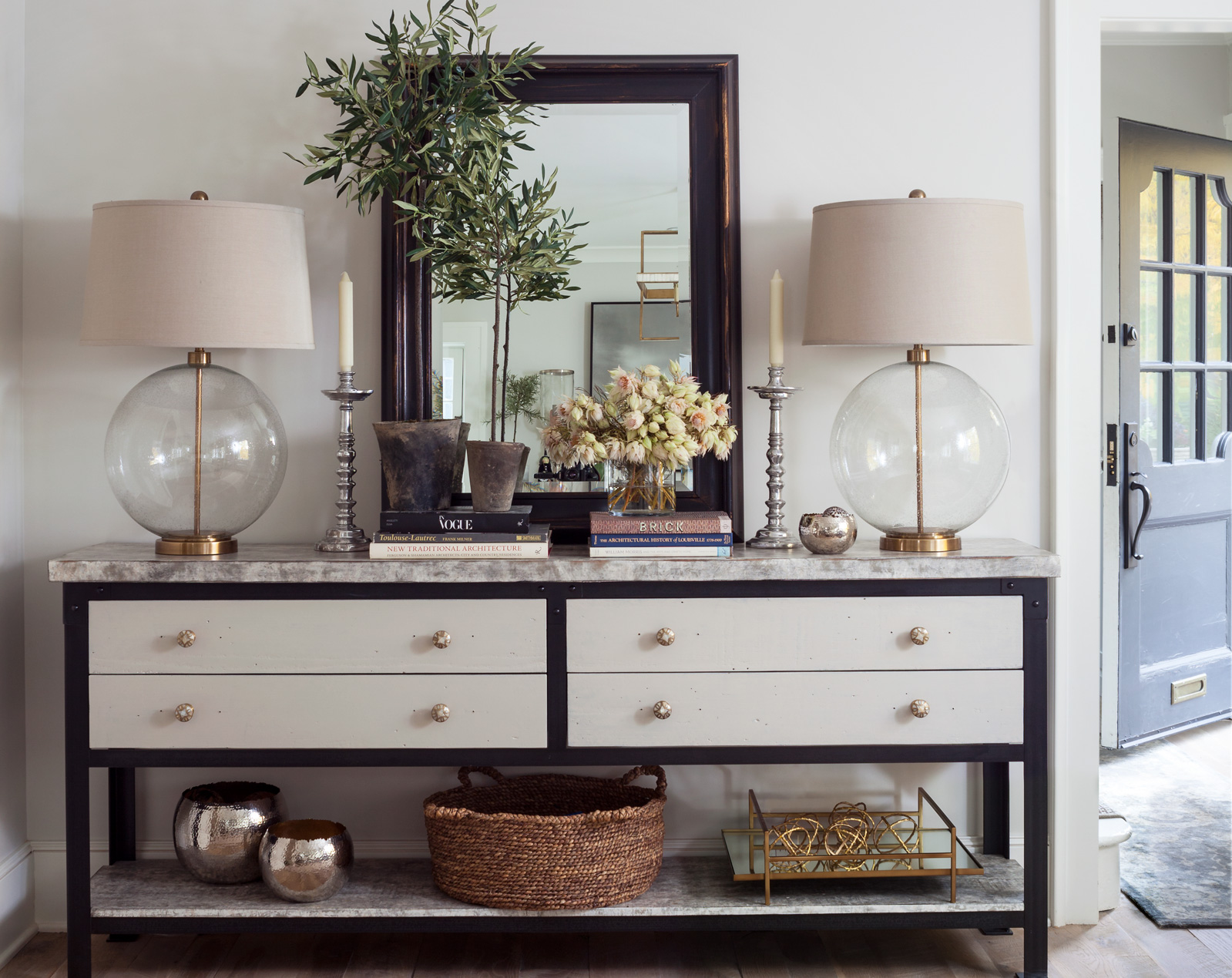
John: Initially, we were going to do edgier interiors, but we decided we should let the original, traditional facade take the lead. So we went a bit more classic, but with an open, airy feel. We kept the millwork white and polished rather than doing antique exposed beams, which allowed Regan to play with different eras of furniture and contemporary elements. It feels like a lofty farmhouse—with a current vibe.

Neutral interiors can feel sleepy, yet these are elegant and hip. Regan, where did you begin?
Regan: The first thing I did was pull fabric and rug samples in different patterns and textures—tone-on-tone florals, mohair, velvet, linen. My favorite colors are grays, creams, and khakis, and I really love classic textiles with beautiful, current patterns. I’ll often put 18 fabrics on my kitchen counter and leave them there for three or four days, pulling one out or adding one when I walk by, just to make sure the colors are working together. There are a million different grays and creams, and if you’re not careful about making sure the fabrics share the same tone, it can be a disaster.

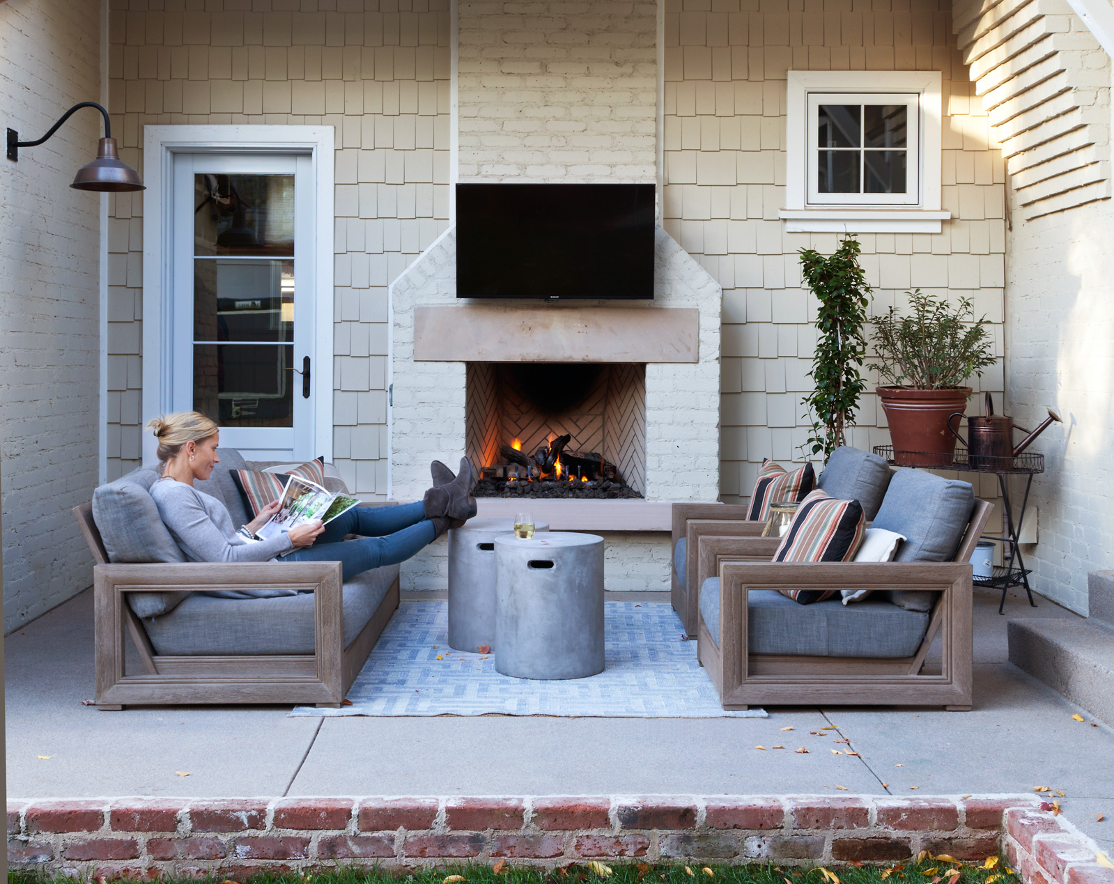
That backyard patio looks like a little patch of Colorado heaven. How do you use the space?
Regan: We use it as another room, even in the winter. We wanted that little area by the fireplace to be a cozy outdoor family room where we can watch TV and movies, and hang out when it’s nice. It was also important for us to have a really great outdoor dining space where we can entertain. Our yard is tiny, but we have two lacrosse players, so they’re out there practicing all the time.
Did the project leave you with any design—or marriage—takeaways?
John: There were a few instances when I questioned what she was doing just briefly, and I know better. I learned a long time ago to let her do her thing. I don’t want it to look like me. I want to see her in the interiors. She softens things up. And that’s what happened.
Regan: There wasn’t a client involved for the first time in our lives, and we never had to say, “I’m doing this because…” We just trusted each other to do our thing, and it came together. We did not spend our evenings talking about the house—and I consider that a win.
Paint Primer

Designer Regan Mattingly unapologetically adores neutral walls. “Even if I’m designing with a bright palette,” she says, “I like the walls to be neutral. It gives you much more ability to create beautiful spaces with accessories, textiles, and furnishings.” Here are her two go-to combos for neutral walls and trim:
Walls: Classic Gray (1548)
Trim: Simply White (OC-117)
Both by Benjamin Moore
“These are the colors I used throughout my house. I use them at everyone’s house! They’re probably my all-time favorite paint colors. Classic Gray almost looks white, but there’s a hint of gray in it, which makes the white [trim] pop.”
Walls: Ballet White (OC-9)
Trim: Revere Pewter (HC-172)
Both by Benjamin Moore
“I love to do a reverse trim, with a really light color on the walls and a darker color on the millwork, to create a cottagey feel. Revere Pewter is a grayish taupe and Ballet White is creamier than Simply White, with a hint of warm gray.”
Buy Art Like the Mattinglys

To curate the art in their home, the Mattinglys worked with Denver-based art consultant Ann Benson Reidy. “People who aren’t schooled in fine art can be scared of it,” Regan says. “Ann showed us that it’s not unattainable.” Here are a few Western artists they’re collecting now:
1. Duke Beardsley
(painting in stairwell adjacent to family room)
“Ann introduced us to local artist Duke Beardsley, and he and John became fast friends. They collaborated on the ‘Los Sicarios’ piece, which means ‘the assassins.’ Duke took a bunch of John’s architectural sketches from over the years, applied them to the canvas, and created his painting on top of the sketches.”
2. William Matthews
(painting above headboard in master bedroom)
“We met Willy at DAM Uncorked (a fundraiser for the Denver Art Museum) years ago and are continually blown away by his work. The layers and details in his paintings make you feel as though you are standing right there in a beautiful Western landscape.”
3. Scott W. Parker
(block print in hallway adjacent to living room)
“We met Scott in college and we were so thrilled to see his work at Visions West Gallery. When I saw Scott’s ‘Church’ I was struck by the deep tones of the sky and the mystery of the winding road to Taos.”
DESIGN PROS:
Architectural Design: John Mattingly, Chalet
Interior Design: Regan Mattingly, Chalet
Art Consulting: Ann Benson Reidy, Ann Benson Reidy & Associates

