The Local newsletter is your free, daily guide to life in Colorado. For locals, by locals.
We pored over piles of gorgeous project submissions from local design experts, and what did we find? A slew of stylish interiors that prove that our city’s taste level and aesthetic are reaching new heights. Here, we highlight eight smartly designed spaces and two whole homes that tell the stories of their inhabitants—and aren’t afraid to make a statement while doing so (hello, hot-pink powder room of our dreams!). And the winners are…
Dining Room

This dining room’s complex character—sophisticated but bold—is a perfect match for its owner: “She is elegant but fun, so we knew we could get away with a few really dynamic pieces,” says designer Beth Armijo of Armijo Design Group, who furnished this space—and every other room in the Cape Cod–style new build in Cory Merrill.
Here, that approach started with a Regina Andrew pendant chandelier, “which is kind of like the jewelry of the room,” Armijo says. “As soon as the homeowner saw it, she was game.”
Even with such a distinct focal point, the room maintains a tranquil mood, which Armijo set with a Casamance wallpaper. “It’s a bold, colorful, strong wallpaper,” she says. “We loved it because it has a landscape feel and looks like water or clouds, which adds a natural element.” The wallpaper pairs well with the built-in painted-wood cabinetry Armijo designed to be both traditional-looking (see: the beautiful brass hardware) and utilitarian.
To complement a high-gloss table with contemporary brass legs, Armijo chose modern, wooden-frame side chairs upholstered in blue-gray velvet, and classic, tweedy end chairs—“an ode to the captain’s chair,” she says. These sit atop a Tufenkian rug that not only echoes the wallpaper but that, as Armijo says, “you can spill wine on and no one will notice.” The chairs and rug match the Samuel & Sons trim on the curtains and Roman shades. “The trim outlines the windows and separates them from the wallpaper, giving them that little extra detail,” Armijo explains. Organic, calm, and a little bit daring: a recipe for dining room perfection.
Design Pros
Interior Design: Beth Armijo, Armijo Design Group
Architecture: Kacy Chetelat
Construction: Factor Design Build
Breakfast Nook

Tailor-made. That’s the best way to describe this crisp but cocoon-like banquette, designed by Andrea Schumacher Interiors for a new build in Arvada.
Built-in seating wasn’t part of the kitchen nook’s initial design, Schumacher says, but she and senior designer Troy Rivington decided a custom banquette would maximize continuity with the adjacent kitchen, which features an antique-brass-colored island and touches of navy, deep red, and cream.
Center stage here is a twig chandelier, which Schumacher had painted a deep maroon—“the color of the year,” she says. The round table, which has a bleached wooden base, is surrounded by a wraparound bench that includes hidden storage spaces for table linens and other accessories. “This is very much the house where the kids’ friends hang out, so they wanted everything to be durable and functional,” Rivington says.
The dark-blue bench cushions are topped with custom pillows in a variety of fabrics, including a striped Brunschwig & Fils print with a Moroccan feel. “I felt like those colors wouldn’t fight too much with the landscape,” Schumacher says, “and I love that you can change out the pillows for, say, greens and marigold yellow to get a whole new look.”
To respect the room’s 180-degree western views, Schumacher added discreetly striped Roman shades by Pindler. “Your eyes aren’t interrupted by some crazy pattern—they go right outside to the mountains,” she says. “The space feels like a wonderful, casual place to curl up with a cup of coffee.”
Design Pros
Interior Design: Andrea Schumacher and Troy Rivington, Andrea Schumacher Interiors
Architecture: Arcwest Architects
Construction: Tim Saul, Saul Construction
Design Studio

With oversized lighting, one-of-a-kind found pieces, and an unabashed mix of colors and patterns, Andrea Schumacher’s new studio and showroom in the ArtDistrict on Santa Fe is a direct reflection of the interior designer’s bold, “sky’s the limit” approach to interiors.
Take the lobby area, for example. Upon entering the studio, clients and contractors are greeted by a spiky chandelier Schumacher found in Paris. “It’s oversized and has a little bit of bling, so it catches your eye from the street,” she says. “It’s also modern but still blends with traditional.” The piece presides over a seating area comprising two matching Vanguard sofas upholstered in off-white linen and a patterned blue rug from Marrakesh. For more seating, Schumacher added two glam green-velvet stools with brass bases from Vermissen and a vintage Mastercraft chair.
The pièce de résistance? A glass-topped cocktail table with a brass praying mantis base by Jacques Duval-Brasseur that Schumacher discovered at a Paris flea market. “I’ve been following that artist for years and always wanted a piece,” she says. “When I saw it, I said, ‘I don’t care how much it is—I have to have it.’ ”
Muralist Sunny Morrell adorned the walls with a swirling custom design inspired by a painting by Schumacher’s late grandmother. “She was an artist who studied with Fernand Léger and Salvador Dali,” Schumacher says. “I had Sunny take one of her abstract pieces and reinterpret it into the palette you see.”
And then, of course, there are all the fun, surprising details for which Schumacher is known: two large chunks of amethyst, Cyan Design’s Ibis lamp near the window, and an oil portrait by local artist Michael Dowling, which shares a wall with an electrified antique sconce from Paris.

In the nearby bathroom for clients and guests, Schumacher saw an opportunity to create what she calls a “little jewel.” The wow factor starts with palm-tree-bark wallpaper in a bold magenta hue and continues with a one-of-a-kind vanity, which Schumacher had built from an Asian chest and topped with an extra-thick slab of black quartz. Overhead is more bling: an acrylic-and-glass mirror framed by brass sconces.
Overall, Schumacher says, “I wanted these spaces to feel vibrant and to reflect that we are always interested in found objects, because that’s important for anyone’s home. With our clients, I always try to extract from them their own story, and these rooms reflect mine.”
Design Pros
Interior Design: Andrea Schumacher, Andrea Schumacher Interiors
Construction: Rick Beaver, Beaver Builders
Master Bath

The first thing you’ll notice about this Cherry Creek North home’s bathroom is its austere beauty, but there’s a deeper story behind that sleek design. The homeowners had just sent their youngest daughter off to college when the husband, a surgeon, suffered a massive heart attack. While recovering in the hospital, he contracted sepsis and lost a leg. Suddenly, the new master bathroom they were planning would need to prioritize accessibility as much as style.
The result is what the bathroom’s designer, Ashley Campbell, calls “elevated duality.” “It’s form meeting function, light meeting dark, comfort meeting minimalism—all of these dueling forces,” she says.
The new space is entirely ADA compliant, “because when the homeowner is not wearing his prosthesis, he is in a wheelchair, so everything needed to be wheelchair-accessible. The design includes a walk-in shower that he could bring his wheelchair into,” Campbell explains.
The space is also strikingly beautiful. “The homeowners really gravitated toward high contrast, so we went with a lot of light and dark, a lot of textural components, to elevate the space,” Campbell says. Floors covered with matte-black penny-round tiles from Waterworks play off the cool, slip-resistant Ann Sacks marble tiles covering the walls and ceiling. A trio of luxurious Kallista showerheads includes an easy-to-use handheld version.
And what about that 950-pound concrete tub? “That is the one thing that is not ADA compliant,” Campbell says, “but the doctor wanted his wife to have it because she loves taking baths.” Elevated duality, indeed.
Design Pros
Interior Design: Ashley Campbell, Ashley Campbell Interior Design
Construction: Toby Frank, Littleton Construction
Master Bedroom

This Snowmass home’s bedroom has decidedly urban, contemporary sensibilities—and that’s because it isn’t just a mountain getaway. This inviting retreat is part of the new full-time home of a family of four who recently relocated from Cherry Hills.
“Sometimes, when clients have multiple homes, we do a design that’s more focused on the local geography,” says Denise Taylor, design director of Cathers Home Furniture & Interior Design in Basalt. As a primary residence, however, this house needed a master bedroom that said everyday Zen, not weekend adventure.
To face off the spectacular view out of a two-story, hillside-facing window on the opposite end of the room, the headboard wall was upholstered with Phillip Jeffries’ dreamy Beyond wallcovering. “In person, it’s quite calming,” Taylor says. While some classic cabin-chic touches are present—a hand-selected hide rug and custom-made olive wood bedframe—they’re balanced by glam elements like the Peruvian shearling-upholstered ottomans at the foot of the bed, which complement the soft hues in the mural-like wallpaper. “They’re very functional but have great feminine lines in contrast to the bed,” Taylor says. The ultimate nurture-meets-nature moment, however, might be the chandelier, in which seeded-glass disks evoke glittering city lights—or a single puffy cloud floating by on a bluebird ski day.
Design Pros
Interior Design: Denise Taylor, Cathers Home Furniture & Interior Design
Architecture: Ken Adler, KA Designworks
Construction: Janckila Construction
Architecture

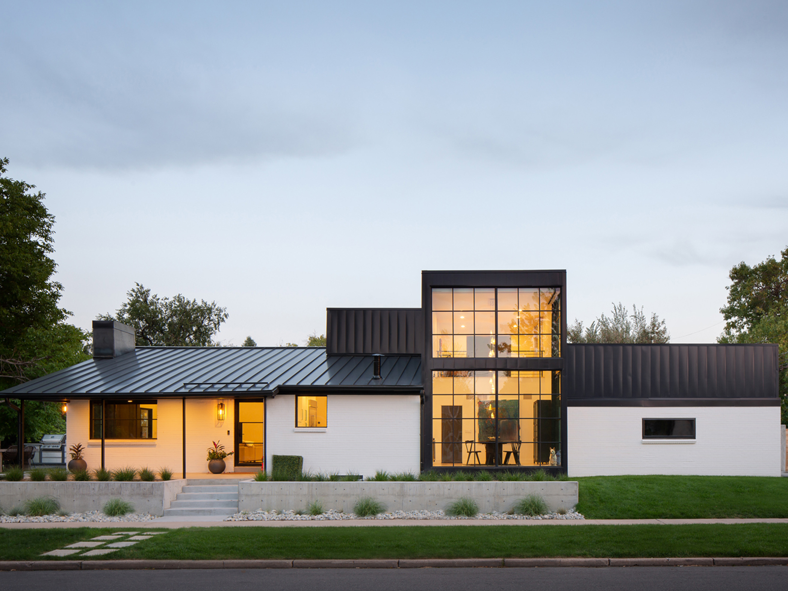
As with any great remodel, the reimagining of this ’60s-era ranch on a corner lot near Sloan Lake started with someone looking beyond what was to envision what could be—in this case, a two-story, mostly glass cube that would occupy the empty space between the house and its detached garage. Today, that space is a fully modern formal dining room on the first floor, plus a lofted home office/guest room. “The original home was a very simple ranch with almost no emphasis on the lake,” says Matt Davis, principal and owner of Davis Urban Architecture. “The goal was to redirect the energy within the home while also respecting the simplicity of the existing form.”

Of course, it’s one thing for architects and designers to dream up such bold spaces; it’s another for homeowners to embrace them. “Our client was a friend whom we’d worked with on several commercial projects,” Davis says. “There was a high level of trust, and they were eager to do something innovative.” He addressed the young family’s privacy concerns by adding motorized shades, and a simple, sleek color palette—custom, black steel windows offset by white painted brick—helps give the approximately 3,400-square-foot home a more streamlined look. In the end though, capitalizing on this home’s coveted location near the lake drove the decision-making because, especially in Colorado, it’s all about the views.
Design Pros
Architecture: Davis Urban Architects
Construction: Sam Brown, Brown Construction
Kitchen

Though this airy cooking space designed for a new home in southeast Denver certainly fits the bill of the white-kitchen trend, Denver design firm Studio Thomas decided to steer clear of too-brilliant shades. Instead, they opted for a creamy wall color that’s good enough to eat: Benjamin Moore’s Vanilla Milkshake. “We try not to do whites that are really bright and hard; it feels too sterile and cold,” says Studio Thomas’ senior designer and design director Kristin Drake, who collaborated on this project with Kristen Thomas, the firm’s principal designer and owner. “Everything still has to have a warmth to it that makes you feel good.”

That ethos radiates from the range wall, clad in Circo white marble, an off-white stone with subtle gold undertones. “I see slabs as pieces of art,” Drake says, noting that she worked with the fabricator and homeowner to run through many possible cuts and configurations until they “achieved the perfect flow of veining in the room on the hood, perimeter wall, and book-matched island.” The slab is divided into five pieces, in part to accommodate the floating shelves—a touch that required close collaboration with G&M Stone Tops and Denver’s Aspen Leaf Kitchens, which also installed the embedded custom-millwork wall that hides the refrigerator, coffee-prep station, and pantry. Finishing touches include two graceful custom pendants that echo the arches Studio Thomas added to the hallway openings—one of which perfectly frames a glass-enclosed wine cellar with steel framing. Including such customized interior architectural elements is a hallmark of Studio Thomas’ work: “We want that in all our projects,” Drake says. “It makes the home feel special.”
Design Pros
Interior Design: Studio Thomas
Cabinetry: Aspen Leaf Kitchens Ltd.
Construction: Mil Younkers, Element Home Company
Great Room

What do you do with a rare 6.5-acre plot of land in the heart of Boulder? For its owners—only the second in the property’s history—that answer was a no-brainer: Ask local firm Surround Architecture to create a veritable campus for their five adult children (and their kids), the center of which is a light-filled great room that quite literally connects the house to its surroundings. “As we laid out the home,” says Surround’s project architect Chad Willis, “its large anchoring fireplace was something that [became] an energy point for the entire site, not just the room.”
Set upon an 11-by-8-foot limestone base, the steel fireplace is supported by an exposed cable truss system that adds a layer of depth to the space. The dramatic design draws the eye up to vaulted ceilings, where wooden beams with a wire-brushed texture contrast with softer, white oak floors. The architects created a similar variation with the room’s limestone finishes: On the hearth, the material has been honed to a smooth finish; above the chimney and on a wall behind the dining table, it was left rough. “We use a consistent materials palette, but we go through a refining process, [asking ourselves], ‘how do we change things for interaction?’ ” project designer Anna Slowey says. Even with a smattering of rustic and industrial design elements, the room feels fresh and modern, thanks in part to furnishings including the curved Vladimir Kagan sofas selected by Denver’s Leap Interior Design. The 53-foot-wide glass side walls that open to outdoor living areas help too, while making the most of this home’s covetable surroundings.
Design Pros
Architecture: Surround Architecture
Interior Design: Jenn Mendelson, Leap Interior Design
Construction: Harrington Stanko Construction


