The Local newsletter is your free, daily guide to life in Colorado. For locals, by locals.
“A really pretty English Tudor” is what interior designers Devon Tobin and Miranda Cullen discovered when they first toured this Hilltop home. The co-founders of Duet Design Group were prepping to launch a top-to-bottom redesign of the 6,000-square-foot residence, which had already been remodeled and expanded three times since its construction in 1935. The problem, Tobin says, “was that it was very apparent where and when each one of those renovations had happened.” What’s more, the designers’ clients had very different visions for the new space. “She really liked the traditional English Tudor style, but he preferred a midcentury-modern aesthetic,” Tobin says.
To unify the fragmented home and its owners’ tastes, the designers began by accentuating the Tudor’s original details—wood floors, elaborate moldings, ornate doors—and adding new but period-appropriate custom trim work and built-in bookcases by K Andrew Construction. Then the pair introduced midcentury-modern-style furnishings, using textured fabrics and a classic color palette of rich creams, reds, and blues to soften the clean lines. “It feels like an English Tudor reimagined for the 21st century,” Tobin says. Here, she shares Duet’s secrets to the successful and sensitive update.

Roll With It
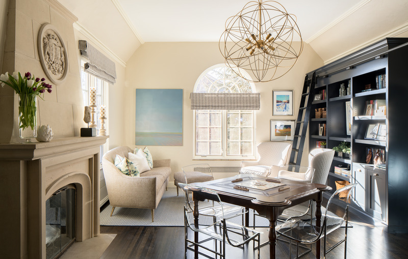
Custom-designed built-in bookcases crafted by K Andrew Construction display the homeowners’ extensive collection of antique books. “The shelves are eight feet high, so you can’t reach the top without the ladder, which rolls across the entire room,” Tobin says. The deep navy paint color—Benjamin Moore’s Polo Blue—echoes the blue shutters and trim on the home’s exterior. Bronze cabinet pulls from House of Antique Hardware are among the metallic finishes the designers incorporated throughout the house.

High Style
The formal dining room offers the only path from the sitting room at the front of the house to the kitchen at the back. To ensure the furniture wouldn’t interrupt the traffic flow, Tobin and partner Miranda Cullen selected upholstered chairs from Lee Industries that can be pushed all the way up to the table’s edge. Their high wings hover just above the custom-designed tabletop by Martin Shea Millwork. The table base is from Julian Chichester. Subtly patterned Rasetti wallpaper from Designers Guild has metallic highlights that complement the sculptural Erickson chandelier by Currey & Company.

A Pleasant Surprise
“This is the main-floor powder room, so we wanted to create a little gem; an unexpected and joyful environment,” Tobin says. “It had to sing!” A flame-stitch-patterned wallcovering from Schumacher creates a dramatic backdrop for the room’s book-matched wood vanity and original sconces, which the designers updated with simple black shades from Visual Comfort. The Melanie stool from Worlds Away pairs a plush, black velvet seat with a sleek metal base.

Material Mix
In the expanded kitchen, countertops and backsplashes of polished PentalQuartz enliven a simple palette of colors and materials: Shaker-style cabinets stained a deep espresso hue, dark blue island cabinetry, and tumbled travertine floors. Contractor Kevin Yuran, owner of K Andrew Construction, originally had some concerns about the weight of the massive backsplash slabs, which are glued to the walls and rest on the countertops. “But the lower cabinets are so well constructed, we knew they could take it,” he says of the custom cupboards by Kitchen Traditions of Colorado. A trio of Currey & Company’s Regis pendants hangs above the island.

Light Right
A Lucite chandelier by Regina Andrew and a banquette upholstered with a sleek selection from Maxwell Fabrics transform the casual dining nook into a dramatic focal point. The tempered-glass table top provides a view of the star-shaped metal Estrella base from Noir Furniture.

With a View
A window seat, which the designers added to bridge the gap between the original kitchen and the new cabinetry to the right of the window, “has turned out to be a very popular seating area,” Tobin says. “The deep red upholstery is a classic Tudor color, but the fabric makes it feel fresh.” Black iron open shelving, custom crafted by Emmett Culligan of Denver’s ECD Metalworks, uses the same gray-and-white PentalQuartz that covers the walls.
TIP: Mix traditional saturated colors with updated shapes and textures to give classic homes a fresh look.
5280 Home: How did you highlight the home’s original architectural details?
Devon Tobin: By creating dramatic contrasts. Typically, trim work is painted a lighter color than the adjacent walls. But here, in some rooms, we did the opposite, painting the beautiful original moldings a darker color—Benjamin Moore’s Early Morning Mist—that stands out against the lighter walls. The original wood floors’ new espresso stain also creates a strong contrast with the walls.
Was it challenging to honor the old house and your client’s request for modern furnishings?
I’ll admit, when the homeowner said he wanted to incorporate his Eames lounge chair, I thought, Oh no, where will we put this? But we always make it a priority to find places for our clients’ prized pieces. It gives the home a better story. That’s how the Lucite bar stools came to be in the kitchen too, and they inspired the other Lucite pieces we incorporated throughout the house.
Lucite in an English Tudor?
It works because it draws attention to other design elements in the space. In the sitting room, for example, the midcentury-style chairs accentuate the unique shapes of the traditional leather-topped game table and the cast-stone fireplace.
Do the light fixtures serve a similar purpose?
Yes. We wanted chandeliers and pendants that are open and sculptural, not weighty. The eye shouldn’t get stuck on a light fixture. Its purpose here is to complement a space, not define it.
You’ve mixed metals so expertly here. What’s the trick?
It’s all about striking the right balance, and it works when it’s done subtly and consistently. Light fixtures are an easy place to start. In the sitting room, the Currey & Company chandelier’s interlocking orbs are finished with gold and silver leaf. The gold tone reappears with the bookcases’ antique brass hardware, while the silvery finish returns on the Lucite chairs. We repeated this combination in almost every room.
What inspired the sitting room’s bookcases—and their deep blue hue?
The clients had always dreamed of having a library, and built-in bookcases were a perfect way to anchor this enormous room and tie it all together. The home’s exterior trim and shutters are a cobalt blue, so this deeper shade—Benjamin Moore’s Polo Blue—was a perfect way to bring that color inside.
Is “glam” an apt description of the kitchen?
Any kitchen with a full-slab backsplash is glam. This room—which we expanded during the renovation—is large enough to handle a material with a lot of movement, so we selected polished PentalQuartz slabs for their cost-effectiveness (compared to marble), durability, and pattern. They’re stylish but not ostentatious—just like the rest of the house.

Striking Gold
The designers took the homeowners’ request for a “very dark bedroom” literally when they papered the wall behind the bed with a black linen wallcovering from Phillip Jeffries. “Black in this space is so elegant,” Tobin says. “It really doesn’t feel so dark.” An ivory four-poster bed and white lacquer chests, all from Modern History, lighten the palette while adding to the drama. “You can’t always introduce a bed like this without it feeling ostentatious,” Tobin says, “but here it just feels classic.” Metallic fibers in the wallcovering and jacquard drapery from Rubelli echo the bed’s gilded accents. The Vanguard Furniture bench’s bold floral fabric complements the rug.

Take a Seat
The homeowner’s modern Eames lounge chair and ottoman found the perfect home in the master bedroom’s sitting area. A diminutive side table from Stanley Furniture rests atop a custom flat-weave rug from Merida. “Basin,” an oil painting by Debra Salopek, is a moody depiction of a Great Plains horizon.

Color Play
Tobin and Cullen highlighted the master bathroom’s vanity—and created a bold contrast with the limestone countertops, floors, and backsplashes—by introducing a deeper version of the red color they used in the kitchen. This one, Benjamin Moore’s Arroyo Red, “has a very rich undertone,” Tobin says. “I wouldn’t call it playful. It’s very sophisticated.” Stefan sconces from Arteriors combine frosted glass, vintage brass, and bronze.

Gilded Glam
To soften the bathroom’s sharp angles (“which take up less room than curves,” Tobin says), the designers added a curvy mirror from Arteriors and a round stool by Ballard Designs (reupholstered in Robert Allen’s Burnished Metal fabric in olive). A custom acrylic vanity from Plexi-Craft fulfills the homeowner’s request for a dedicated makeup station.
TIP: Lucite pieces fade into a room’s background, allowing other design details, such as an ornate table, to stand out.

