The Local newsletter is your free, daily guide to life in Colorado. For locals, by locals.
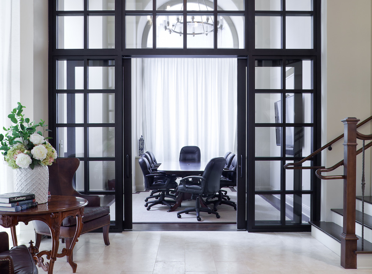
Many of us spend nearly as many waking hours at the office as we do at home, which means that the environment we work in matters. And even more so for companies that regularly bring clients into their space, such as managing director David A. Simon’s SRS Capital Advisors, a financial advisory firm. So when he moved his team downtown to Denver’s storied Equitable Building at 17th and Stout streets, he tapped partner and director of design Melissa Mabe-Sabanosh of Ruggles Mabe Terrell to create a state-of-the-art space for employees and clients while respecting the two-story suite’s historic components.
“When you’re happy and proud of your space, it can create a lot of different emotions: loyalty, happiness for longer hours,” says Mabe-Sabanosh. “Plus, it reinforces your brand for clients. Especially when you’re asking people to invest, to trust you, or selling something, the environment you create reflects so much about who you are.” Her mission is to design light-filled, timeless canvases for companies to add comfort and interest through art and meaningful objects.
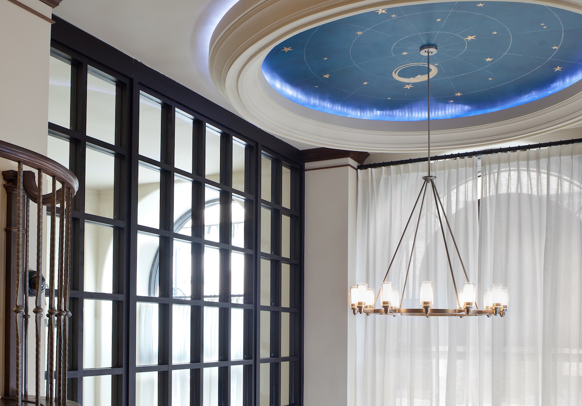
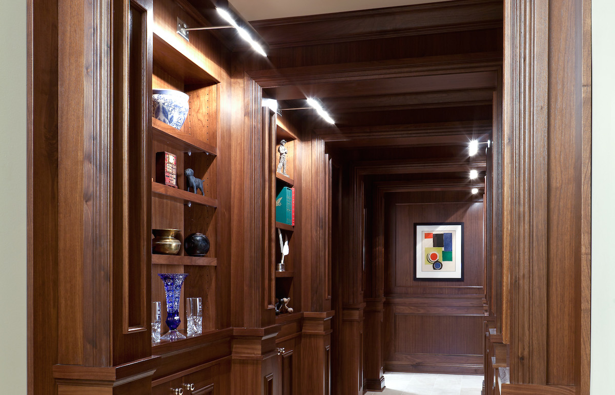
For Simon’s office, the first challege was how to allow sunlight to come in the towering two-story windows while cloaking the urban hustle and bustle of the bus stop just outside. Mabe-Sabanosh chose dramatic sheer drapery that obsures individuals on either side but keeps the interior bright. “I think it’s really important to capitalize on any natural light,” says Mabe-Sabanosh. “Whether it’s sunny or cloudy, it’s nice to be connected to outside, good for your psyche.” Then, she brought the outside in with a constellation mural, handpainted by a local artist. Finally, she added built-in bookshelves for Simon and Co. to showcase conversation pieces such as artifacts acquired through travel, gifts from clients, and favorite books.
The result? “Clients love it,” says Simon. “They have many millions invested with us, and it feels comforting for them to come into such a beautiful space. And our employees are proud, so it’s been a huge plus for our culture.”
Mabe-Sabanosh agrees: “People want to feel at home and special in their offices, and their clients do as well. We want to know these people, have some kind of connection. Companies are now doing that through how they finish their spaces.” Here, the designer gives five tips for how to translate the look to your own workspace, be it a suite in a grand building or a run-of-the-mill cubicle.
1. Embrace flower power. “Especially in the summer, it’s great to walk in and see a big, fresh flower arrangement.”
2. Make it personal. Mabe-Sabanosh uses stone samples left over from design projects as bookends in her own office. “Use things from your industry. For example, doctors might take a bone model for granted, but used sparingly in decor, it’s charming.” Books that inspire you are also good to keep around.
3. Light right. Harsh overhead lighting can be grating; combat it with warmer light from a shaded lamp at your desk.
4. Hang frames. Don’t neglect wall space; even cubicles can get a lift from artwork in beautiful frames. Mabe-Sabanosh suggests cutting and bending a clothes hanger to create a hook that hangs from over the top of your wall.
5. Pay attention to details. Mabe-Sabanosh chose a signature font, so all the titles on binders at her desk are visually cohesive. “It’s really about being thoughtful and rolling into a consistent pattern.”
Follow copy chief Jessica Farmwald on Twitter at @JessicaKF.

