The Local newsletter is your free, daily guide to life in Colorado. For locals, by locals.
What’s a designer to do when a client comes calling for a hip, modern home, but his wife yearns for the classic elements of traditional design? When residential designer Stephen Hentschel and tag-teaming interior designers Angela Coleman and Cassy Kicklighter Poole found themselves in just such a scenario, their solution was to help the couple—who were making the move to Denver from Florida—meet somewhere in the middle of that style spectrum, in that delightful territory known as transitional design.

Tasked with designing the brand-new home for the couple’s recently scraped University Park site, Hentschel—senior project designer for Denver architecture firm Mandil Inc.—began by using elements from an architectural style that’s more traditional than modern: a classic Denver Square. This choice was practical—“It’s such a pure rectangle to work with, so you can maximize your structure’s footprint on these narrow city lots,” he explains—but also all about fitting in: “I believe a home should bow to the street,” Hentschel says. “Many new homes seem to be saying, ‘Oh, look at me, I’m modern and cool!’ Or, ‘Hey, I’m Tuscan!’ But when you’re sliding these new houses into an established neighborhood, you have to take care to be a little simpler and calmer, and not so screamy.”

And so, for this home’s exterior, Hentschel whispered, incorporating subtle classical details including cast-stone window headers and a barrel-vaulted front porch. Modern windows and light fixtures provide the first hints of a break from tradition, but inside, Hentschel made his intention to “blow it up” clear, by pulling the typical central staircase off to one side to create an open floorplan that funnels traffic toward an open-concept kitchen, breakfast nook, and family room, and the outdoor living spaces beyond them. Upstairs, he and Coleman designed a 21st-century master suite—complete with a hidden walk-in closet and an exaggerated cove ceiling. And to connect both levels, Coleman devised an undeniably modern, glass-railed staircase.

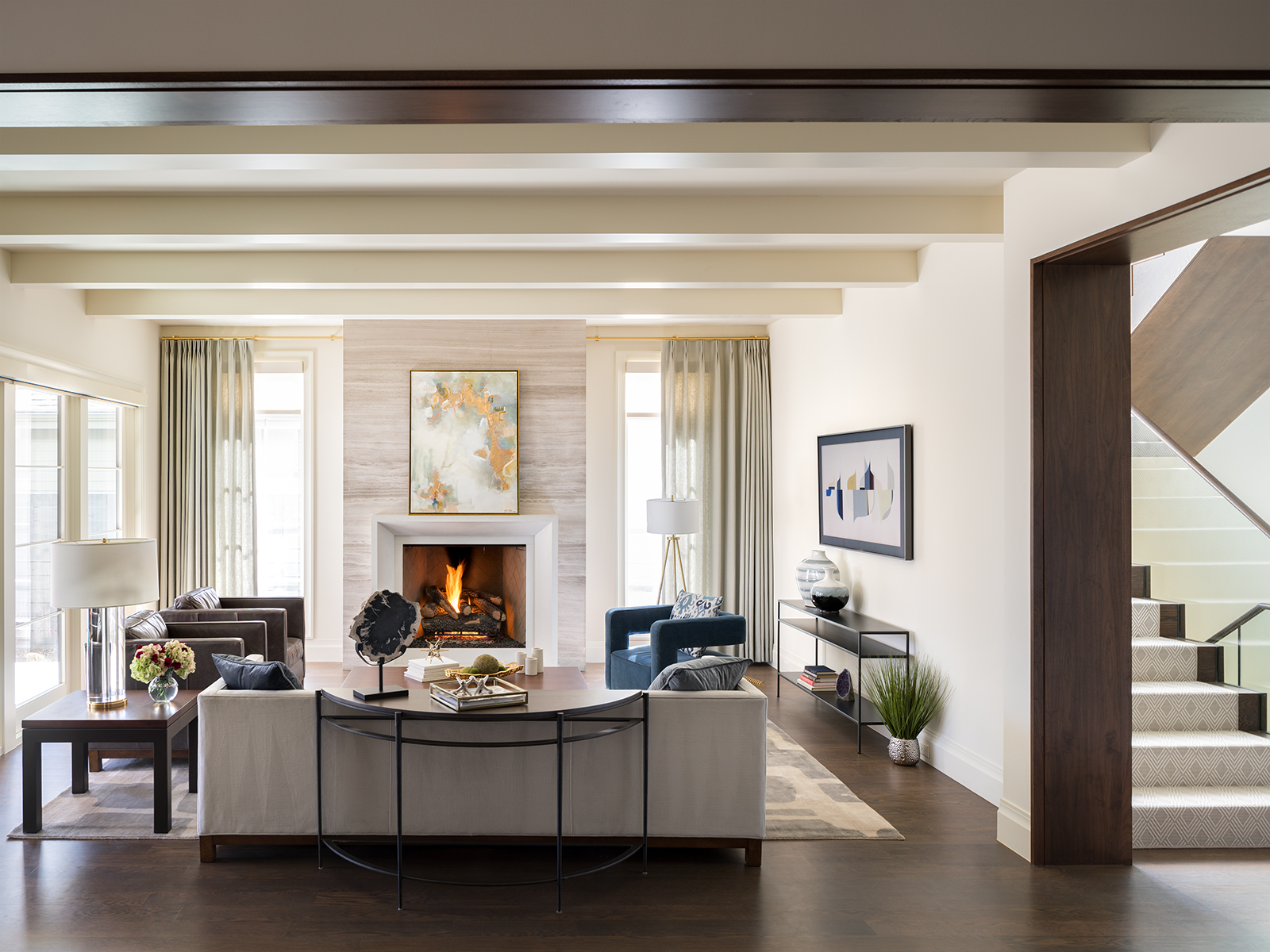
Despite these updates, the home’s shell remained simple enough to swing to either side of the style spectrum—or both simultaneously, which was Coleman and Poole’s plan. “Initially, we went down this path of creating a hip, modern, loft-like version of this home,” Coleman says, “but then we realized that the wife needed a couple of softer, curvier lines and traditional touches.” To please her eye, the design team incorporated some classic millwork: coffered, beamed, and coved ceilings; paneled walls in the master suite; and kitchen cabinetry with beveled doors and furniture-style bases. For her husband, they added modern wood accents, including walnut-wrapped door jambs and walnut floors with a custom gray-black finish.

For the kitchen, Coleman, owner and principal of Spec Design and Luxe Kitchens & Interiors, created an almost-traditional style—a classic mix of white countertops, subway tile, and cabinetry paired with brass accents—with the unexpected twist of a raised walnut bar top that seemingly hovers over the island. And though the master bathroom feels elegant with its Statuario-marble floors and walnut vanity wall, the powder rooms’ floating vanities and sleek finishes are decidedly mod.

Poole struck the same balance when furnishing each room. In the breakfast nook, the owner and principal of Kaleidoscope Design paired a mid-mod tulip table with a more traditional upholstered chair and bench. In the living room, she placed a tailored Chesterfield-style sofa opposite a sculptural modern chair upholstered in a deep-teal mohair. And for the master bedroom, where “he loved boldness and she loved soft romance,” Poole recalls, she designed a custom rug that incorporates the shimmery beige hue of the graceful upholstered bed—and paired it all with two masculine wingback chairs in deep indigo.

Throughout the house, similar pops of rich blues and grays punctuate a quiet palette of creams, beiges, and golds—which, according to the designers, is the key to the entire design. “In the dining room, we literally have six different fabric patterns and a bold piece of art—a daring move that would intimidate most people,” Poole says, “but it all looks so beautiful together, and it’s the consistent color palette that makes it work.”

Two people not daunted by such fearlessness? The homeowners. “Our clients said, ‘We trust you. If you think that’s the best choice, we’re in,’” Coleman says. “When a client says, ‘Show us what you’ve got,’ it really helps to support the design process,” Poole adds. Proof positive that sometimes, relinquishing control to the pros can yield the most personal style of all.

Design Pros
Residential Design: Stephen Hentschel, Mandil Inc.
Interior design (fixed finishes): Angela Coleman, Spec Design and Luxe Kitchens & Interiors
Interior design (furnishings and accessories): Cassy Kicklighter Poole, Kaleidoscope Design
Construction: AJ Kirkegaard Contractors, Inc.

