The Local newsletter is your free, daily guide to life in Colorado. For locals, by locals.
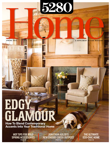
Traditional design has a boring rep: The gabled rooflines, the carved wood millwork, the tailored upholstery—it all feels so earnest. But this house in Denver’s Bonnie Brae neighborhood proves that a home can have classic good looks and a little edgy glamour, too. “It’s in the details that you find youth,” says interior designer Beth Armijo, principal of Armijo Design Group in Denver. “The architecture is more traditional, but if you mix your periods and styles with unexpected accessories and lighting, you can add personality.”
With help from Armijo and Cadre General Contractors, the owners—young professionals and new parents—remodeled the house into a space that fit their style. “They found a home that was 90 percent right for them, and then they gave it a facelift, so now it reflects who they are and how they live,” Armijo says.
The master suite needed the most help. In the bedroom, Armijo pulled up the wall-to-wall carpet and added hardwood floors, then clad the walls in horizontal slat paneling, painted soft gray. “Because there’s that gorgeous wood paneling in the living room, the texture on the walls [in the master] fits, but it’s a little unexpected,” Armijo says. She put the bed against the wall opposite the door—“so you walk into the room toward the bed, which feels good.” Behind the wall was unused crawl space; Armijo designed nightstands that swing open to the empty area, giving the owners extra storage.
For the decor, Armijo chose a clean-lined bed from Kravet, which she topped with custom pillows in yellow-gold from Pollack and a modern embroidered print from Dedar. She created a cozy nook with a contemporary version of a classic wingback chair from Lee Industries and a gray translucent side table from Oly Studio.
The bathroom, meanwhile, needed a complete overhaul. Armijo designed a sophisticated retreat that shimmers with beautiful textures and materials. Martin Shea Millwork Co. created his and hers sink vanities, which are surrounded by glass tiles from Waterworks. The rest of the tile is Calcutta marble, set in distinctive hexagonal patterns. “I really try to make a statement with tile, but subtly,” Armijo says. “You can get a lot of interest with design detail and textures without using trendy materials that will feel outdated in 10 years.” And the frameless shower shows off the room’s impeccable finishes.
The designer added a few surprises through the rest of the house, too. In the living room, she added drama by replacing a Tiffany-style pendant with a chandelier of hammered metal circles from Currey & Co. Custom pillows in a geometric Brentano fabric add contemporary flair. For the nursery, she selected bright, modern elements, including a bright yellow lamp and a chartreuse side table from Bungalow 5—“things that can stay in the baby’s room long after he’s not a baby anymore,” she says.
With the remodel done, Armijo loves that the home “isn’t too formal, but still has a special, custom feel.” Her best advice? “Feel free to combine styles under one roof. That’s how you get a home that you love.”


