The Local newsletter is your free, daily guide to life in Colorado. For locals, by locals.
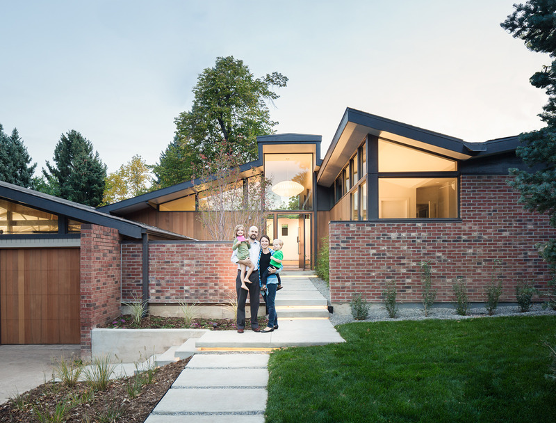
You could say that historic remodels exist on a spectrum: On the one end, you have painstaking renditions of the original style, which often lead to stiff, museumlike spaces. (Yawn.) On the other: Frankensteinian projects that carelessly blend eras, with boxy additions often bolted onto the backs of old homes. (Yikes.) Thankfully, there’s a middle ground, as this 1964 house in Boulder’s Newlands neighborhood reveals.
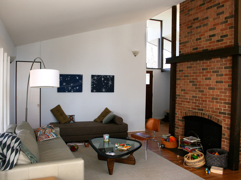
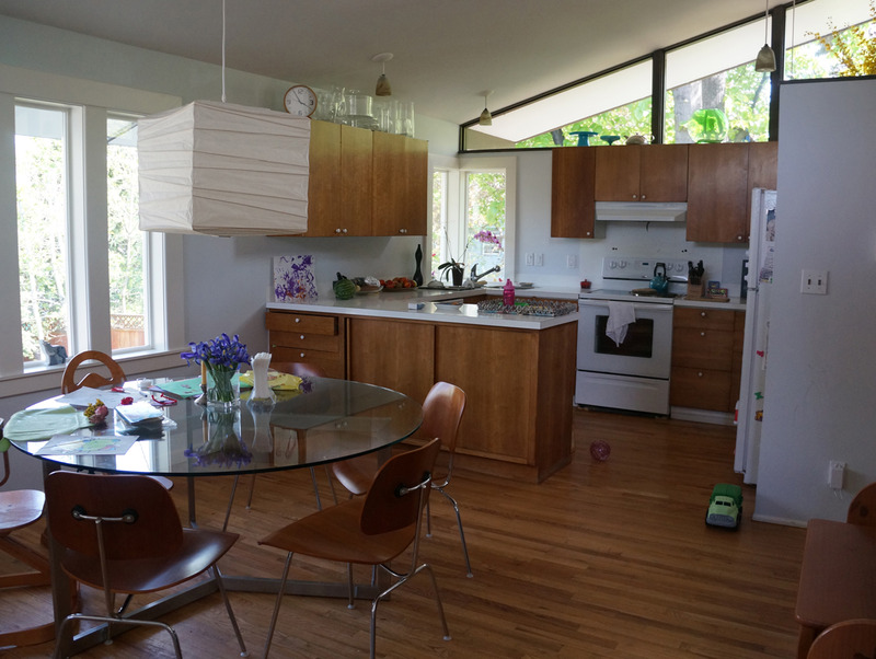
Architect Neal Evers and his team at HMH Architecture & Interiors worked with the owners—a pair of design-savvy East Coast transplants with two young kids—to add onto the home’s strong midcentury framework and bring the layout and finishes into the present day. The original house showed its age: a cramped footprint not suited to a family of four, a massive fireplace (popular in the ’60s) that stood in the way of a free-flowing floor plan, and—the curse of old homes—a dark, dysfunctional kitchen.
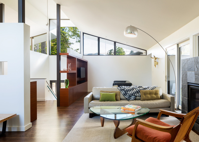
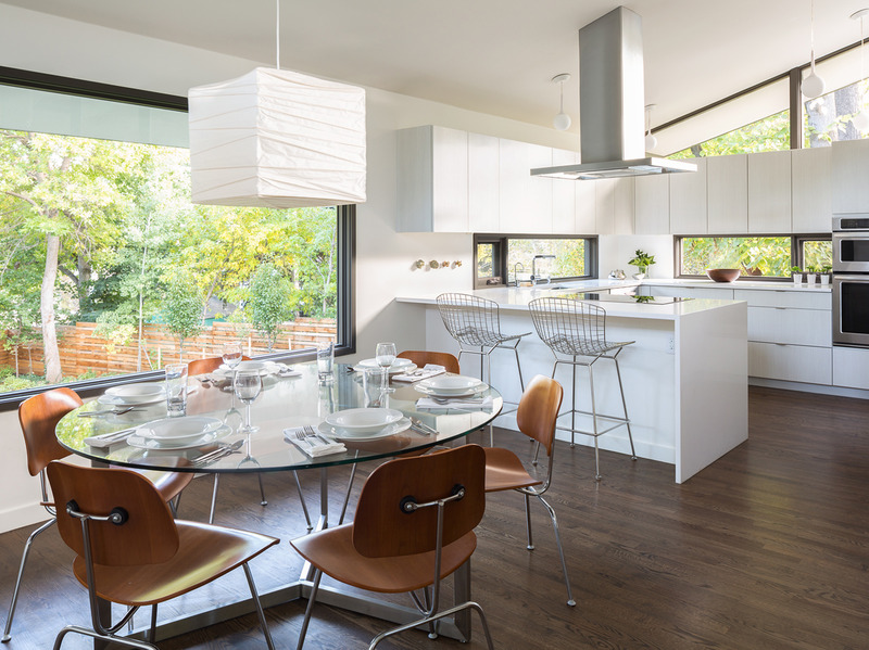
On the main floor, Evers opened up the layout (so long, towering fireplace) and reoriented the living room around a new double-sided fireplace that also faces the patio on the exterior side of the wall. The couple already owned most of the home’s furnishings (including Noguchi Akari lamps acquired when the wife worked at the Noguchi Museum in New York City), but they purchased new lighting to help accent the vaulted ceilings. “For the most part,” Evers says, “the home got tons and tons of daylight because of all the clerestory windows. So the lighting is almost sculptural.” To further structure the open space, the architect called for built-in elements like the TV console, which not only adds storage but also helps partition the area.
Reno Checklist
- An open-but-organized main floor freed of its former blocky fireplace
- Windows custom-built to look like the originals
- New oak flooring stained to downplay dirt and scratches
- An overhauled kitchen with extra storage and ample daylight
- Sliding-glass doors to extend the living space outside
- Multitasking built-ins that pair open shelving storage
- An addition that adds a courtyard, bringing elegance to the entryway
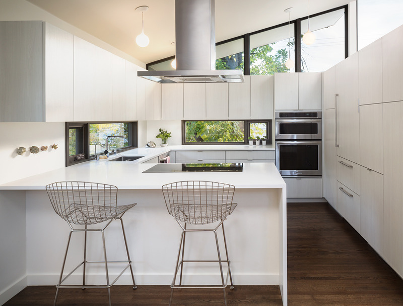
In the transformed kitchen, super-sleek style pairs with family-friendly function. “We put the cooktop on the peninsula,” Evers says, “so if one of the parents is in the kitchen, they still have a view of what’s happening in the living room.” The laminate cabinets (manufactured by Kabi) were kept hardware-free for a stark, modern look, and durable Caesarstone countertops shrug off sticky fingerprints and ketchup spills.
What’s the trick to making it all look cohesive rather than cobbled together? “Find the ‘rules’ that exist in the house,” Evers says—in other words, the design patterns already at play. Here, for example, he continued the existing line of clerestory windows throughout the remodel and replaced the old windows with new lookalikes. He also chose to break a few rules, adding cool, contemporary elements like an oversized entry door and trendy exterior wood paneling. That careful blend of old and new is what we call…a happy medium.
Design Pros
Architecture: Neal Evers, HMH Architecture & Interiors
Landscape Architecture: Ransom Beegles and Ryan Manning, R Design
Construction: Ron Patryas, Live Modern LLC

