The Local newsletter is your free, daily guide to life in Colorado. For locals, by locals.
It’s a great time to be a design fan. Thanks to Instagram, Pinterest, and cable TV, we’ve got more gorgeous rooms than we could look at in a lifetime—and expert tips to help us get the look—right at our fingertips. But with the same modern farmhouse kitchen popping up on the feeds of viewers from Cleveland to Fresno, it’s no wonder that design these days has become rather, well, homogenous. That’s why we’re especially proud to represent a community of design pros who dare to create spaces that say more about the people who live and work in them than about what’s trendy now. For this issue, we pored over portfolios to find the best examples of forward-thinking design for your home and office (and because this is sunny Colorado, your outdoor space, too). We can’t wait to share our finds with you.
1. Corporate Office
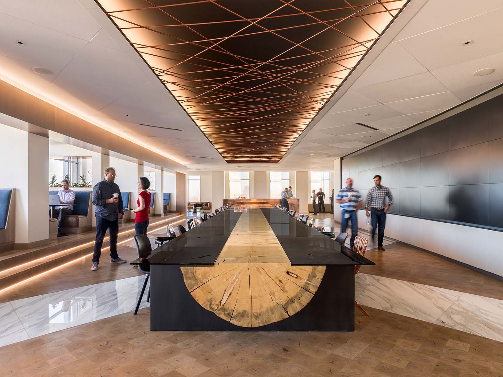
Anyone who spends her days in an office building knows the lingo: cube, desk, conference room, kitchen (if you’re lucky). But in this 138,000-square-foot new commercial building on Platte Street, the spaces are a little less conventional: There’s the Nest, a two-story gathering space defined by a giant hammock and swings; the Base, modeled after your favorite Colorado ski lodge, complete with fireplace, ping-pong tables, oversized chairs, and a moveable glass wall that opens to the Platte River; and the Unity Café, anchored by a 52-foot-long custom-made table crafted from a single, lightning-felled lodgepole pine from the Steamboat Springs area.

The inventive space—opened in July as the headquarters for BPX Energy, BP’s United States onshore oil and gas unit—is the result of collaboration between teams headed by Laura Leffler, the company’s chief of staff and head of communications and culture, and designer Sarah McGarry of Stantec’s Denver office. “We started with their vision of creating a home away from home for employees,” McGarry says. “They were strategic about selecting the building’s location—backing up to the river with views of downtown—and we played up those features with our layout and placement of the spaces.”
Then her team layered on materials and furnishings that feel…homey. Rich wood tones, warm metal details, and sleek marble glow under soft lighting and abundant sunshine. “Laura and her team kept asking how to enhance the user experience,” McGarry says. “That’s what drove our decisions.”
Leffler says she walks the building daily to see how her colleagues use it. “We try to listen to our employees, and they’ve said that they want to be in an environment that’s authentic,” she says. “That’s what we want to be, meaningful and authentic.”
Pros
Interior design by Sarah McGarry, Stantec
Project management by Chad Rabon, Project One Integrated Services
2. Dining Room

The rug—an element that’s more often a finishing touch than a jumping-off point for a space—provided the design direction for this dramatic dining room and bar in Cherry Hills Village. “It took about a year to get [the floorcovering] finished,” says Andrea Schumacher, principal of Andrea Schumacher Interiors. But once the rug’s pattern, color, and scale were dialed in, the room’s high-contrast palette of sleek black walls and floors, white countertops and columns, and warm wood accents fell quickly into place. “The idea for the house was bringing the Hamptons to Colorado—with a twist of glam,” Schumacher says of the project she collaborated on with Alvarez Morris Architectural Studio. That East Coast vibe comes from wood-slat wall paneling—painted a matte black hue—and crisp-white marble slabs that cover the bar area’s long countertop and high cocktail table. Organic elements, including custom walnut cabinets by Abacus Cabinetry and a live-edge-wood dining table, create a Colorado connection. As for the glamour? Schumacher designed a set of black-velvet-upholstered dining chairs that are “not too stuffy and a little sexy,” she says. Champagne-colored flecks in their fabric add “a lot of texture without a lot of color,” she adds—and complement the antique brass accents she employed to warm up the room: Apparatus’ Highwire Tandem chandelier, leggy bar stools, and decorative vessels on the bar’s open shelves. Add a glass-walled wine room and custom hanging rack for glasses, and this design has fine dining nailed.
Pros
Interior design by Andrea Schumacher, Andrea Schumacher Interiors
Architecture by Alvarez Morris Architectural Studio
Construction by Character Builders
3. Library

Sometimes the best designs are the ones that evolve over time: In this new home in Observatory Park, for instance, the initial plan was for a sleek, modern space. “But after several conversations with our clients, it became clear that we needed to layer in classic elements to soften the home’s look,” says Angela Coleman, principal of Spec Design and Luxe Kitchens & Interiors, who worked with Cassy Kicklighter Poole of Kaleidoscope Design on the home’s interiors. That approach delivered this serene library, whose visual anchor is a fireplace with simplified lines, topped with a wood-veneer wallcovering by Ralph Lauren Home and artwork by Kristin Blakeney. “I love the room’s layout, the huge play on symmetry,” says Poole, who placed the furnishings so they’re floating in the room. “The lines of the space—from the two-toned coffered ceiling to the geometric shapes on the rug—all reference each other and make you feel good in the room.”
The other secrets to the space’s irresistible vibe? First, “a sophisticated palette with layers of pattern and texture,” Coleman says. “You can do a lot if you stay with a few muted colors expressed in a lot of materials.” And second, a smart decision to recess the TV in a credenza behind the chairs, which makes the room more than a place to binge-watch Netflix. “The owners have coffee in here, chat with friends, work on their laptops, have a cocktail in the evening,” Poole says. “It’s a space they actually use.” And that’s a payoff worth waiting for.
Pros
Interior design by Angela Coleman of Spec Design and Luxe Kitchens & Interiors; Cassy Kicklighter Poole of Kaleidoscope Design
Architectural design by Stephen Hentschel, Hentschel Mandil Architects
Construction by AJ Kirkegaard Contractors Inc.
4. Architecture

It’s hard to believe, but the spot in Denver’s LoHi neighborhood where this contemporary home stands was once home to a shuttered American Legion post. It might have sat long overlooked if homeowner Rhys Duggan—who was on the hunt for a unique infill space for a modest-size single-family home and his auto collection—hadn’t found it. The site, tucked amid restaurants and other commercial buildings, with primary access off the alley, felt like the ideal location for his project.
Enter Matt Davis, principal of Davis Urban Architecture, who created a design that employs simple lines, economy of form, and a raw palette of materials (exposed concrete, zinc cladding, and custom steel and glass openings), and feels residential despite its urban surroundings. “We achieved a sense of privacy and intimacy by creating a courtyard defined on one edge by a guest house and on the opposite edge by the garage and auto gallery,” Davis says. “The primary living space is on the north boundary and benefits from the large double-height doors opening to the courtyard to the south.”
This living room, though grand in volume, makes use of smart scaling techniques: The fireplace’s steel form
is approximately 10 feet above the floor, as is the kitchen’s wood wall. These forms align with the catwalk that connects the stairway to the bedrooms above, a strategy that “reduces the perceived scale of the large volume,” Davis says—and makes the room feel both impressive and comfortable.
The moral of this home’s story? “No parcel should ever be forgotten,” Davis says. “Small parcels like this one can and should be developed to add small, bite-sized developments that increase density without destroying the neighborhood’s existing historical fabric.”
Pros
Architecture by Matt Davis, Davis Urban Architecture
Landscape architecture by R Design Landscape Architects
5. Master Bedroom

Duet Design Group had clear marching orders from the owners of this Cherry Hills Village home: Make the handmade bed the centerpiece of the master bedroom. Luckily, it wasn’t an unfamiliar task: “That bed has gone with me to every bedroom I’ve done for this client,” says Devon Tobin, co-founder of the Littleton-based firm that has designed multiple homes for the young couple—including this one. Handmade by the homeowner and his father from slabs of narra hardwood, the piece is certainly rustic, but the couple’s style isn’t as easily defined: “They are truly eclectic,” Tobin says. “They love modern, they love industrial, she has a true passion for that sophisticated luxurious look…they just love good design.” To satisfy all their tastes this time around, Duet assembled a texture-rich mix of furnishings that span the style spectrum: a feminine pair of mercury-glass-and-bronze lanterns from Currey & Company; sleek wood Sho Modern nightstands with perforated-metal bases and acrylic drawer pulls; linen curtains and Roman shades; and a showstopping abstract-watercolor wallcovering from Area Environments. “The headboard is low and the ceilings are high, so the wallcovering creates a sort of ‘headboard wall,’ ” Tobin explains. The look, though bold, is designed to last: “I like to push the limits of design in areas that are easy to change—a crazy wallcovering, bold pillows,” Tobin says. But, she adds, when it comes to the room’s foundations—walnut-paneled ceilings, site-finished white-oak floors, custom-stained baseboards—“the longevity of those is forever.” Until the next bedroom comes along.
Pros
Interior design by Duet Design Group
Architecture by Brett Linscott, Architectural Workshop
Construction by Wade Cumming, C4 Ltd.
6. Contemporary Kitchen

When the owner of this Wash Park house asked architect Stephen Barsch and interior designer Megan Hudacky, principal of CKY Design, to replace his dim, straight-outta-the-1980s kitchen with a “warm modern” space, Barsch responded with a large, light-filled room that opens—via a 20-foot-wide, multi-slide pocket door—onto a spacious patio and swimming pool. But this presented a new challenge: “Open kitchens can easily get cluttered with hardware and drawer faces and multiple materials,” Hudacky says. Preventing that fate, she says, was “as easy as eliminating the hardware, [minimizing] the amount of upper cabinets, and using the same materials in the kitchen as we did throughout the house.” That palette—stone, wood, and metal—might sound familiar, but the ways in which Hudacky manipulated these materials is anything but. Slabs of white marble—which match the island’s top and sleek sides—create a three-sided box that conceals the range hood. Planks of reclaimed pickle-vat wood (sourced by Reclaimed DesignWorks and planed to create a not-too-rustic surface) add dimension to the wall behind the bar sink. And warm brass—typically applied in a cabinet knob here, a faucet there—covers an entire bank of bar cabinets custom made by Scott Gottwald and David Kremer of Design Labs. “I always feel like the bar is that area where you can do something a little unconventional—and so we did,” Hudacky says. For the backsplash wall, she veered away from typical mosaic or subway tiles, opting instead for limestone rectangles set in a herringbone configuration—“a subtle way to bring in a beautiful pattern,” she explains. Broad expanses of brushed-oak cabinetry, Tom Dixon’s brass Tube table (which Hudacky customized with a new wood top), caramel-colored leather dining chairs from DwellStudio, and rows of dark metal ceiling light fixtures echo the light and dark tones of the wood-plank walls, creating a texture-rich space that’s modern, yes, but also so warm, it glows.
Pros
Interior design by Megan Hudacky, CKY Design
Architecture by Stephen Barsch, Barsch Design Inc.
Construction by Jason Solis, Solis and Son Construction
7. Outdoor Room

This Hilltop home’s outdoor living room began with a common design directive—provide privacy and shade—and solution: flexible shade sails positioned over a concrete patio. But after a year, it became clear to the homeowner that a commonplace concept just wasn’t going to cut it. “[The homeowner] wanted something sculptural and extraordinary,” says Paul Wrona, a principal at landscape architecture firm Elevate By Design. Specifically, the client envisioned a take on a traditional teahouse, built with the same palette of metal and wood used inside and outside his home. “We all fell in love with the idea,” Wrona says, and the team got to work designing a structure tall enough to match the home’s roofline, wide enough to mirror the sunken patio’s footprint, but still small enough to feel inviting and cozy.
Powder-coated-steel support posts and beams give the structure stability while visually anchoring the space. Ipe wood slats lend a sense of softness. To achieve some irregularity in the design, Wrona’s team created a rendering with a generic layout of the slats, then the homeowner and Chad Beall of Tree Frog Woodworking adjusted the design as they laid each piece on site, leaving one side open to “invite an existing L-shaped water feature into the space,” Wrona says. A screen designed to look like a smaller version of the teahouse provides privacy for an adjacent outdoor kitchen. A minimalist fire feature designed by Denver architecture firm Entasis Group, smartly placed LED up- and downlights on the teahouse, and orb-shaped light fixtures wash the outdoor room with a warm glow, rounding out a design that’s functional by day—and downright magical by night.
Pros
Teahouse design by Elevate By Design
Screen fabrication by Chad Beall, Tree Frog Woodworking
Fire pit design by Entasis Group and installation by Old Greenwich Builders

