The Local newsletter is your free, daily guide to life in Colorado. For locals, by locals.
On a busy stretch of West 32nd Avenue, just beyond Highland Square, sits a sprawling modern house and matching workshop connected by a charming courtyard. With their industrial-rustic mix of standing-seam metal roofs and board-and-batten wood siding, they’re often mistaken for one of the neighborhood’s trendy breweries or restaurants. In fact, the buildings, which occupy the lot where neighborhood landmark Ted & Bob’s Service Auto Repair once stood, are the design handiwork (three years in the making) of husband-and-wife duo Marke and Kimberly Johnson, owners of graphic-design studio the Made Shop. The couple describes the space, which was built by Kim’s brother, Brad Weiman of Work Shop Denver, as “minimal modern farmhouse Shaker” in style—a surprising blend of aesthetics that totally works. Here’s how they pulled it off.

5280 Home: Black and white and wood—this seems to be the theme for your home and workshop’s design.
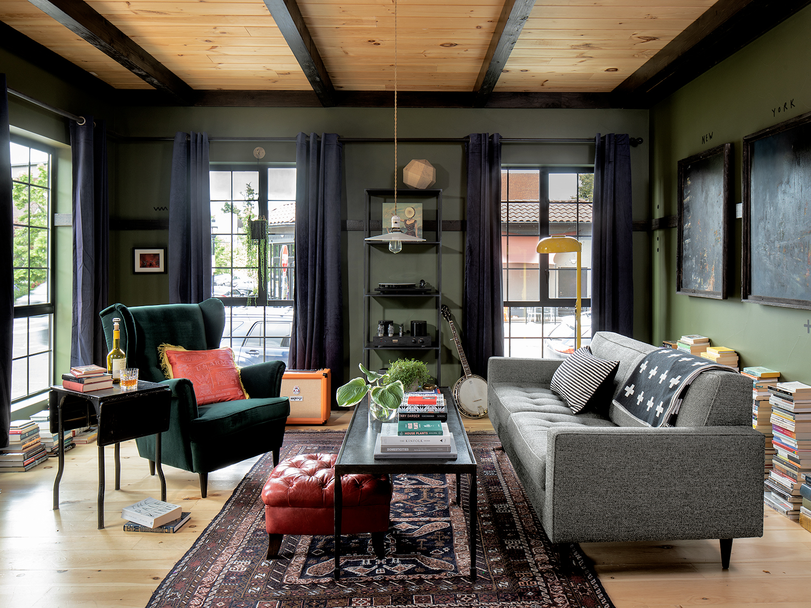
Marke Johnson: We like a little bit of eclectic clutter, so we wanted a really simple background palette: large, open, simple spaces and fun little things piled up. We really like using natural materials like wood and tile and unfinished steel; the point was to use things that weren’t quite perfect in a modern, minimal way. The design on paper is pretty restrained, but it’s not this pristine, perfect box; it has a lot of character and imperfection.


You built on a bustling stretch of 32nd Avenue. What’s special about this location?
MJ: We wanted somewhere walkable, with history. The goal [for our aesthetic] was to somewhat break the mold while still respecting that history. From the outside, the structure looks a little more severe, but inside, it has a surprising warmth. It goes back to Frank Lloyd Wright, who just delighted in surprising people as they entered a building.

Speaking of surprises, let’s talk about the five garage doors on the house and workshop. Are they a nod to this property’s roots?
MJ: That’s what caught our eye about the original building here: It had these beautiful garage doors and the best light. Even though in the end we had to tear it down, we were determined to have some garage doors [in the new buildings]. We love them because you can open them up and suddenly have indoor-outdoor space, but they’re also one of the cheapest ways to do windows, and they have an industrial feel.

Tell us about some of the interior details, starting with the living room fireplace.
MJ: We wanted the hearth to feel like the center of the home; we wanted it to feel warm and cozy, but also, again, modern and minimal. So we had this idea of exposing a cast-iron fireplace and raising it up. This whole area is kind of what we built the home around. The layout of the windows was taken from lots of old houses, which would have high windows by the fireplace for air circulation.

What inspired the unfinished-plywood “headboard wall” in the master bedroom?
MJ: One of my favorite artists is Tom Sachs, who does work in plywood. I like the philosophy of using things that are raw and utilitarian and meant to be hidden. Like the raw steel of the stairway, [the idea to incorporate] plywood came from that feeling of using a simple material that maybe isn’t expected. This [bedroom centerpiece] was actually an ordeal, because working with plywood is not what most contractors are used to. We did this piece almost three times. It was a struggle.


The room’s layout is pretty unusual too.
MJ: We like a lot of openness; we’re not particularly private people. The idea started when we considered that there could be a central “structure” that works on the one side as a headboard and that also separates the sleeping area from the bathroom.

You designed and built 6,000 square feet—the home, office-meets-workshop, and an Airbnb space—from the ground up. Did you devise any innovative budgeting strategies?
MJ: It was a monetary goal but also an aesthetic goal to find cheap or utilitarian materials and use them in interesting ways that feel elevated, where the impact is from the design and not necessarily from the most expensive materials.
Kimberly Johnson: All of our cabinets’ inner workings are from IKEA; we had custom fronts made for the kitchen cabinets. The bedroom storage walls: all IKEA. We found this line that had enough pieces that we could puzzle-fit them together, cut legs off some of them. It’s a good way to save money.

What sort of magic happens in your workshop?
MJ: We’ve been trying to answer that for just over 10 years. Our most recent description: a shape-shifting design collective. In its simplest form, we do graphic design. But we take a really broad approach that includes branding, visual identity, and logos for companies and products; signage, menus, collateral, and interior art for hospitality businesses; and a whole other side in the entertainment industry: music videos, album covers, multimedia stuff…. That’s the shape-shifting part.

What do you love most about your home-and-workshop combo? The commute?
MJ: I think, in a way, the commute is what we love most about the project—but not just because it means less time spent in traffic. It represents our entire goal: a seamless blend of work, family, and creative living—all on one city lot. Now that we’ve settled in, [the property] has developed this wonderful feeling of a creative ecosystem with separate but complementary parts: the house, shop, and outdoor spaces. The boundaries between the parts are important, but [the parts] also blend and interact with one another in a self-sustaining balance that we’ve come to truly love.
Design Pros
Interior design: Marke and Kimberly Johnson, the Made Shop
Construction: Brad Weiman, Work Shop Denver

