The Local newsletter is your free, daily guide to life in Colorado. For locals, by locals.
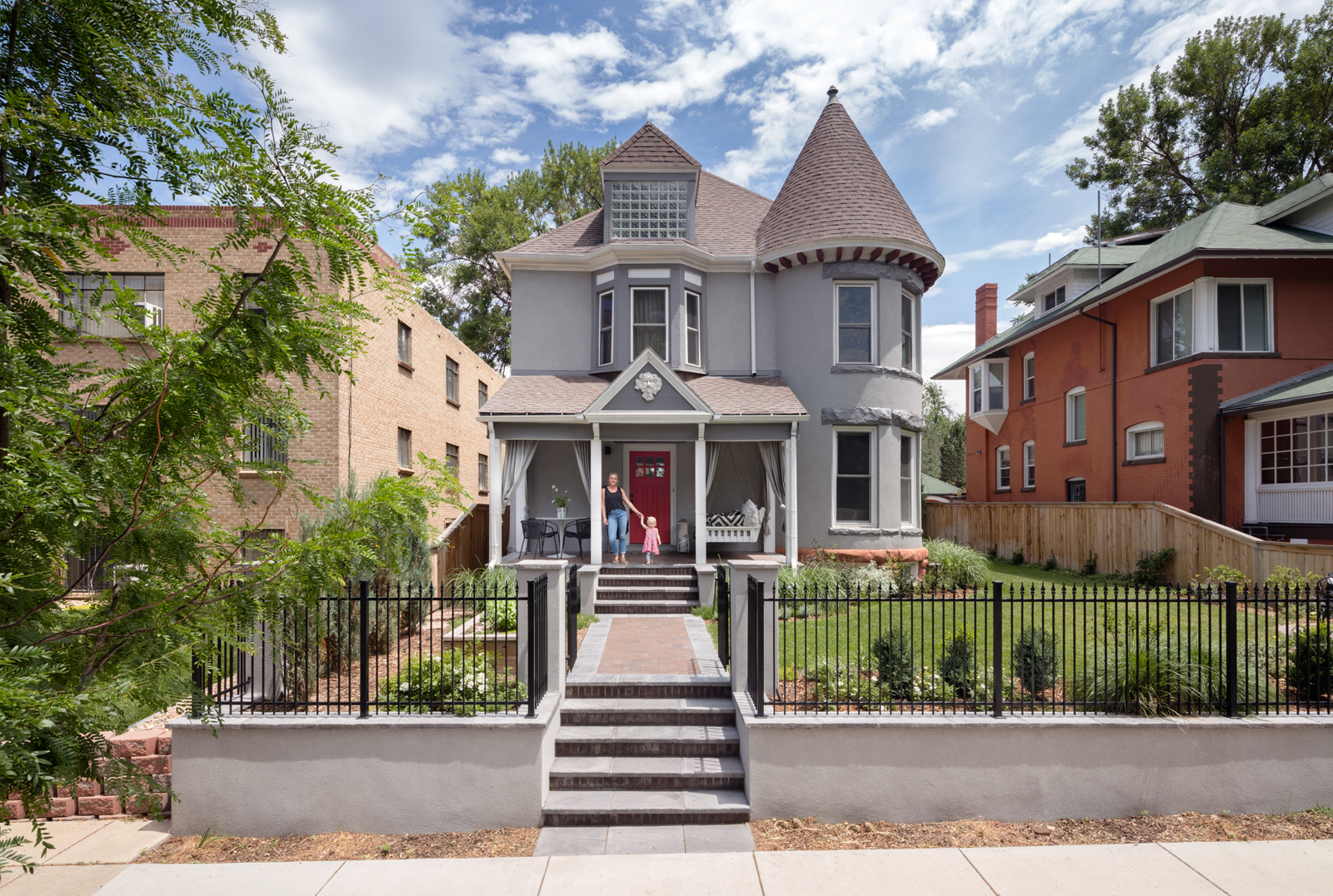
When Sam and J.B. Hochman bought their vintage Victorian home, it seemed like the only for-sale house in Congress Park big enough for their newly blended family, which includes five young daughters and one big dog. The 4,000-square-foot home offered a master suite in the attic, five bedrooms on the second floor, and another bedroom in the basement. And though its stuccoed exterior lacked some of the magic of a classic 1890s Victorian, the home’s original interior details were intact, including finely crafted moldings and a grand staircase.
“We loved the bones,” Sam says—but that’s about all they admired. The original layout was a confusing warren of rooms, made more disorienting by a harsh combination of stark white walls and near-black wood trim, which framed every doorway. The cramped, dated kitchen was cut off from the rest of the house, and when the couple set about renovating it, the seemingly straightforward project quickly took on a gigantic new scope.

Steven Perce, co-founder of architecture and interior design firm Bldg Collective, and builder Ryan Wither of Buildwell, had planned to remove the walls that separated the kitchen from the adjacent dining and living rooms, and steal some extra space from an unneeded back staircase. But as that project grew—the team discovered that the floor system was so uneven, they would have to install four helical piers in the basement to hold it up—Sam and J.B. decided they might as well address the rest of the dysfunctional floorplan too.
Seizing the opportunity to create a more logical flow, Perce closed off a large opening between the foyer and the turreted, front sitting room; that single move created a more defined entry, a cozier living space, and directed traffic back into the heart of the house. By enclosing an opening between the dining and living rooms, he created places for a built-in buffet on one side of the new wall and a sofa on the other.

As they removed openings, the team preserved the original moldings, which they used to accent new walls and doorways. By painting the walls and trim the same color, they emphasized the molding’s fine detail and craftsmanship. “Now you see the texture rather than just the color,” Perce says.
Texture plays an equally important role in other new finishes that have the qualities of materials used a century ago. “When people walk into old homes, they experience this warmth and lived-in feel,” Perce says. “That’s what we were aiming for, rather than a particular style.” For example, Wither built the living room’s sleek glass-and-steel French doors just as a craftsman would have in the early 19th century, waxing (rather than painting) the hot-rolled steel to preserve its blemishes, and using a simple window putty to install the glass panes. Perce had the new oak floors coated with a natural oil finish “that will patina and wear where people walk,” he says, and for the kitchen, he designed cabinets with thick, wire-brushed-oak veneers.

A simplified and natural color palette, which ranges from light and bright in the living room to dark and moody in the adjacent sitting room, shows off modern-leaning furnishings—and a few unexpected design moves: a curved sofa that nests perfectly in a turret, a fireplace wall clad with modern, dimensional tile, and bright orange chairs at the dining table.
“What Steve did so well was help us keep the character of the old house but also modernize the space—but not in a cheesy, predictable way,” Sam says of the mix. “We have a unique family, and I think the house is just unconventional enough to fit us.”

sitting area, and contemporary back stoop that combines rough-cut cedar beams with a sleek steel canopy and support posts. A trio of concrete fire columns from Target illuminates the pool deck. Photograph by Raul Garcia
Design Pros
Architecture and interior design: Steven Perce, Bldg Collective
Construction: Ryan Wither, Buildwell


