The Local newsletter is your free, daily guide to life in Colorado. For locals, by locals.
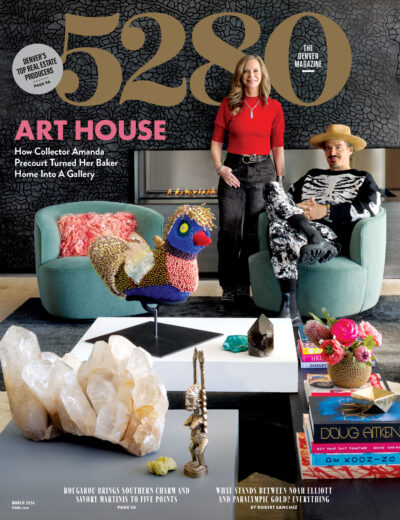
We live in a world in which nothing is static: Software updates often tweak how we interact with our computers, and apps on our phones refresh themselves with an almost disturbing regularity. Magazines are a bit more measured in the ways they change, renew themselves, and re-imagine the reader experience. By way of illustration, the last time we completely redesigned 5280 was three and a half years ago, back when a man named Barack Obama was president and the Broncos were actually a good football team. (I know, it seems so long ago.) The issue you’re holding in your hands does not represent a complete design overhaul, but we have modified a few things that you might have already noticed as you perused the table of contents. Some of our typefaces have changed to make the layouts feel more modern. “This design refresh is anchored by the display typeface Giorgio,” says 5280 art director Dave McKenna. “Giorgio balances legibility, which helps readers navigate the magazine’s sections, with a beauty that allows it to complement 5280’s dynamic photography and illustration.” We’ve also revised the organization of the front of the magazine so the pages fit under one header, Compass. The content—cultural coverage, mini profiles, adventure stories—remains the same, albeit delivered in a way we think you’ll find more reader-friendly. I hope you’ll like our new look as much as our team does, and we welcome your feedback at letters@5280.com.


