The Local newsletter is your free, daily guide to life in Colorado. For locals, by locals.
1. Family Matters
Nature-inspired colors and textures define a kitchen sized-up for a crew of six.
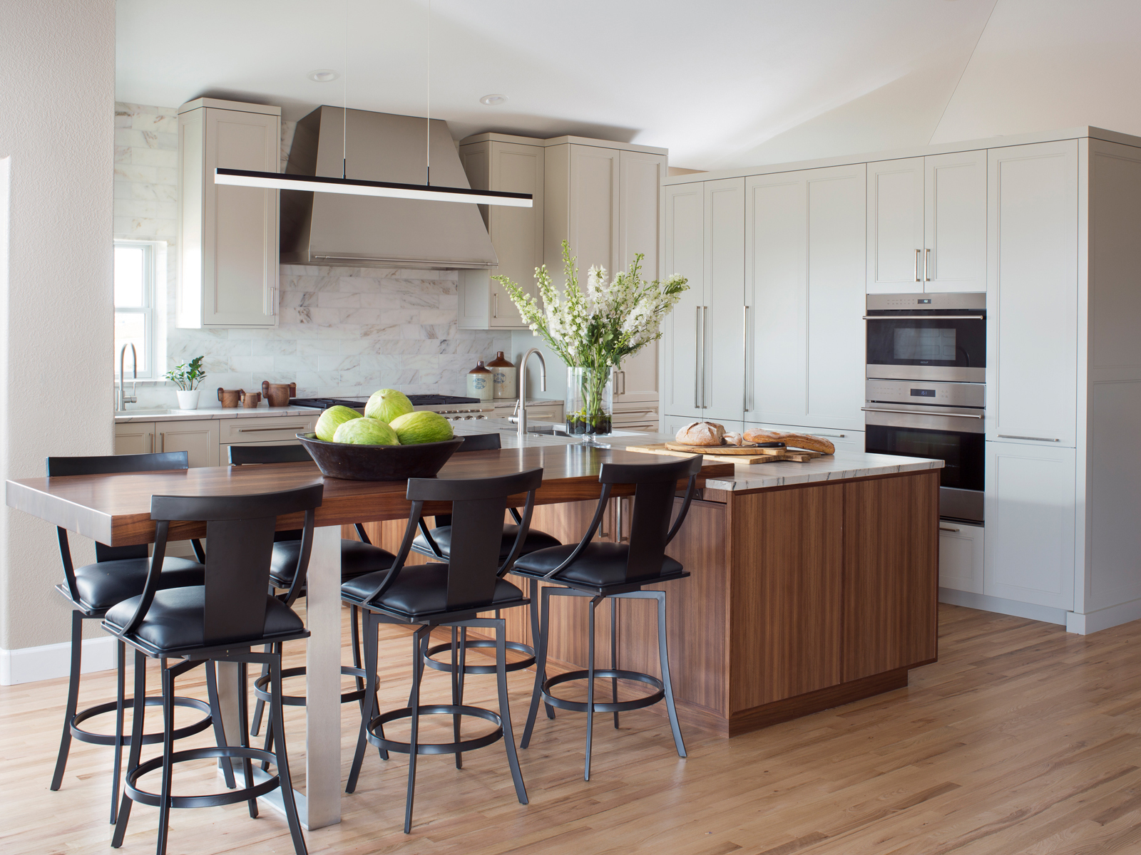
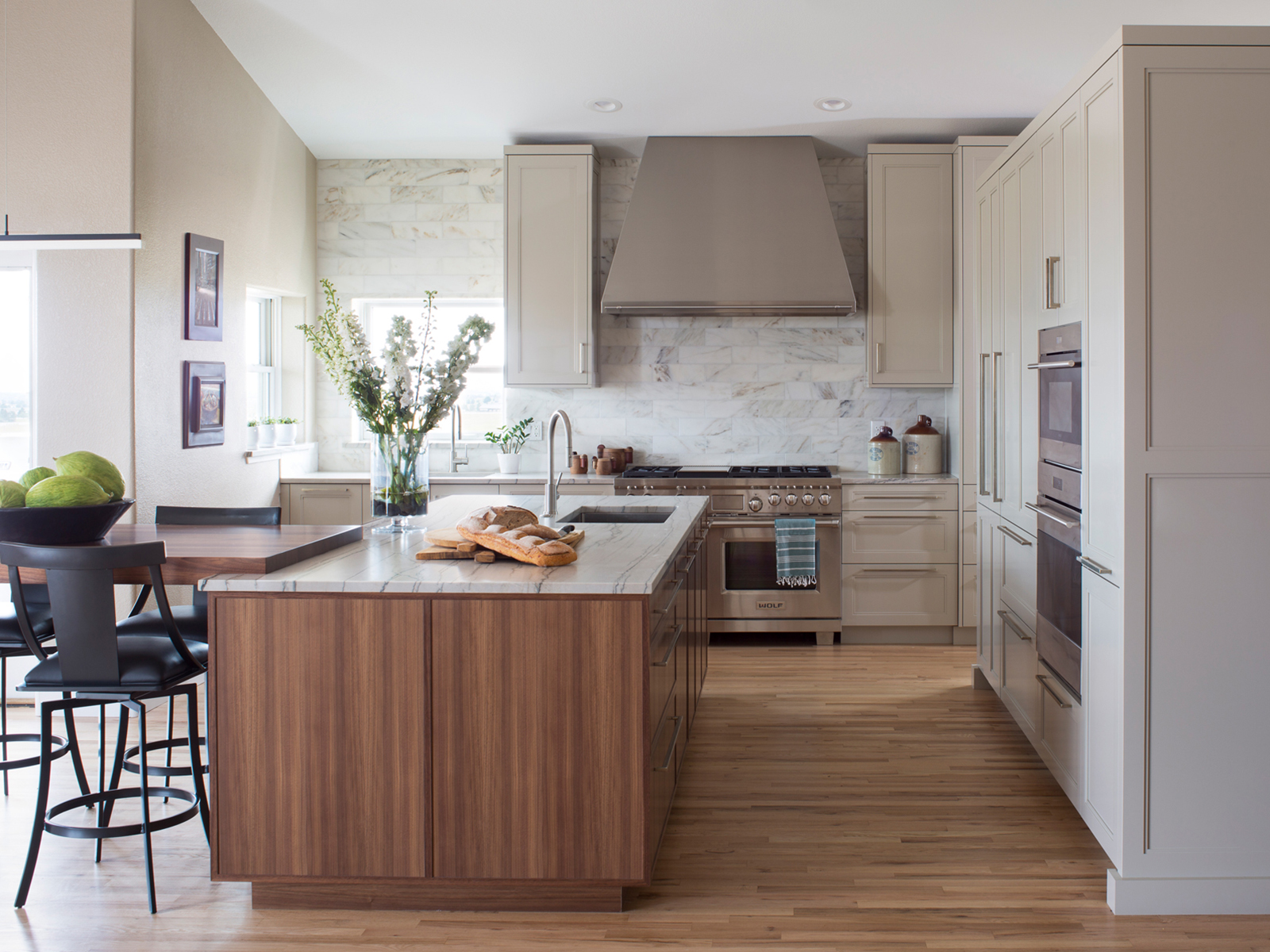
If there’s one thing a kitchen designed to handle the whims of four kids needs, it’s space. Which is the one thing this Loveland family of six didn’t have, because of a giant floor-to-ceiling fireplace. Knocking it down and removing a couple of extra walls was step one of Kitchen Distributors designer Brett La Hay’s plan to open up the kitchen and make it more welcoming for the large family. She added a half-wall (which holds the fridge, microwave, and an extra oven) behind a white Macaubas-quartzite-topped island to prevent the newly expanded room from overwhelming the rest of the main floor.
Step two for La Hay was lightening up the color palette and creating a connection to the outdoors. (The home, built in the late 1980s, is nestled into the foothills of Loveland and surrounded by farmland.) La Hay accomplished those goals by dreaming up a walnut-topped extension to the new island; incorporating brown, green, and gray tones in the finishes; and adorning the Artcraft Kitchens cabinets with handmade bronze hardware (from Rocky Mountain Hardware) that sports a subtle organic texture. “Anything overly manmade, with too much shine, would have been out of place in the home,” she says.
The handsome design is functional too: Double sinks and various workspaces mean multiple family members can cook simultaneously, and outlets hidden under the table make it a convenient spot for teens to do homework. For the grown-ups, a coffee station, complete with a faucet and lighting, is concealed behind doors in the half-wall. Because if there’s one thing parents of four kids need easy access to, it’s caffeine.
Design Pro
Kitchen Design: Brett La Hay, Kitchen Distributors
2. Showstopper
A go-with-everything palette and linear design help a centrally located kitchen flow with the rest of this home.
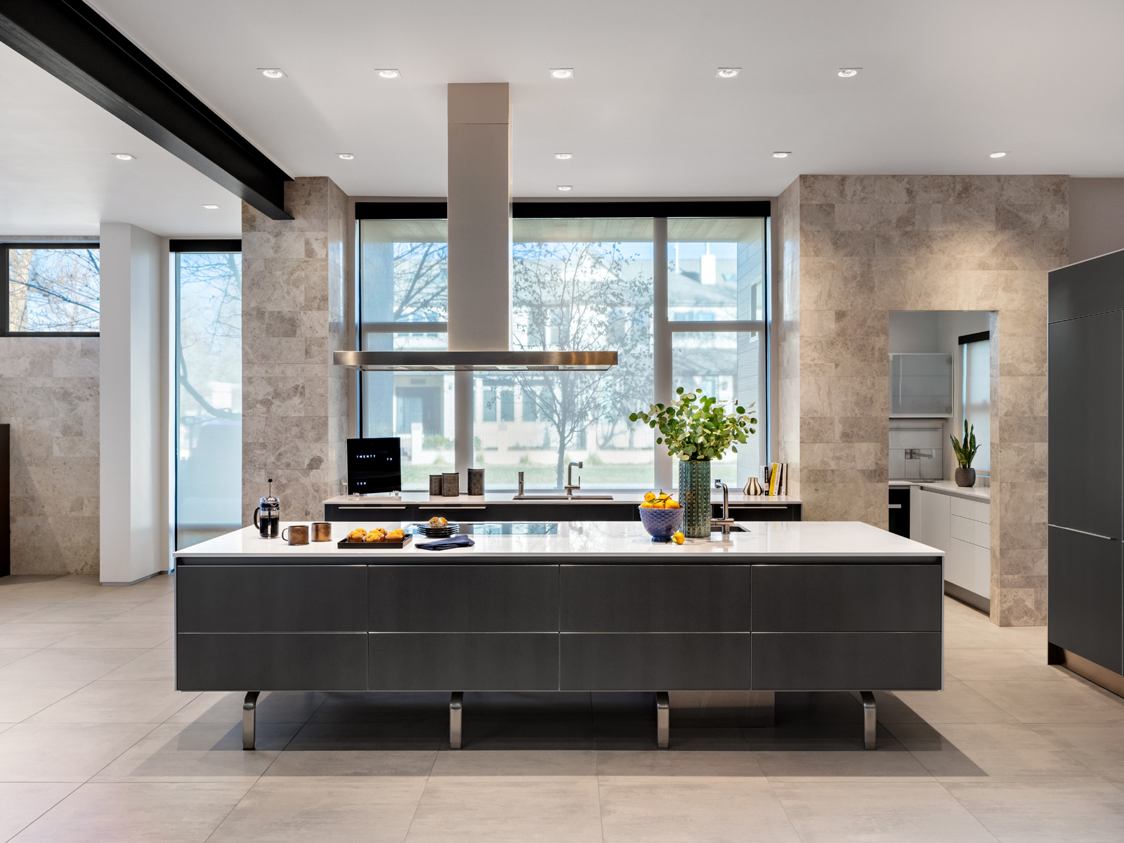
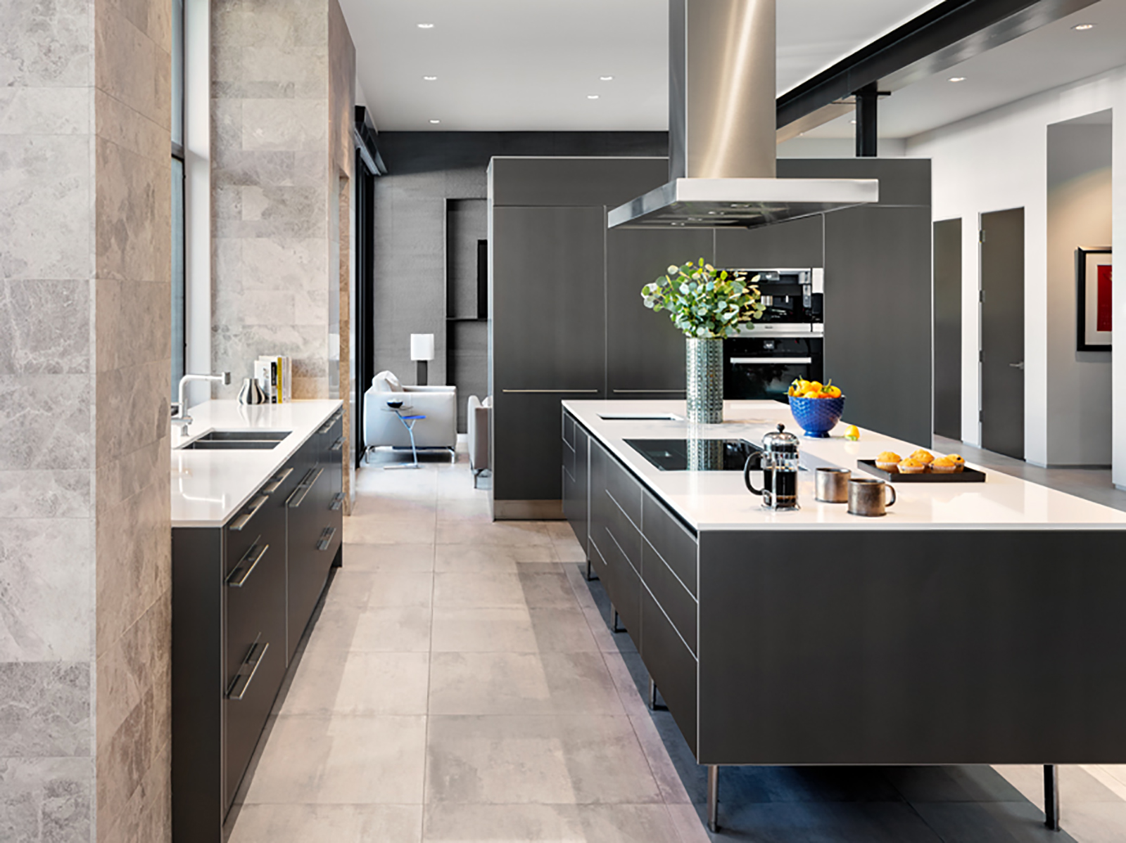
The trickiest part of dinner parties? Trying to hide the stacks of dirty pots and pans before guests arrive. Bulthaup kitchen designers Jed MacKenzie and William Landeros created a clever solution for this modern Cherry Creek North home: Conceal almost all of the prep space and appliances in a scullery behind the marble-tiled wall.
The kitchen is “front and center” when you walk through the front door and “central to every part of the home’s first level,” MacKenzie says, so the two-person design team used neutral hues and clean lines, with integrated appliances and no wall cabinets in the main kitchen. The slate gray graphite-and-anodized-aluminum paneling on the base cabinet fronts and wall cabinets is a Bulthaup original. (Littleton-based Kitchen Distributors is an authorized partner for the line, which is handmade in Bavaria and sold at the company’s Denver showroom.) “It’s a chameleon finish—it changes color throughout the day depending on how the sun and the lights hit it,” MacKenzie says of the cabinetry. “It’s something that you don’t get tired of…and it also relates well with a lot of different materials and colors”—like the white quartz composite countertops in the kitchen, scullery, and bar, and shiny metal detailing (see the Bulthaup hood).
The minimalist design doesn’t forego function. The paneling is fingerprint-resistant, and the counters are heat-resistant. And while the hidden scullery is the main store room and prep area, the central kitchen also has storage on the backside of the island and in recessed drawers, so guests leaning against the counter don’t bump against handles. A bar opposite the integrated ovens invites guests to spread out in the open space. The only thing the designers didn’t provide? The dinner-party menu.
Design Pros
Kitchen design: William Landeros and Jed MacKenzie, Bulthaup
Interior design: Sean Hughes, Mandil Inc.
3. In Perfect Form
Classic good looks and tailored detailing reign in this Cherry Hills kitchen, thanks to a thoughtful overhaul.
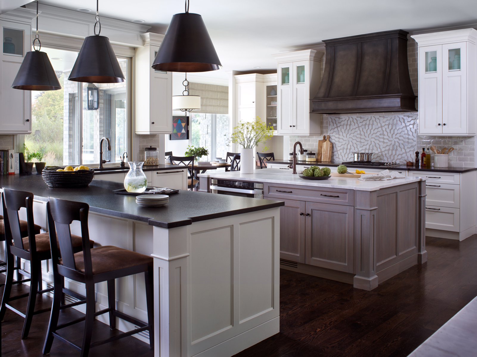
Pre-renovation, this Cherry Hills Farm house had the familiar, cringe-worthy “elegance” of 1990s suburbia: upholstered walls, bad faux finishes, an overabundance of crystal chandeliers. So the New York City transplants who bought it—a couple with three young children—hired designers Jennifer Pruett and Eric Mandil of Denver’s Mandil Inc. to peel away the gaudy layers and entirely reimagine the space using classic finishes with staying power. Phase one: the kitchen. “[The homeowners] are very refined and have an eye for sophistication,” says Pruett, the lead designer. “Their New York sensibilities translated into a very clean, polished-but-not-stuffy design.”
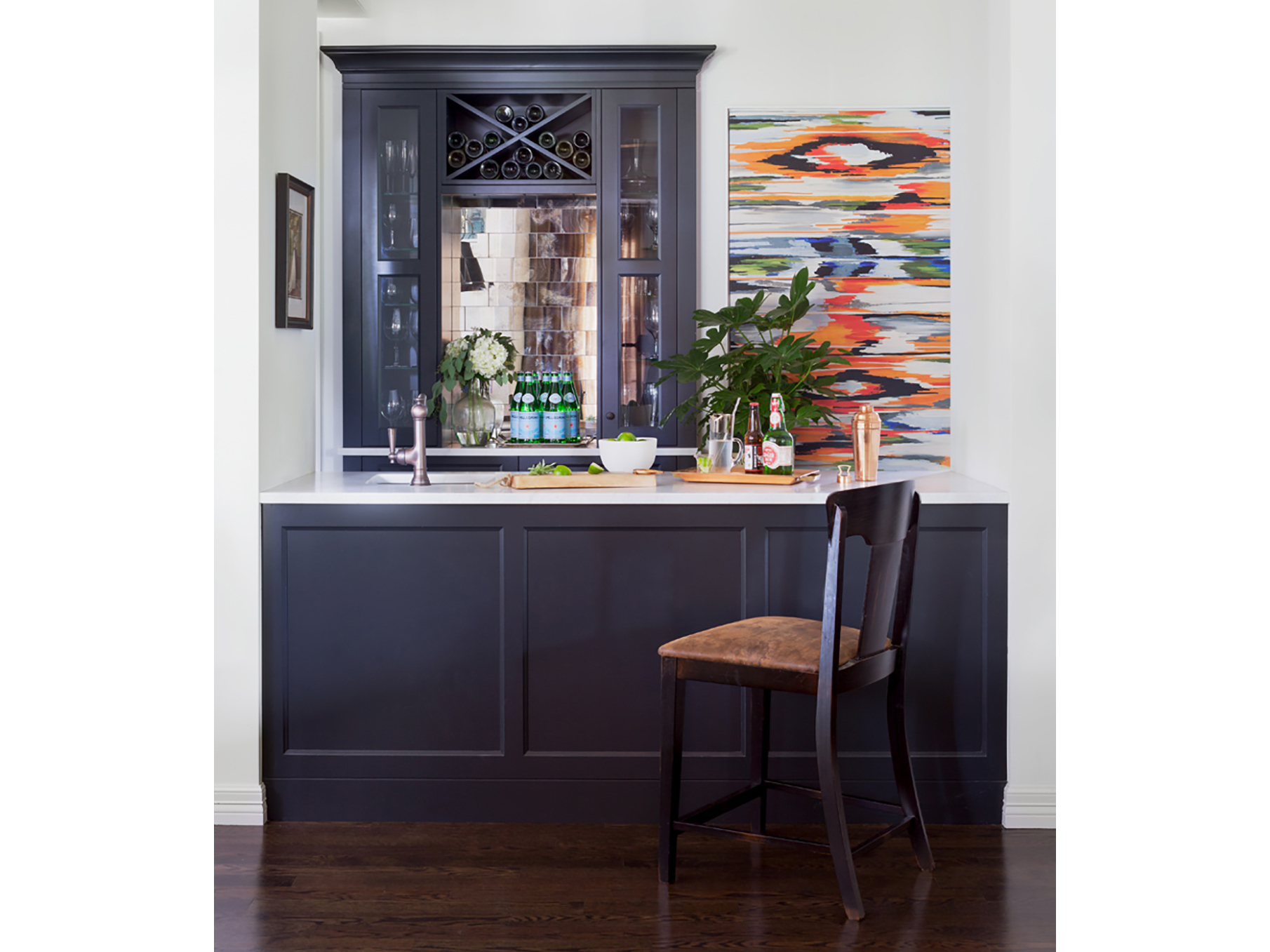
Timeless white and gray William Ohs cabinets embody this directive, Pruett says: “That small double bevel in the panel—versus a standard Shaker door—was the level of detail they were looking for.” Plus, you can’t get more classic than white—made more elegant with high-contrast black perimeter counters and oversize black-and-bronze pendant lights. An Ann Sacks mosaic above the range and a custom steel hood with traditional lines give the space wow points—and hardworking granite on the island ensures it withstands chefs of all ages. “The overall feel is timeless and casual for a growing family,” the designer says—with nary a ’90s style trope to be found.
Design Pros
Interior design: Jennifer Pruett and Eric Mandil, Mandil Inc.
Cabinet design: Angela Otten, William Ohs (now of Inspire KDS)
4. Worldly Wisdom
A Littleton kitchen where you can pretend to be a continent away? Yes, please!
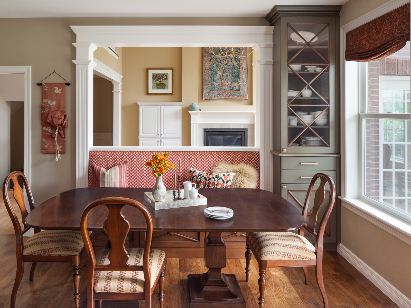
The way interior designer Katie Schroder tells it, it’s not often—especially in Denver—that one gets a call from prospective clients looking to redo their home in “European traditional” style. But that’s just the aesthetic this Littleton home’s owners wanted to create with help from the Atelier Interior Design principal. And they achieved it, thanks in no small part to some ultra-sophisticated sage-green cabinets, which Schroder sourced from the Open Cupboard in Lakewood. “We saw them when we walked into the showroom and basically said, ‘We’ll take ’em!’ ” she says of the cabinetry.
Of course, the Old-World style—a bold choice made all the more glamorous by dulled-gold hardware from Atlas Homewares—is only one part of the winning formula: A patinaed copper hood and a pair of antique-brass Visual Comfort light fixtures, though new, feel like they’ve been hanging in the kitchen for a century. And the eating nook, smartly furnished with a classical walnut Bernhardt dining table and burgundy upholstered banquette, feels like the perfect place to sip an espresso out of an Italian-made cup and saucer. “Alone, every nuance holds its own,” Schroder says, “but it’s really the mix of finishes that have made this kitchen such a treasure.”
Design Pros
Interior design: Katie Schroder, Atelier Interior Design

