The Local newsletter is your free, daily guide to life in Colorado. For locals, by locals.
There’s a place for sweeping staircases with turned-wood balusters, red-oak-paneled libraries, and shimmering chandeliers—and according to the owners of this Hilltop property, it’s not in their home. But all of it was in the two-decade-old dwelling when the couple purchased it for themselves and their two young children—along with arched windows, ornately beaded and beveled cabinetry, and enough crown molding to give a place twice its size a prim and proper style.
The family had quickly fallen for the home’s spacious floor plan and proximity to Cranmer and Robinson parks, but “they did not like all the cupcake-style detailing,” says Denver-based Factor Design Build’s lead designer, Robin Bryant, who was called in, along with interior designer Beth Armijo, to orchestrate an aesthetic overhaul. “They really wanted to streamline everything to a softer, calmer, more welcoming style.”
Although Bryant was careful to retain the structure’s architectural integrity—the arched picture windows stayed, as did the paneled walls and coffered ceilings—she didn’t hesitate to make modern interventions, from sleek new fireplaces to twin sets of steel-framed sliding glass doors that connect two sides of the family room to the yard. In the powder room, she clad the floors and walls with hexagonal tiles, feathering the hard finish’s edges into a bold botanical-print wall covering. On the main staircase, she replaced the traditional spindles and newel posts with metal balusters.
The interior’s early-aughts time stamp was most obvious in the kitchen, where Bryant jettisoned the stainless-steel appliances, glass mosaic backsplash, and unrelenting expanses of golden oak cabinetry and started fresh with whitewashed white-oak slab cabinet doors and a backsplash of taupe, ribbed glass tile. To one wall, she added a streamlined plaster hood and a modern, folding-panel window that opens to the outdoor dining area. An adjacent wall of floor-to-ceiling cabinetry is inset with bronze-tinted glass cupboards in aluminum frames, “which lend a bit of industrial edginess without feeling hard,” she explains.
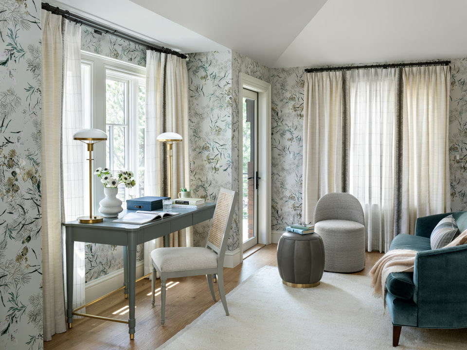
These finishes, along with matte-white quartz perimeter countertops, provide a quiet backdrop for the island’s massive slab of Blue Marine quartzite, which introduced a palette of robin’s egg blue and gold not just to the kitchen, but also to every room in the house. For example, after Bryant’s team carved an intimate sitting room out of the expansive main bedroom suite, Armijo covered the new space’s walls with a botanical-print wall covering in hues of pale blue and green, then carried those soothing colors into the adjacent bedroom’s textiles and art. In the dining room, chairs upholstered in smoky blue and vibrant chartreuse pop against walls and trim painted a warm shade of white. Armijo brought similar bold colors into the study, updating the paneled walls and coffered ceiling with a coat of blackened-teal paint and the French doors with a fresh citron color. “I didn’t want to strip the house of the old,” she explains, “but I did want to create more of a European aesthetic in which the bones are traditional and the finishes and furniture introduce a timeless modern style.”
From sculptural side tables to playful chandeliers that riff on everything from birds on a wire to a string of pearls, the new furnishings selected for these rooms reveal the homeowners’ sense of adventure. “The homeowner has such a whimsical style, so she was like, ‘A curved living room sofa? Yeah!’ ” notes Armijo, who paired that piece with rounded chairs that can swivel toward the fireplace or the piano. “I love that modern play of curves in a very structured house.”
To further soften the rigid formality, Armijo piled on texture: hearty wool rugs streaked with saturated hues, soft sheer and linen draperies, chunky chenilles and wool bouclés on chairs and beds, and plush velvets “that carry gorgeous color but are also super durable,” she says. “Here, it’s more about texture and color than pattern. The pattern play comes from the geometries of the architecture and the curves of the furniture.”
“Play” being the operative word. “We needed to bring the house up to speed for the time and for the people who bought it,” Armijo says. “This couple is young and very willing to go outside the box, so we knew this was a place where we could have a lot of fun.”


