The Local newsletter is your free, daily guide to life in Colorado. For locals, by locals.
With a few creative tile choices and a daring design move here and there (yes, hang that chandelier above the tub!), you can turn your blah bath into a sophisticated, spa-like retreat—not to mention increase your home’s resale value. To get you started, we rounded up bathrooms guaranteed to inspire. Plus, we chatted with the pros about tile trends and found the best wallpapers for a quick and easy powder room refresh. Ready, set, relax…
Clean Slate
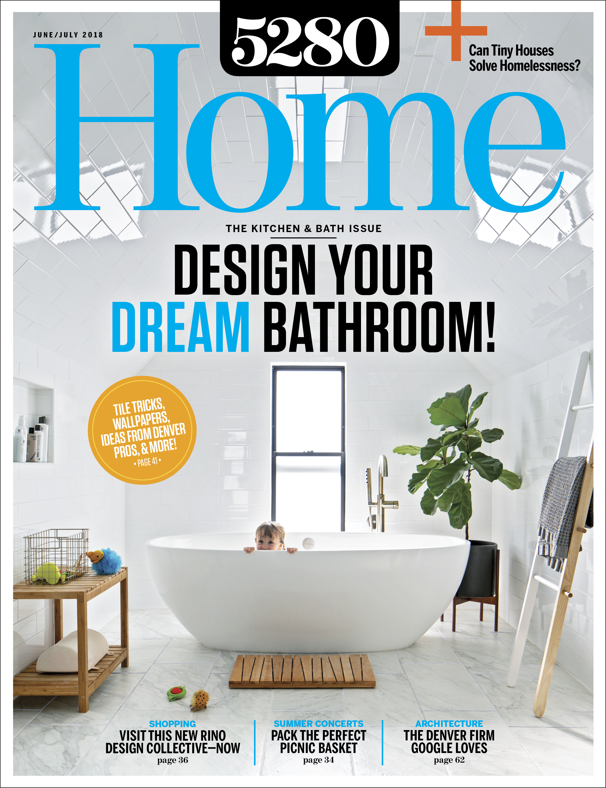
“We had to reimagine the Victorian house to work for a modern family,” says architect Caroline Wilding, who orchestrated the update of this 1883 Highland charmer for Design Platform (she’s since opened her own firm, Construct Design and Architecture). The 90-square-foot shower area, which Wilding tucked into one of the home’s three, angled top-floor gables—is the perfect example. She covered the walls and ceiling in elongated subway tile, a waterproofing strategy that gives the space a clean look. Three little kids, two showerheads, and one waterproof room with a cozy, modern feel? Bliss.
Design Pro: Caroline Wilding, Design Platform
Into the Blue
This sapphire-and-citrus bath in Boulder has all the right design moves.

When the bathroom is the starting point for a high-end, total-home remodel, you know it’s going to be good. Blue is this homeowner’s favorite color, according to interior designer Andrea Schumacher of Andrea Schumacher Interiors, and in this room it plays off the view of the Flatirons—which is easily enjoyed from the soaking tub—giving the entire space a tranquil vibe. “Blue harmonizes with nature,” Schumacher says. “I love the combination of ocean blue with a little citrus color, which we did in the chandelier.”
The secret to making a darker tile work without overwhelming the space: Use it as an accent, Schumacher advises, and not on all the walls or floors. “Opt for tile as a backsplash,” she says, “then bring it into the shower and do just the ceiling, or use it on the floor around the bathtub. Make the tile a piece of art.”
Design Pro: Andrea Schumacher, Andrea Schumacher Interiors
What We Love
“I tried to mix high and low,” Schumacher says. New Ravenna’s Marcasite Bricks tile, from Decorative Materials, plays well with Carrara marble floor tiles from Home Depot. Atop the KTM Millwork-built custom vanities are marble countertops with mitered edges, which make them look more substantial than they are. A Cyan Design chandelier and printed drapes (Abaza Resist in Indigo from F. Schumacher, no relation to the designer) frame the sleek Victoria & Albert tub and add a touch of glam to the space.
Lofty Ideals
This LoDo bath remodel makes the most of the space’s rich industrial roots.

Denver’s Flour Mill Lofts building (built in 1906 and originally called the Pride of the Rockies flour mill) has all the authenticity and craftsmanship that homeowner Craig Troyer was craving. His vision for the renovation, says Jennie Bishop, a principal at Chicago-based Studio Gild (which collaborated with Denver’s Robb Studio to overhaul the space) was “industrial, old-school construction mixed with new technology—all the bells and whistles.”
The bathroom redesign improved the flow: “At first, the space was kind of choppy and awkward,” Bishop says. With the original brick, plaster, and windows still in place, now the bathroom showcases the historic integrity of the building and the elegance of furnishings like a clawfoot tub. The custom vanity, which features a sink carved into a thick Calacatta Lincoln marble slab top, nods to the owner’s and design team’s affection for beauty and quality that will last—for at least another hundred years.
Design Pros: Jennie Bishop, Studio Gild; David Austin Robb, Robb Studio
Up In The Air
In this Four Seasons condo, discover marble-and-walnut perfection—with Rocky Mountain views.

Several stories up at the Four Seasons Private Residences Denver, this penthouse master bath serves as an escape from hectic urban life. The look is sleek and clean, with a white, geometrically patterned modular screen wall adding just the right amount of flair. The wall is paired with white Calacatta marble on the walls and floors, “inspired by the view of snow-capped Rockies,” says interior designer Arianna Noppenberger, founder of Laguna Beach, California–based Aria Design. To complete the look, rich walnut wood warms the palette and gives the space dimension—and an irresistible appeal.
Design Pro: Arianna Noppenberger, Aria Design
What We Love
A Eurostone Greige countertop plays off the veining in the polished MaxFine Calacatta floors and walls for a seamless transition between design elements. The walnut cabinets and mirror—both custom by Aria Design—balance the glossy surfaces with a hint of natural ruggedness. The room’s capstone element: a Modular Arts InterlockingRock, a partition wall featuring the “Lily” pattern of diamond-shape cut-outs.


