The Local newsletter is your free, daily guide to life in Colorado. For locals, by locals.
Lillian and Tim Lu are masters of French cooking and baking techniques, which demand total precision to produce simple yet elegant dishes. And, when it came time to build out their new LoHi restaurant and bakery, Noisette, they applied that same level of care and attention to detail to the eatery’s design.

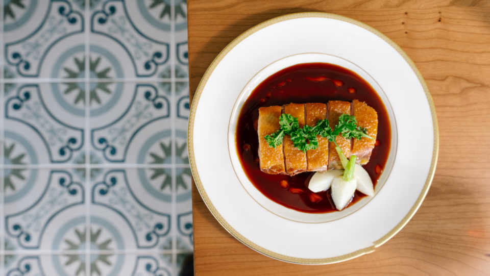
Take Noisette’s lovely dining plates: Lillian spent months scouring Colorado antique shops to create a perfectly curated set of dinnerware covered in dainty flowers and delicate gold accents. “I was going around with my measuring tape, making sure it was an 8 ¾-inch plate and not an 8 ½-inch plate,” she says. “It was quite meticulous.”
Partnering with Denver design firm LivStudio, the husband-and-wife duo carefully contemplated every piece of furniture, yard of fabric, and splash of color at Noisette, which is located on the ground floor of Denver’s Lumina apartment complex. In true French style, the result of all that fastidiousness is a 2,800-square-foot space that feels effortlessly chic and classic.

The couple chose a soft color palette of dusty rose, pistachio, light blue, and warm gold, accented with natural wood tones, to make the dining room feel authentic and comfortable. To that same end, crews covered up all traces of the building’s industrial underpinnings, including the ceiling ductwork. Massive floor-to-ceiling windows, petite glass vases holding a few artfully arranged flowers, and intricately patterned floor tiles also help brighten the room. A small gallery wall installation features vintage framed portraits of cats, gilded metal hand fans, and other vintage knickknacks. The chair legs and teardrop-shaped wall-mounted light fixtures add subtle mid-century modern vibes.
“We just wanted people to have this feeling of being surrounded by something precious and beautiful,” Lillian says. “To walk into a beautiful space and start off your meal that way, that’s important for our guest experience. It’s not just about the food for us.”
Though blending modern and classic elements can sometimes be a challenge, LivStudio’s designers seamlessly combined the two styles by making strategic decisions at Noisette. They used the ovular shape of a cameo brooch, for instance, as a “foundational form” throughout the dining room, from a row of mirrors above the plush, rusty-brown banquette to the custom ceiling molding, says Tana Anderson, principal at LivStudio. The rounded form is also part of Noisette’s logo, which was designed in collaboration with Denver creative studio Paper Laundry.

The airy aesthetic proves the perfect backdrop for upscale French comfort foods like magret de canard (duck breast with radish, lavender oil, duck and foie jus, and confit potatoes) and exquisite pâtisserie-style desserts like pêche melba parfait (made with vanilla, peach, and raspberry).
“Our food is cuisine bourgeois, which is really rooted in tradition—mothers and grandmothers would be cooking this food for their families,” Lillian says. “We wanted the space to reflect that, to really feel like you’re stepping into your grandmother’s dining room.”

