The Local newsletter is your free, daily guide to life in Colorado. For locals, by locals.
5280 Home: Hello, color! Your clients must be incredibly fun people.
Erin Iba: They are! They really wanted to put their stamp on the place. It was a beautiful home, but it was full of big leather furniture and wood coffee tables that didn’t reflect them at all. It had no personality.
They love color and pattern. There were times when I said, “Are you sure you want this much?” and they always said yes. It’s a designer’s dream.
Where did you begin?
With the fireplace. It’s visible from the entry and living and dining rooms. It needed to be a unifying, central point in the design, and I think it steals the show. It has back-painted glass with metal reveals. We were gritting up the design a bit with those details. It’s very Austin Powers—or maybe what Austin Powers could be if he grew up a bit.
He’d dig that red chair in the entry.
That chair is one of my favorite pieces. We needed somewhere people could sit and take their shoes off, but I couldn’t do a bench. It felt trite. I found this outdoor chair at Hoff Miller in the Denver Design District, and it’s irresistible against that wall covering, which is a picture of a wall under a bridge in Brooklyn. If you look close, you can see grommets and graffiti. We printed it on high-gloss paper, so it looks like a photograph of concrete, not concrete itself. It’s more about the art than the material.

ENTRY
Designer Erin Iba created a showstopping entry with just two elements: a Kenneth Cobonpue Dragnet chair from Hoff Miller and edgy wallpaper created from a photograph of a concrete wall (under a bridge in Brooklyn) printed on high-gloss paper.
Tell me about the move from the edgy entry to the living room and that bold, orange ceiling.
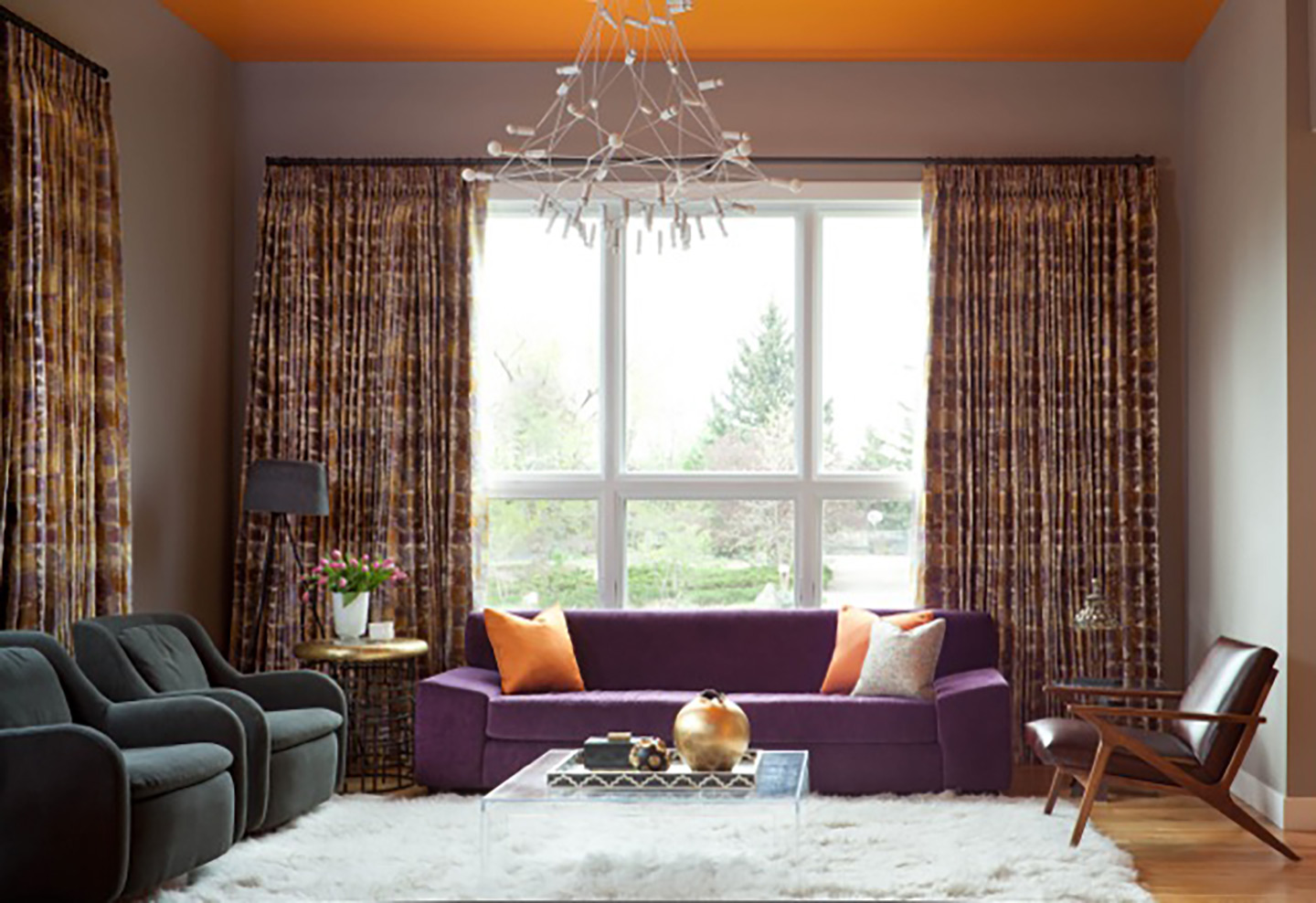
The ceiling is soaring, so we needed something that would envelope people as they walked into the living room. Orange is warmth, so we painted it orange. It took 13 attempts—such a labor of love! But it’s perfect. Then we paired the purple velvet couch with that midcentury-inspired leather chair from Crate & Barrel and a pair of sexy gray armchairs. And that modern white fixture from ABC Home pops against the ceiling.

DINING ROOM
A trio of cloudlike pendants floats above the family’s dining table and chairs (Masters Chairs by Philippe Starck and Eugeni Quitllet for Kartell). “I like to combine whimsy and structure,” Iba says. “It keeps a room from feeling too predictable.” Iba found the dining room’s two paintings at a local frame shop. “I don’t believe in matching your art to your throw pillows. Art should tell you a story, speak something special to you.”
How do you make an orange ceiling and purple sofa look sophisticated?
I have a good relationship with color. I think I have a knack for making unusual combinations work well. Here, the purple sofa acts like a neutral, like a navy sofa would, so it’s not competing with the orange ceiling. The quality and scale of pieces matter, too. Furnishings that are the right size for a room—that sofa seats four people comfortably—automatically feel more elegant than pieces that are too small. The window treatments here carry from the living room to the dining room. They’re copper and platinum and rust—a nod to the orange ceiling—and they’re very painterly, so they add to the sophistication, too.
The dining room has a definite mid-mod vibe.
It’s those chairs! They’re Masters Chairs [by Philippe Starck and Eugeni Quitllet for Kartell]. They’re sculptural, gorgeous, and crazy comfortable. I love their sleekness alongside the light fixtures—they’re called Clouds, which feels so whimsical. The dining room has a lower ceiling than the living room, so putting a big chandelier here would have emphasized that transition. The Clouds make it all feel airy.
Speaking of whimsy, could you tell us about the master bedroom?
If we were going to do one wild thing, we had to go all out. Otherwise, the one wild thing would have felt out of place. That bed is like something out of Alice in Wonderland. It’s groovy. It kind of floats against the wall of sayings the homeowners picked—things like “Namaste” and “Don’t Stop Believin’ ”—which we hired a calligrapher to write. The patterned fabric on the window treatments is bright, but again, we couldn’t choose something muted, not with all the other elements. Can you imagine beige linen with that hot pink bench?

MASTER BEDROOM
The large custom bed helps bring down the soaring vaulted ceiling—and adds a seriously hip vibe. The hot pink bench from Ablyss Upholstery and the patterned window treatments from Jonathan Adler make similarly bold statements.

MASTER SUITE
The bedroom’s cheerful style gets amped up with an artful, preppy paint pattern and a bright chevron ottoman, while the bathroom’s subdued colors serve as a contrast.

FAMILY ROOM
Iba had the family room’s sectional (inspired by the colors of gumballs) made so the whole family could sit together to chat and watch TV. The shelving unit, from CB2, adds structure to the space.

KITCHEN NOOK
The family’s eating area elevates everyday meals to high-style events. The wallpaper is made of recycled newspaper. Durable, stackable chairs from West Elm surround the CB2 table, while the bright red credenza (also CB2) hides supplies. “Who ever knew storage could be so sexy?” Iba laughs.
All of these rooms are fantastic, but my favorite might be the powder room. What’s that wallpaper?
It’s called Love Monkey by Flavor Paper. It’s total whimsy. I’m a big fan of powder rooms. People come to your home, and they probably won’t see your bedroom and maybe not even your family room, but they’ll likely see your powder room. It should be a statement space. This one was generic initially. We laid beautiful marble tile, bought a custom mirror, found the wallpaper, and then we had the ceiling covered in Venetian plaster in a custom lilac color. It’s super kitschy and fun but also elegant. I guess you can say that I don’t believe in being subtle.

PLAY AREA
An indestructible table and CB2 stools make an ideal craft and homework center. And when practicing math problems gets too dull, the foosball table is a happy distraction. “I’m big on having zones for different activities and multipurpose rooms,” Iba says. “It makes the house work for the family’s life.”
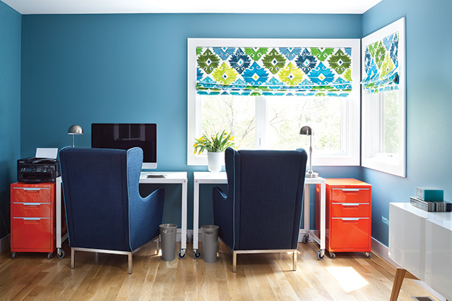
OFFICE
The owners use this room to plan their many far-flung adventures. “There’s a giant map along one wall, where they pinpoint their travel plans,” Iba says. “It’s quite inspiring.”

POWDER ROOM
The Love Monkey wallpaper (from Flavor Paper) in the powder room is perhaps the home’s boldest—and most fun—statement.

