The Local newsletter is your free, daily guide to life in Colorado. For locals, by locals.
There are two types of videos that always bring me to happy tears when they pop up on my social media feeds: military members reuniting with their dogs after a deployment, and people with monochromacy—complete color blindness—trying on corrective glasses and seeing green trees and blue skies for the first time. I may be a sap, but the latter videos are good reminders of color’s visceral, emotional impact on us. It’s why we yo-yo between paint samples—Blue-green? Gray-blue? How about deep navy?—and why I currently have six swatches of warm whites taped to my living room wall. Depending on the desired outcome, the right color can add a burst of energy to a space or have a calming, grounding effect—and if a hue is even slightly off, it can alter the feel of an entire room.
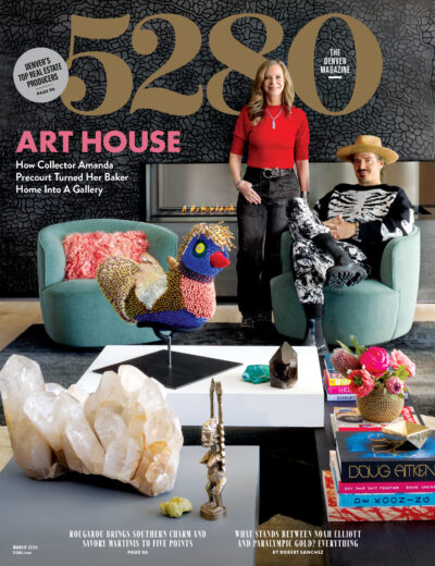
This issue highlights local spaces that harness the power of color, from a Bow Mar home with playful pops of saturated hues (“An Ultra-Fresh Take on the Suburban Ranch”) to a Morrison residence outfitted with spunky, jewel-toned interiors (“A Groovy, Watercolor-Inspired Wallpaper Sets a Playful Tone in This Morrison Home”)—both of which are featured as our first-ever dual cover stars (one sent to you subscribers, one for those of you who grabbed this issue on newsstands). I hope the following pages help you find the perfect color matches for your own home—even if it takes several paint swatches and a bit of trial and error to get there.


