The Local newsletter is your free, daily guide to life in Colorado. For locals, by locals.
Banish brown. Beige, be gone. Classic design doesn’t have to mean conventional. So say Katie Schroder and Erika Rundiks, principals of Atelier Interior Design, who revamped this traditional suburban home for an energetic family of five. “Relocating from LoHi was a big move for them, and they wanted to make the house work for the way they live,” Schroder says. “This homeowner went for it, as far as design choices were concerned. She wanted the look to be timeless but also fun and young.” The combined effect of the smartly designed spaces is a home that’s practical and beautiful. The lesson? Replace the sepia-toned filter with a Technicolor finish and you get vibrant, timeless results—and a lot of fun.

Family Room
A painted mantel and built-ins, along with textured tile around the fireplace, add boldness to the family room. A sculptural coffee table and a velvet-upholstered sofa lend just the right amount of glamour.

Powder Room
Colorful wallpaper—Montacute by Nina Campbell—combined with a playful mirror and Palo Alto sconces from Troy Lighting makes a statement in the powder room.

Kitchen
The designers worked with Denver architect Jon Hindlemann’s renovation plans to incorporate a colorful tiled backsplash that offers visual interest while remaining wonderfully wipeable. The island resembles traditional furniture topped with Carrera marble. Overhead, hammered-metal pendants cast a soft, golden glow.
Tip: Make spaces work for you. Fearing the homeowners would be clocking too much mileage going from workspace to workspace in the kitchen, the designers added an island. “It’s kind of furniture-esque, so it gives the room a homier feel,” says Katie Schroder.

Entry
Black-and-gray wallpaper recalls the dining room’s more prominent pattern, and a teal front door and walls match the dining room’s ceiling. That teal, along with touches of yellow-green and rust, carries through many rooms, appearing in tile and wall coverings, upholstery, and throw pillows. “We tend to show clients a lot of pattern and color and see if they’ll bite, and this homeowner wasn’t afraid of much,” Schroder says. “She was really amped and trusted us.”
Tip: Greet guests with style. The entryway is a chance to show your stuff, Schroder says. Here, she and Erika Rundiks hung black Osborne & Little wallpaper and installed gray herringbone carpet on the stairs. A statement mirror and a metallic console create a glam-inspired vignette.

Dining Room
A classic black-and-silver scheme is sized up. Once a formal living room off-limits to kids, the space is now devoted to family meals and entertaining. Chunky spindles give the dining table an exaggerated scope to match the outsize chairs. A traditional wallpaper pattern is blown up to modern proportions and offset by hot pink artwork. It’s classic style on steroids.
Tip: Let patterns take the lead. Fernery wallpaper by Osborne & Little sets the scale for the furnishings in the dining room. “The pattern in the wallpaper was larger, and that meant we could have the chunkier Lexington table,” Schroder says.

Parlor
The old dining room got a new purpose asa grown-up parlor (at left). “We suggested making it a place where they could unwind with friends and each other after the kids are in bed,” Rundiks says.

Tip: Keep bedrooms simple. “The master bedroom is purposefully serene and more monotone,” Rundiks says. The designers incorporated softer colors and patterns here than in the rest of the house, including in the muted bed linens by Serena & Lily and Schnadig Home Collections’ Cobblestone upholstered bed.

Bedrooms
Pinks and purples rule in a daughter’s fanciful bedroom that doubles as a playroom. A colorful tree wall decal adds whimsy—and negates the need for framed art. In the more Zen-like master bedroom, calming Serena & Lily bedding and a subtle yellow paint invite relaxation.
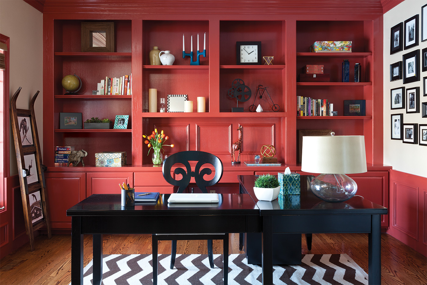
Tip: Choose stripes or chevron for easy style. In the parlor, the designers paired a Maddox chaise from Highlands Design Resource—upholstered in a traditional floral (Ojai in ebony from Pindler & Pindler)—with a chevron rug, tying them together with color. “Stripes or chevron can either be really classic or contemporary, depending on the lines. Then you can mix that with something that’s softer, rounder, or more organic,” Rundiks says.


