The Local newsletter is your free, daily guide to life in Colorado. For locals, by locals.
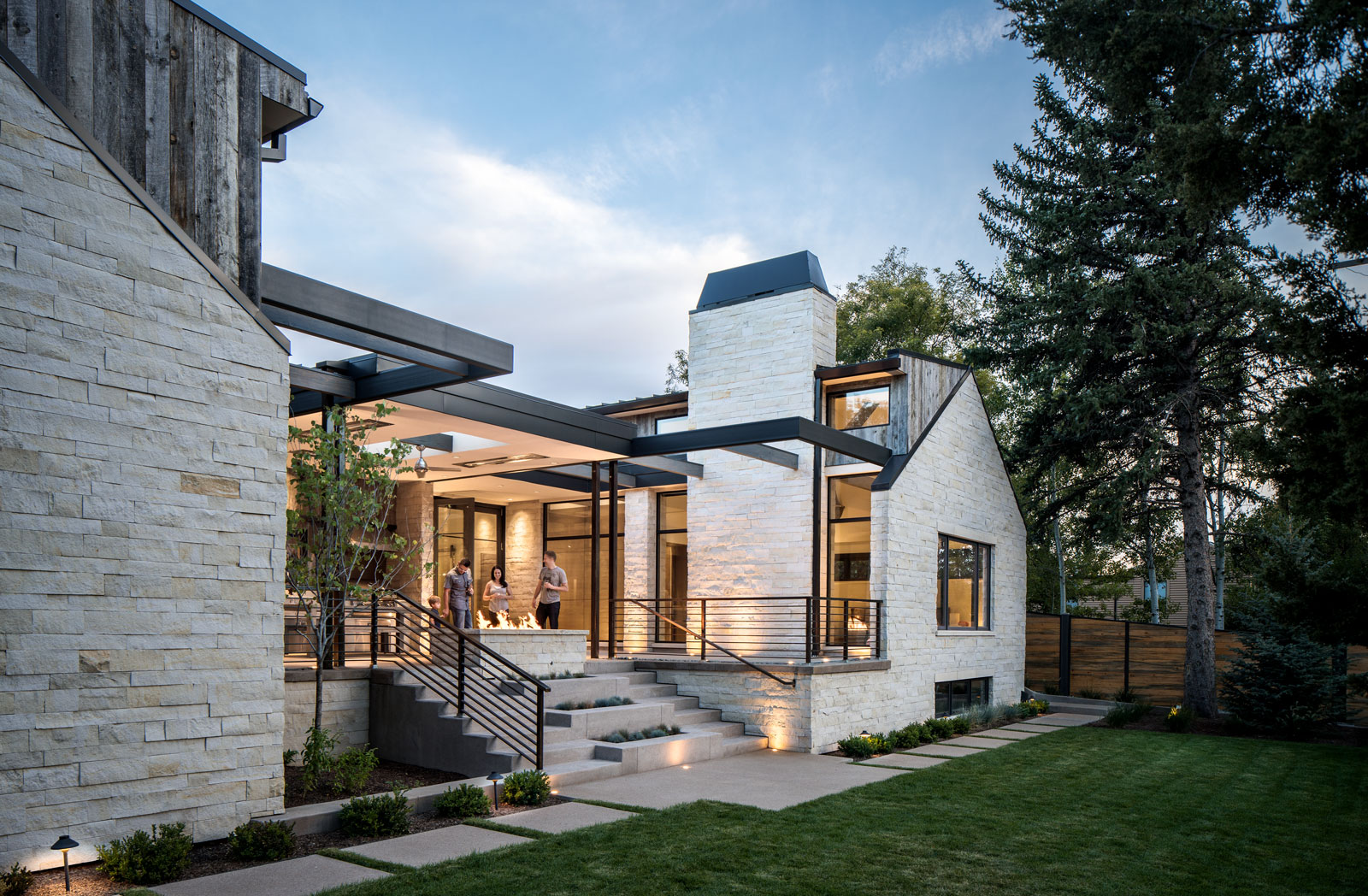
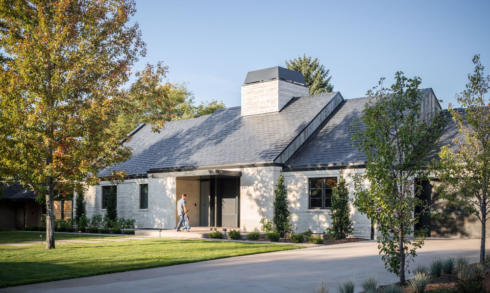
Sometimes the best-laid plans aren’t the ones that pay off in the long run—especially in the realm of design. Such was the case for a 1950s home in Hilltop, which architect Scott Parker had planned to remodel for its owners. But early on, Parker (principal of local firm Nest Architectural Design) and his clients decided to pivot from their original approach, take the house down to its foundation, and start fresh. Their primary objective, however, was to preserve the spirit of the home’s original 1950s exterior. “We wanted people to recognize it as part of the neighborhood from the street,” says Parker, who modernized the formerly stone-and-brick facade with Colorado buff limestone and reclaimed barnwood. “But inside, it needed to support the lifestyle of a young family, small and large gatherings, and free-flowing circulation between interior and outdoor living spaces.”
To achieve these goals, the home, built by local pros from Boa Construction, is laid out like an H. The central front entrance—with its honed limestone walls and towering steel-plate pivot door—gives way to a casual gathering area and then, the kitchen. On one side are the formal dining and family rooms and a butler’s pantry; on the other, a private bedroom wing. It’s all centered around another element dictated by the site: The backyard slopes down away from the house, making it less than ideal for outdoor entertaining. (Who wants to carry food and drinks down a hill?) So Parker dreamed up a rear courtyard that provides a private outdoor space for
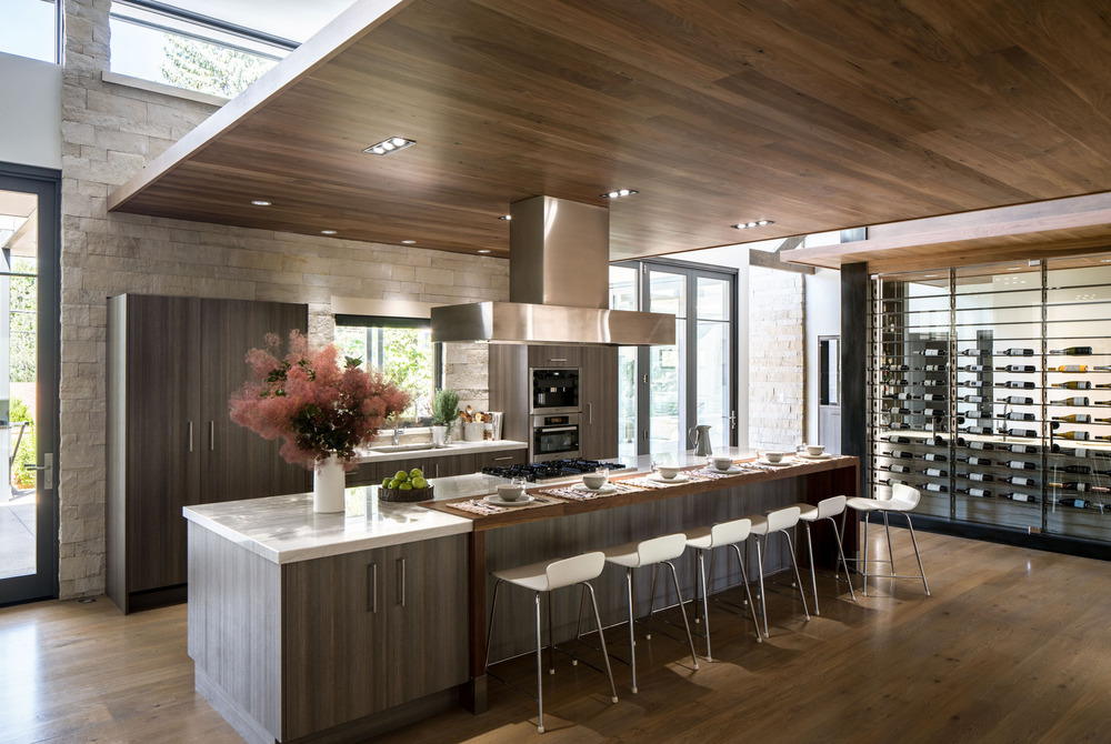
the family to enjoy Colorado’s plentiful good weather. Folding glass doors connect the kitchen and family room to the outside, which is appointed with a ceiling fan for the summer and a large gas fire pit for cool shoulder-season evenings. Guests can move easily from perches on the living room’s sectional sofa to the courtyard’s large wooden dining table with bench seating, and then on into the sleek kitchen to admire the innovative wine wall Parker designed to hold (and protect, thanks to a built-in cooling system) the owners’ collection.
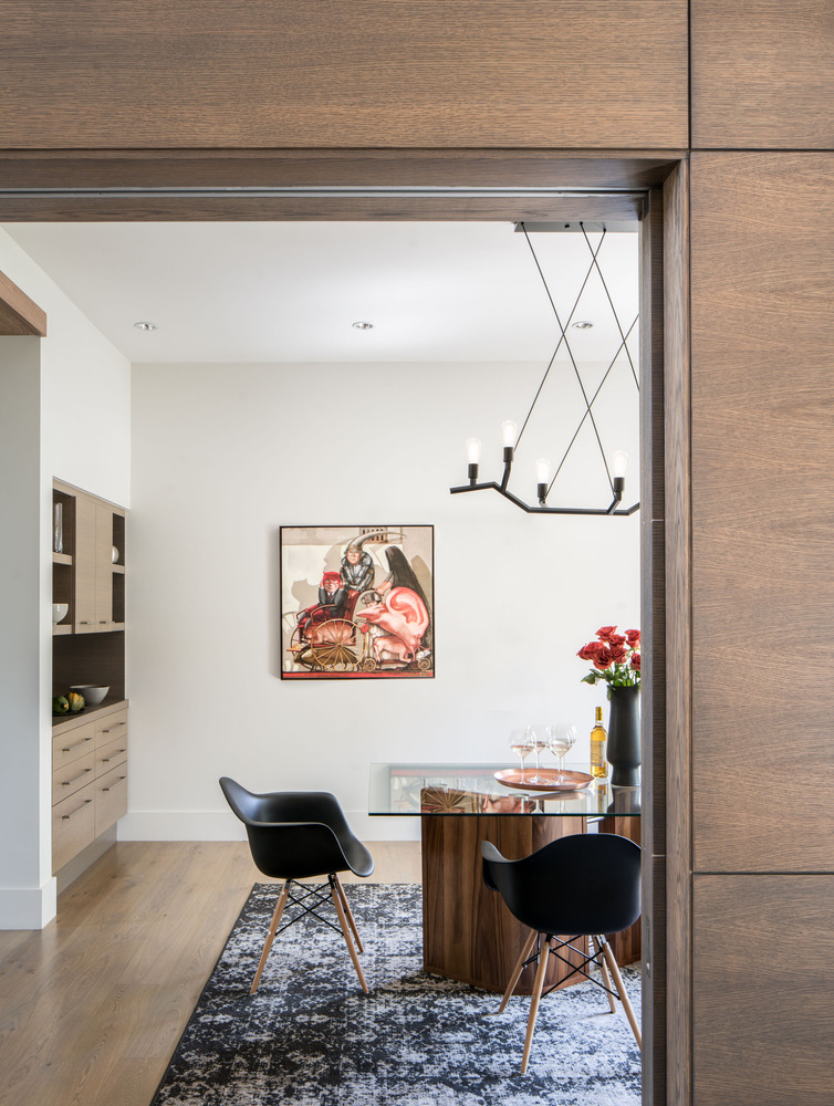
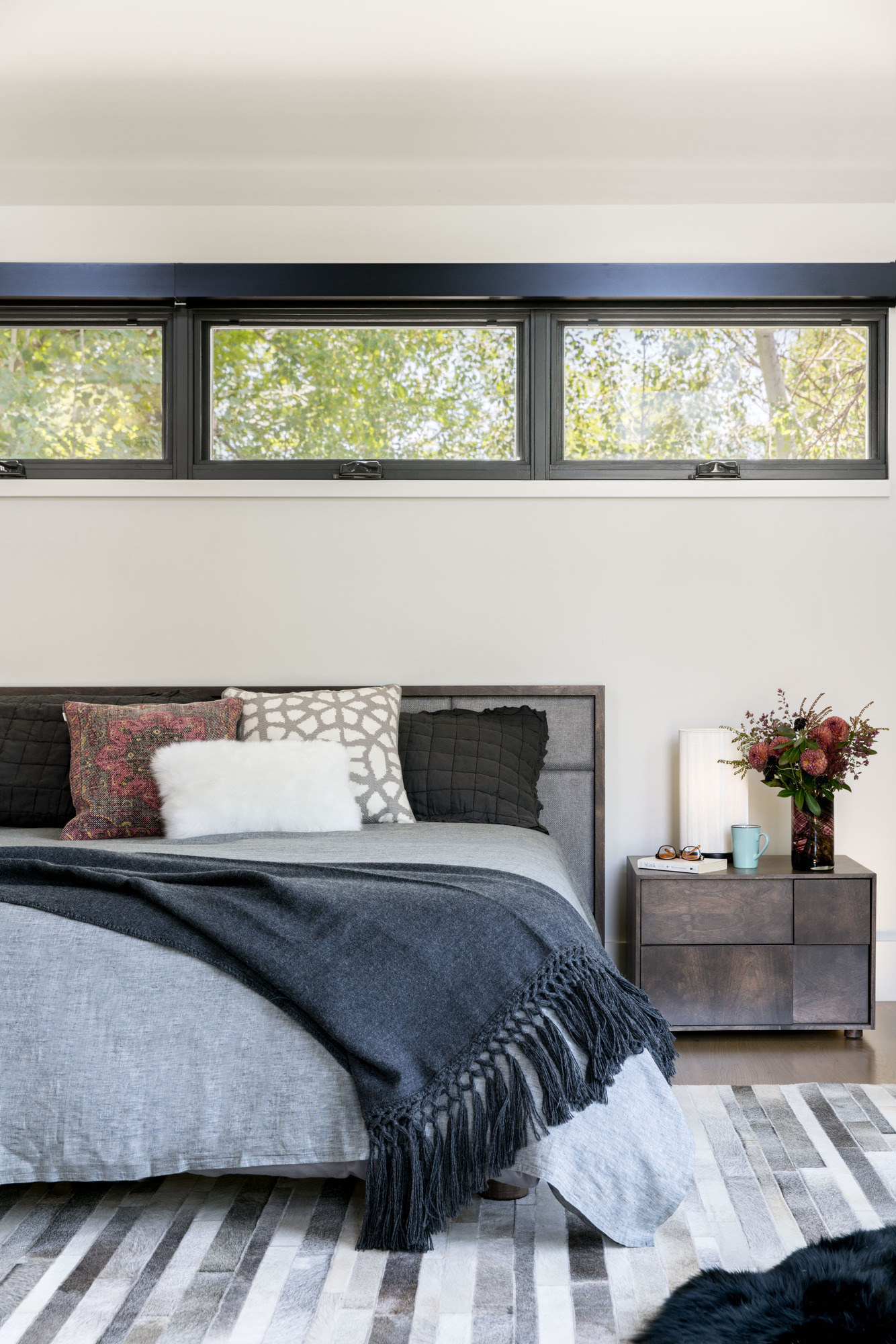
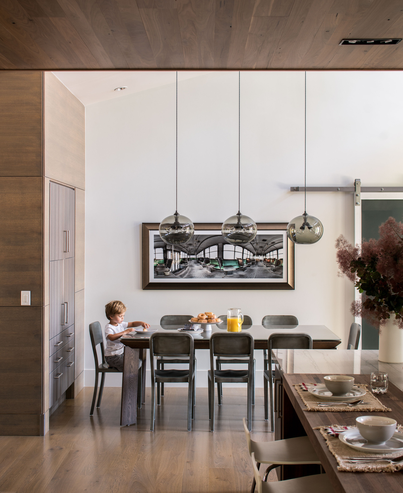
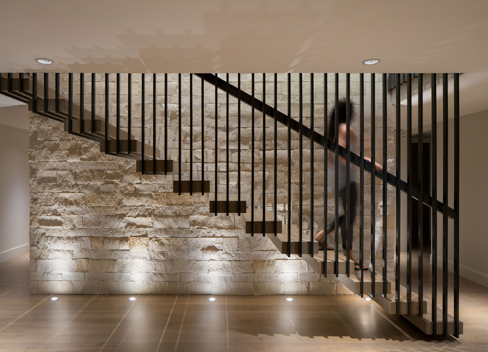
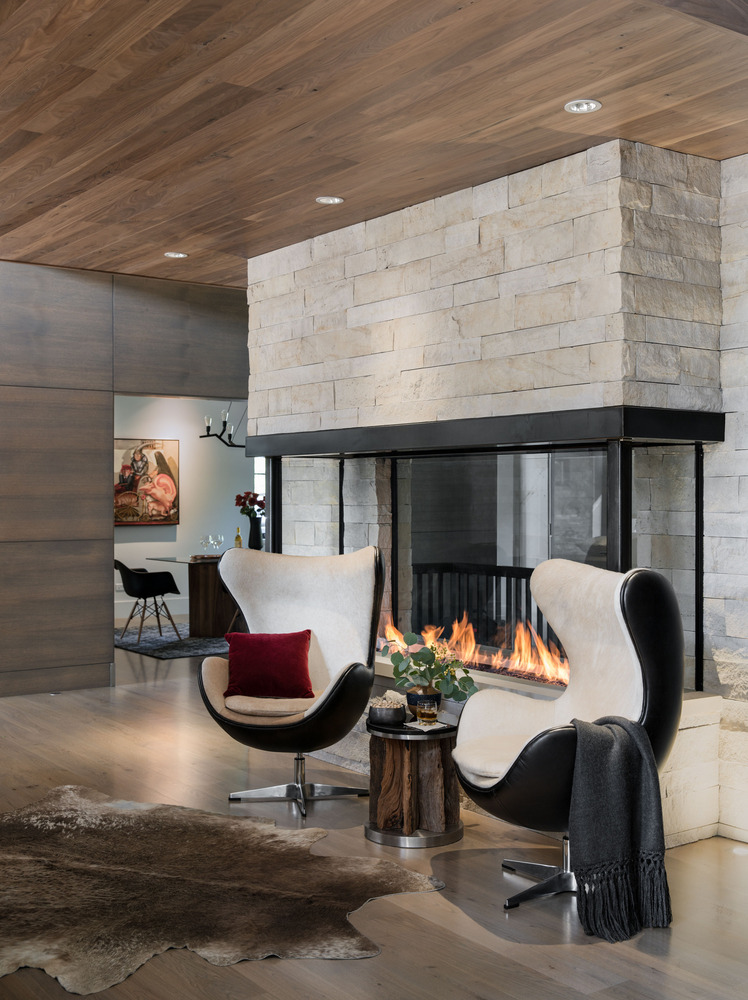
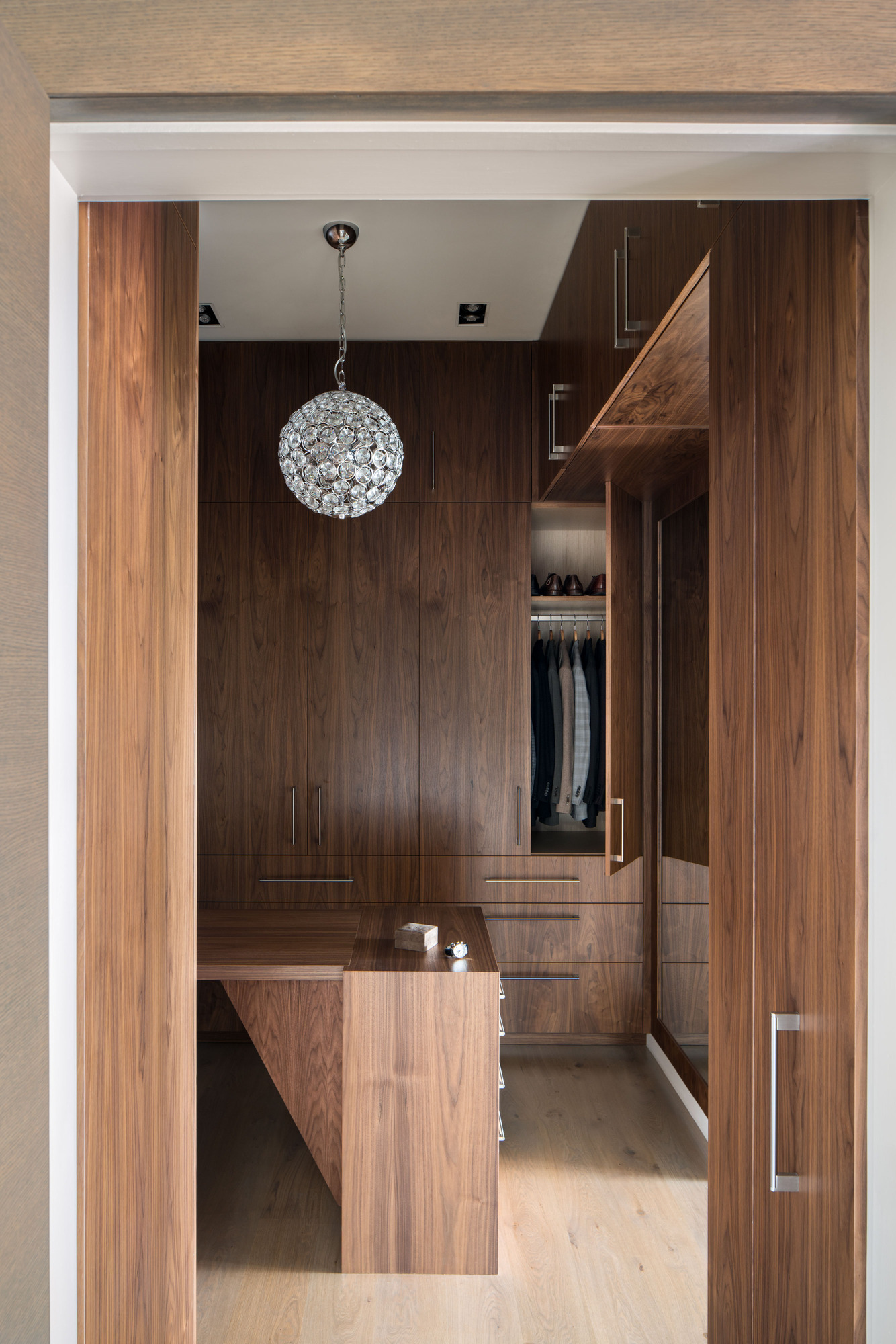
Just as the neighborhood and lot decided the home’s look and layout, the architecture drove interior designer Beth Armijo’s choices. “The furniture is good-looking, but there’s not a lot of it,” says the principal of Denver’s Armijo Design Group. “It’s more about the flow, being in the space, and not having a lot of stuff.” The raw elements of stone, wood, and steel only needed a bit of sparkle here and a touch of softness there to make the home feel warm and welcoming: a glittering ball chandelier in the walk-in closet; a pair of horsehair-covered chairs next to a glassed-in fireplace; the owners’ artwork displayed on white walls. “Clients can get nervous about going modern because it can be sterile,” Armijo says. “The goal for these owners was to have the house be inviting—with this really beautiful, minimal architecture. They wanted to do Scott’s work justice by not detracting from the materials.” Interiors and architecture that harmonize? That’s a plan that always pays off in the end.
Design Pros:
Architecture: Scott Parker, Nest Architectural Design
Interior Design: Beth Armijo, Armijo Design
Construction: Boa Construction
Kitchen Design: Exquisite Kitchen Design
Custom Millwork: Abacus Cabinetry
Photography by David Lauer and styling by Natalie Warady

