The Local newsletter is your free, daily guide to life in Colorado. For locals, by locals.

Create Outdoor Conversation Areas: You don’t need an expansive patio to be able to enjoy Colorado’s beauty. Here, a simple arrangement of patio furniture (from now-shuttered Smith & Hawken) lets the homeowners and guests enjoy the sounds of Gore Creek.
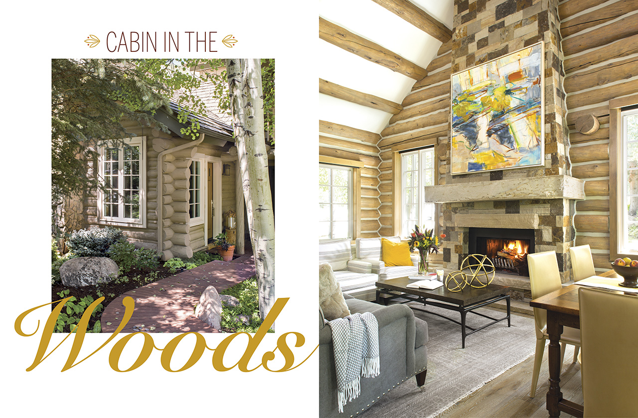
Jim and Laura Marx are pros at making the most of Colorado. The Denver couple splits time between the city—where Jim heads an architecture and engineering firm—and the mountains of Vail, where Laura volunteers with local nonprofits. In Denver, they indulge their love of art collecting. At higher elevations, they hit the trails and slopes. This happy double life is made possible by a 1,200-square-foot log cabin, situated near Gore Creek, that the couple bought in 1993.
For many of the ensuing years, the space embodied classic ’90s design: grays and reds paired with authentic Native American art and artifacts the Marxes had curated. The couple had made piecemeal updates over the years, but the home was starting to show its age. The layout needed a more open arrangement; the staircase wasn’t up to code; and the space felt cold and dark.
Yet rather than adding on in the style of mountain McMansions, Jim had a different vision: to keep the home’s modest footprint intact and revamp its interior, à la a master suite hotel room. Imagine a classy penthouse at a high-country Ritz-Carlton, where the master bedroom, living area, and kitchen all flow together on a single floor.
Jim had already put his ideas on draft paper when he contacted Edwards-based Slifer Designs’ Kim Toms. It was an ideal collaboration: “[The Marxes] have educated taste,” she says. “Jim uses his perspective on architecture. Laura has a great eye for color. They’re great complements to one another.” The three of them became a creative unit, with Jim helping think through the layout, Laura scouting furniture and art, and Toms editing ideas and serving as creative director.

Contrast Wood With White: A bright, open kitchen with white glass-front cabinets, a not-too-dark quartzite slab, and open-back barstools from HW Home is the perfect counterpoint to wood beams.
First, the interior architecture and finishes needed an overhaul. The existing ceilings were a patchwork of gray-washed logs with strips of tongue-and-groove boards in between—the culprits responsible for the dark feel. To de-stain and refurbish the timber, general contractor Mike Warmenhoven arranged to have the logs treated with a corn-kernel-blasting technique (similar to sandblasting, but easier on the wood and more environmentally friendly). Then he installed drywall between the ceiling logs, which brightened the space and created room for recessed lights.
In came new, taller windows and gray hardwood floors by Arrigoni Woods, and down went a few key walls to create the main-floor master and its sophisticated en-suite bath. The kitchen was gutted and transformed with the help of white cabinets—the perfect foil to the wood elements—and smart organization from kitchen design firm William Ohs.

Perform A Balancing Act: Offset the heavy texture of log walls with contrasting elements such as a minimalist staircase, bright art, and clean white walls (China White OC-141 by Benjamin Moore). Introduce Color Through Art: Neutral furnishings and fixtures in different shades of the same color (in the living room, taupe-ish gray) provide a great backdrop for bold art.
The sculpted framework is handsome in its own right. “If you were to take everything out of the house,” Toms says, “it’d be beautiful just sitting there.” But what fun is a home remodel without rugs and pillows and art? “Jim and Laura love traditional,” the designer adds, “but they knew the clean lines and smaller forms of contemporary pieces were needed because of the space’s small scale.” So Laura and Toms tag-teamed to create a balanced mix. The homeowner scouted pieces in Denver—from retailers such as John Brooks, HW Home, and Design Within Reach—and shared her choices with the designer, who made sure the mix didn’t get overly fussy. They also ordered furnishings online and reused a few pieces the couple already owned.

Rethink The Traditional Nightstand: Pair a simple, decorative table with hanging or wall-mounted lights to illuminate the space. In the master bedroom, artistic glass pendants from John Pomp Studios play off of tech-inspired reading lights.

Go Big With Tile – Large-format, laser-cut mosaic floor tile by Marble Systems (from Decorative Materials) and oversized wall tile in the master bath reduce the presence of grout lines in the small room.
Most of the furniture and fixed finishes wear shades of taupe or gray to create a neutral backdrop for the home’s real centerpiece: art. At every turn, works pay homage to the couple’s travels, from Napa, California, to Paris to Hong Kong. The painting above the living room mantle—a loose, lively composition by Colorado artist Amy Metier (from the William Havu Gallery in Denver)—ties the whole scheme together.

Don’t Be Shy About Mixing Styles: Pairing antiques—like the guest room’s twin nightstands that the couple already owned—with more clean-lined pieces (bright pillows and minimalist sconces) is a recipe for a relaxed space.
The transformed home is a light, easy mix of color and texture with beautifully balanced proportions and polished spaces. It’s a “jewel box” of a home, as the Marxes fondly call it; an expression of their loves and personalities. Which leads us to predict they’ll be checking into their personal mountain “hotel” even more often.
—Styling by Kerri Cole


