The Local newsletter is your free, daily guide to life in Colorado. For locals, by locals.
When I was a kid and couldn’t fall asleep at night, I played a game: I thought of all the “homes” I had at that moment. I would tell myself, “I’m in my bed, in my room, in my house, in my neighborhood….” You get the idea. I would usually get so far as “in my solar system”—and then shiver a little at the smallness I felt in relation to those big, far-off planets.
Even then, I knew I inhabited layers of home, not just a house, and maybe I even vaguely understood that part of my self was formed by my surroundings. There’s a line between person and place, but it’s blurry: Who we are is intimately connected to—and influenced by—where we are.
Which is why we should all be invested in Denver’s built environment (that is, the homes and apartments, roads, parks, bridges, office buildings, schools, hospitals, theaters, stadiums, and other spaces that human beings create). As the city has grown and the economy has beefed up, Denver has also become the unfortunate recipient of some banal, soulless buildings. These hulking rectangles don’t just disappoint architecture buffs like me (and maybe you, too, if you’re a reader of this magazine). Recent studies by cognitive neuroscientists show that our brains respond intuitively to design—in an attempt to make sense of our world, to know if we’re safe and well or at risk of danger. We register the brightness of our bedroom light, the curve of the garden path, the height of the conference-room ceiling, the facade of our new apartment building—all without realizing fully the ways they nudge us through our days and influence many of the small decisions we make. Put simply, the environment we build affects what we think, do, and feel.
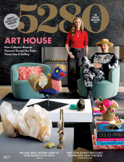
There is good news: I hear healthy discussion (and lively debate) about how Denver’s built environment can and must improve. Colorado’s design community is vibrant, engaged, and growing—and helps us fill this magazine, six times a year, with inspiring spaces and stories. Further evidence: our second-annual Top Denver Design feature (page 71), in which we showcase 14 gorgeous and thoughtfully created spaces that aren’t just the best in the city, but also some of the finest in the country.
Still, there are plenty of instances in which the city should do better as we build and develop, a concept we explore in “Beauty Is A Beast.” 5280 senior editor Spencer Campbell takes a critical look at what we’ve gotten wrong and what we can get right going forward. I encourage you to read it to learn how you can get involved in making Denver a more beautiful place.
Magazines like this one might make you think that the only design you should consider is within the walls of your home. But don’t be fooled: Good design should permeate every layer of home, including the city we love so much.


