The Local newsletter is your free, daily guide to life in Colorado. For locals, by locals.
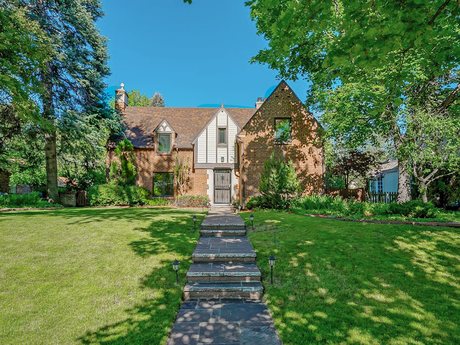
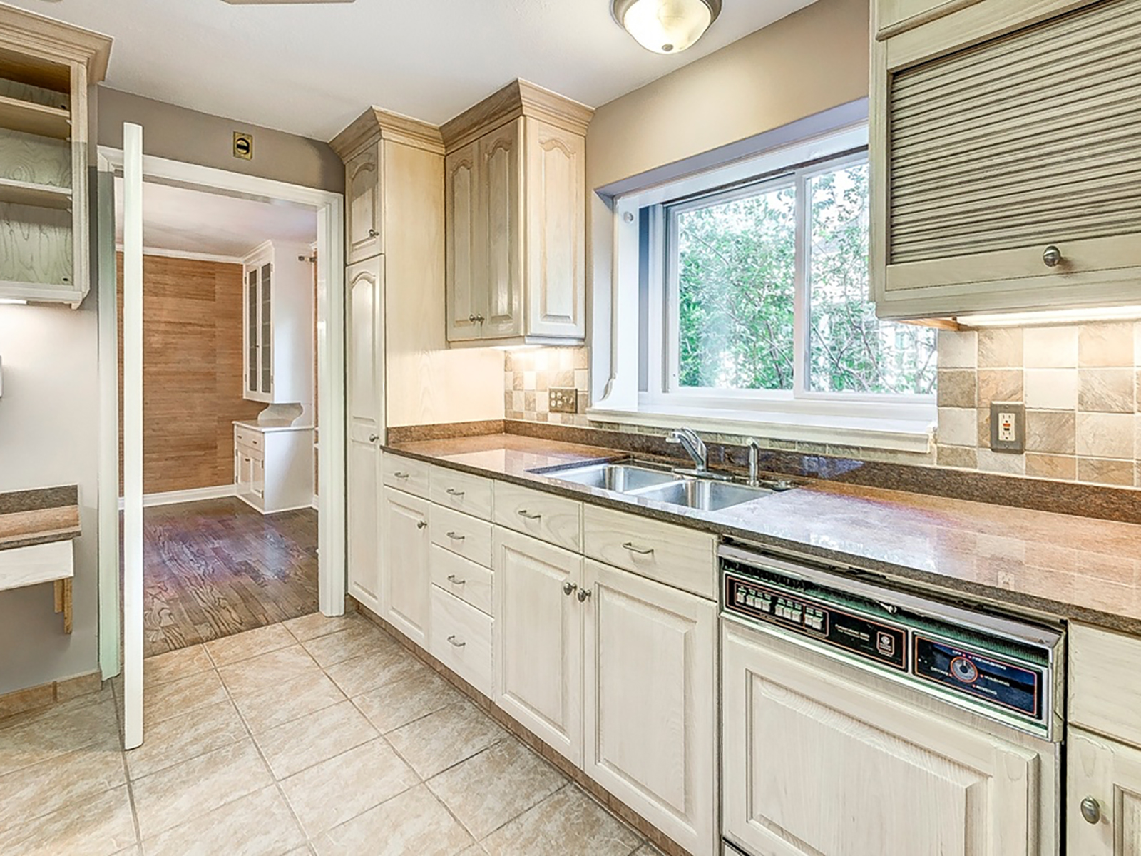
Sometimes it pays to find something that hasn’t been touched since the 1980s: vinyl records, say. Or a mint-condition Gerard van den Berg leather lounge chair. But a whole house? Not so much. When Denver designer Jodi Cook’s clients bought their 2,300-square-foot 1936 brick Tudor in Hilltop, it was a total throwback—and not in a good way. “There were lots of choppy little rooms, a galley kitchen, a long formal living room…it needed a total reno,” Cook says. And that’s exactly what she and the couple did, renovating all the main living areas (and turning the existing dining room into one big kitchen) and piggybacking on an addition to take the space from four bedrooms, four baths to five bedrooms and five and a half baths—or, in more poetic terms, from lackluster to a latter-day dream.

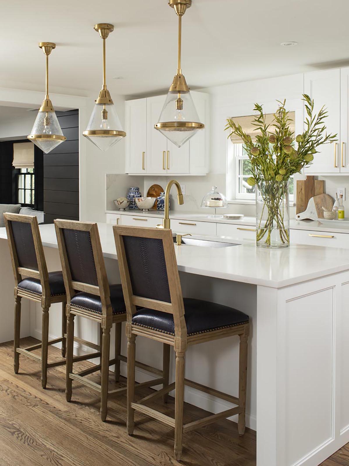
The homeowner had a lot to do with that. “She had clear ideas of what she wanted from the beginning: classic and traditional bones, but freshened up and made current with modern white paint,” Cook says. The designer’s white of choice—Benjamin Moore’s Chantilly Lace—is beloved in the industry for its clean, crisp look; Cook cozied it up further by opting for brass fixtures—drawer pulls, pendant lamps, and more—because “chrome would have felt cold.” The neutral palette provides the ultimate backdrop for bursts of pattern and texture: a rose-and-gray bedroom scheme, a bathroom wall clad with ikat-patterned tile. “We said from the beginning, ‘We need to make sure we have enough contrast so it doesn’t feel stark and institutional,’” Cook says of the design.


By the time the remodel was finished, the couple had two young kids (and another baby on the way), so Cook put a big emphasis on hard-wearing surfaces and fabrics, including vinyl bar stools that can stand up to peanut-butter-plastered fingers, and an outdoor fabric on the TV room sectional that is, in Cook’s words, completely bulletproof. “If a friend spills wine or a kid spills a milk bottle, it’s no problem. The fabric gives [the homeowners] that freedom to enjoy their home—without having to worry that anything is too precious.” The durability factor was another reason Cook painted the walls white: “You can scrub them with a Magic Eraser and the marks come up!” she says.


An exterior face-lift gave the home’s ho-hum facade an old-Hollywood-style glamour the entire neighborhood can love. Because the now-closed-in patio’s bricks were a different hue than the original ones, Cook had it all painted Benjamin Moore’s Ballet White for a seamless look. “Always go brighter inside than you do outside,” the designer says. “It never works out well otherwise; it looks too bright, given the Colorado sunlight.” Claiming a grande dame’s place in the sun? Priceless.
Before & After
Exterior
The problem: Good but dated bones, plus mismatched brick.
The Fix: Tired brick got a makeover with help from a few coats of Benjamin Moore’s Ballet White paint; paired with black accents, it’s at once classic and modern. The stone around the front door is original, but the homeowners installed new windows, a new roof, and painted the gutters and fascia to match the windows.
Kitchen
The Problem: Outdated and tired in appearance, and cut off from the rest of the house.
The Fix: “We blew out the kitchen and opened it up to the rest of the house,” Cook says. “Now it’s where the family lives.” Updated white and gray cabinets and brass fixtures hit today’s trends.
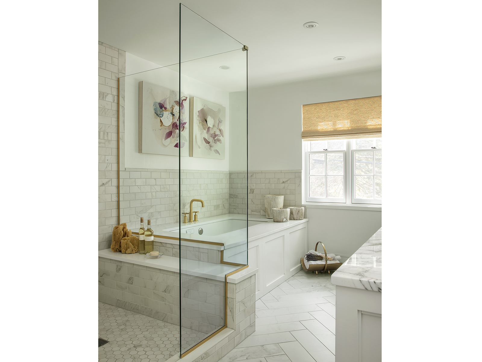
Master Bathroom
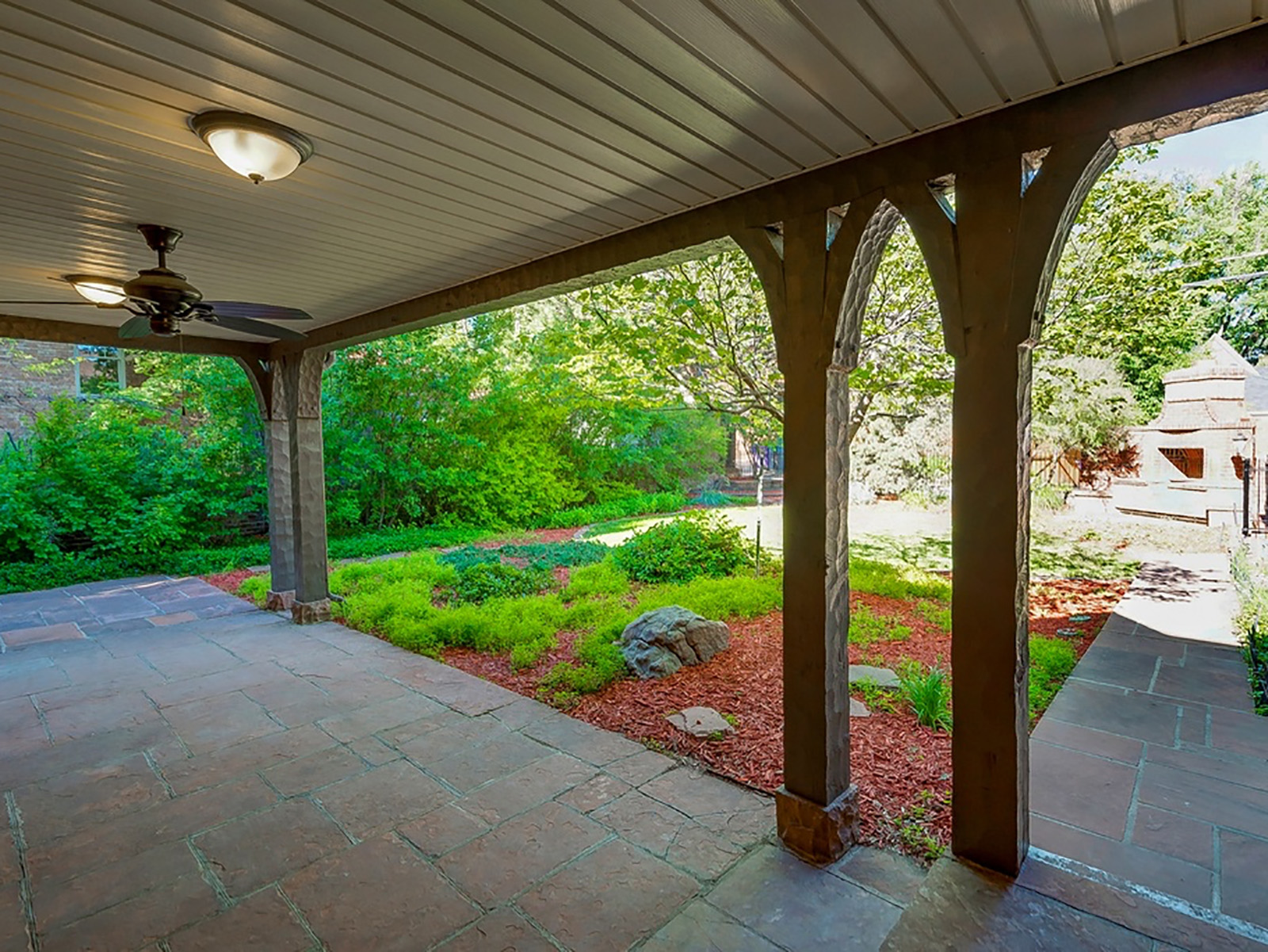
The Problem: An unused covered patio in the back of the house felt like wasted space.
The Fix: The now-framed-in patio became the dining room and bar area on the main level—and made way for a spacious new master suite on the second floor.
Design Pros:
Styling: Elaine St. Louis
Interior design: Jodi Cook, Cook Design House
Architecture: Patrick Cashen, Patrick Cashen Architect

