

The Local newsletter is your free, daily guide to life in Colorado. For locals, by locals.
Many parents choose to downsize after their adult children move out, but one Castle Pines couple decided to stay in the early-aughts home where they raised their brood and transform it into the perfect space for their new phase as empty nesters. “They have a beautiful piece of property with expansive views that look out over the golf course and all the way down to Pikes Peak,” says Ashley Jacobs, lead designer at Denver-based Cook Design House. “And the house holds a lot of memories and sentiment for them.”
The homeowners tasked Jacobs with creating a brighter, more cohesive, and more sophisticated version of the traditional East Coast–inspired home they’ve loved for many years. Here’s how Jacobs pulled it off in each living space.
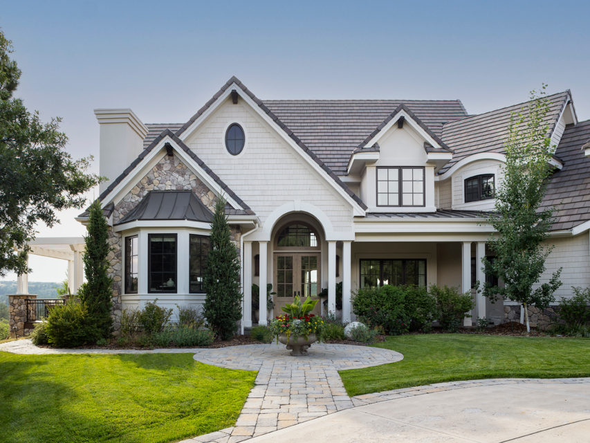
Exterior & Entry
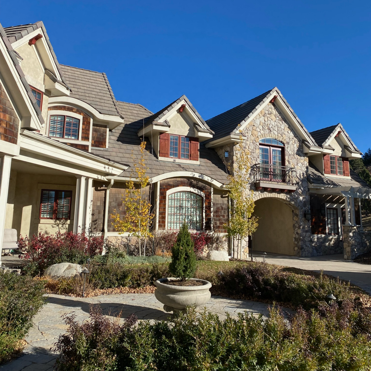
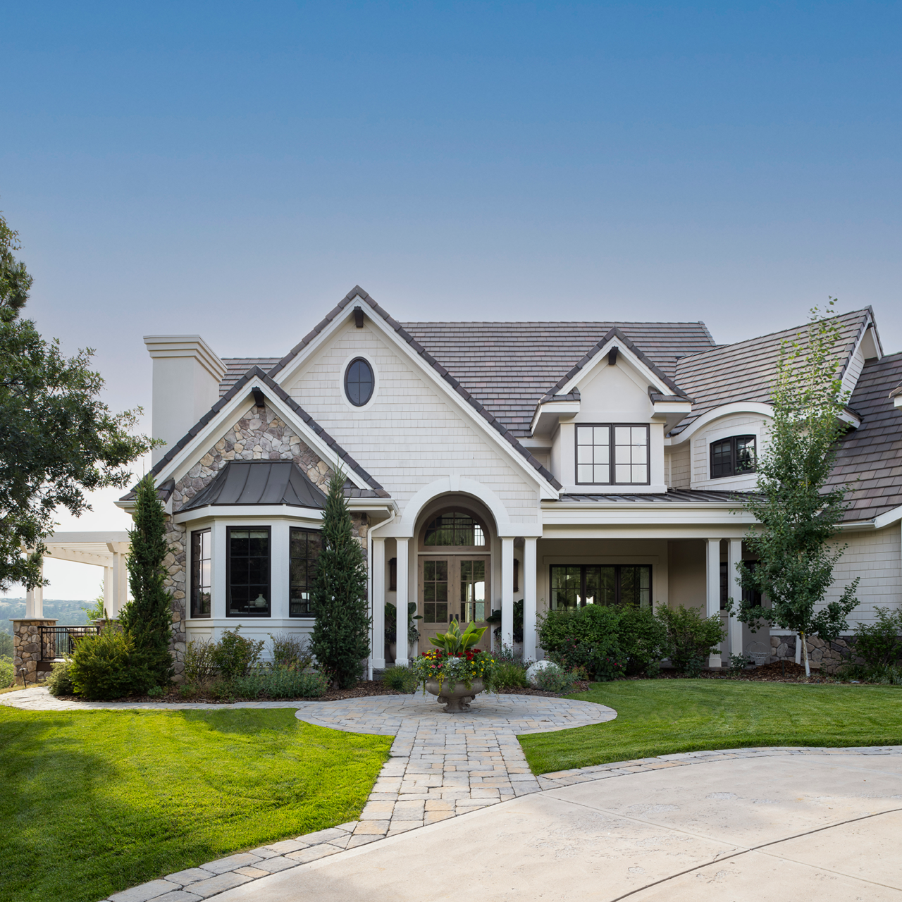
Jacobs toned down the home’s busy facade by making the stucco, shingles, and trim monochromatic with a creamy shade of white paint. “We talked about limewashing the stone, but when we started painting the exterior, the stone took on a different life and we actually really liked it,” Jacobs says. Cranberry-red windows were replaced with larger panes surrounded by modern black frames, and Jacobs successfully squeezed a knotty-wood double door in the entry’s existing opening.
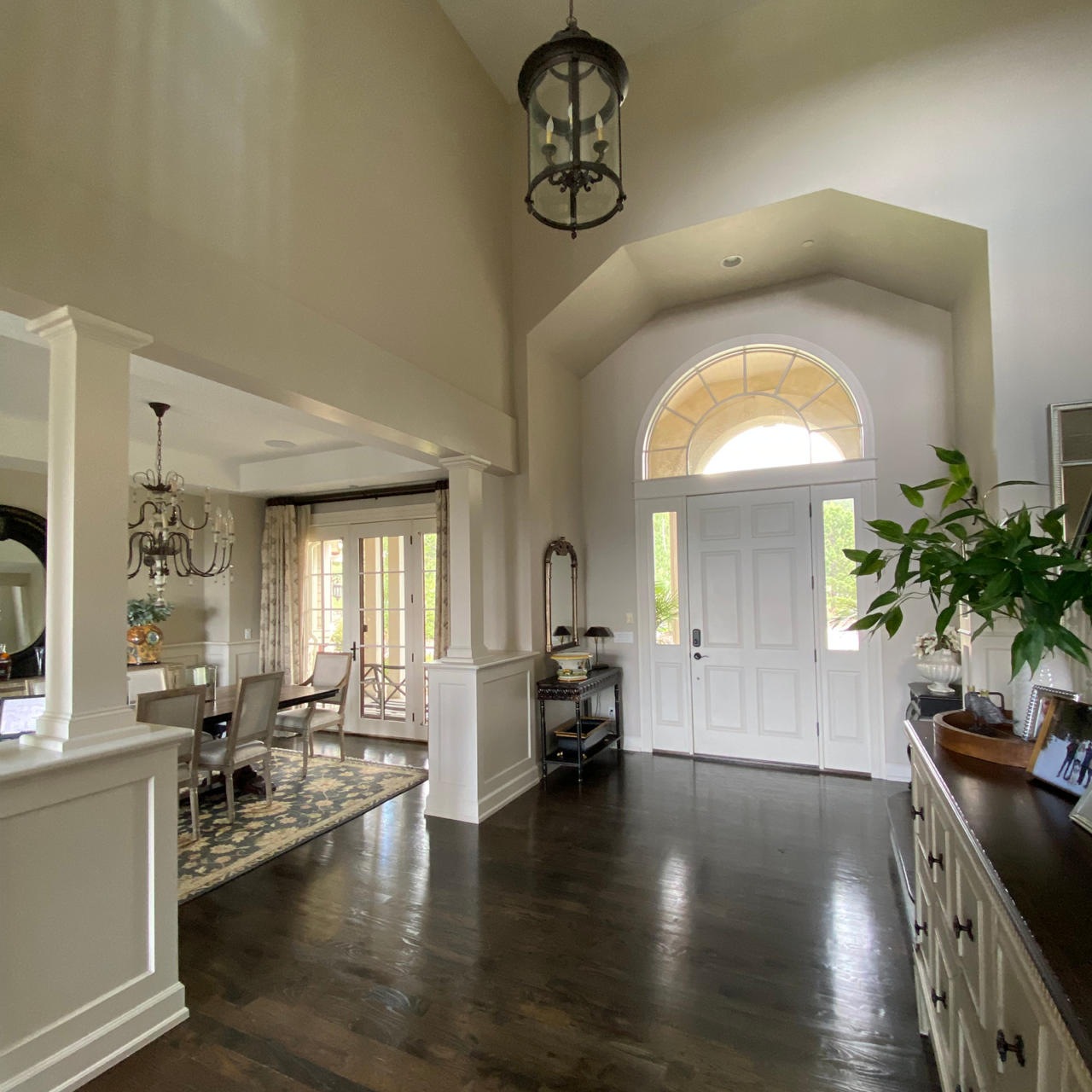
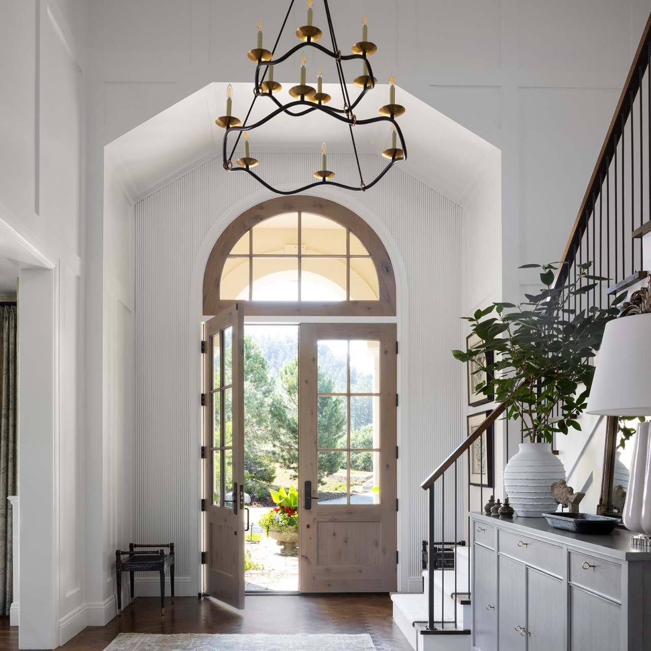
To bring the home’s grand two-story foyer back down to human scale, Jacobs added paneling to the blank expanses of wall and traded a small pendant light for a tiered and tapered mixed-metal chandelier. “It adds height, volume, and width to the space, and we liked that it has an open silhouette that’s simple enough to allow the other details in the space to hold their own,” Jacobs says.
To better define the main-level rooms and mitigate visual clutter, the design team also closed a series of awkward openings from the entryway to the study, dining room, and basement stairs. “There was an odd flow in the house. It was like, Which direction should I go?” Jacobs says. “So we really wanted to clean that up and simplify it.”
Kitchen & Dining Room
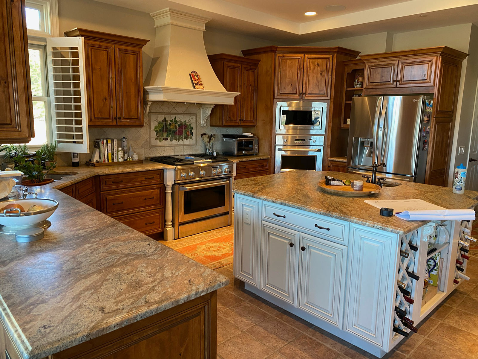
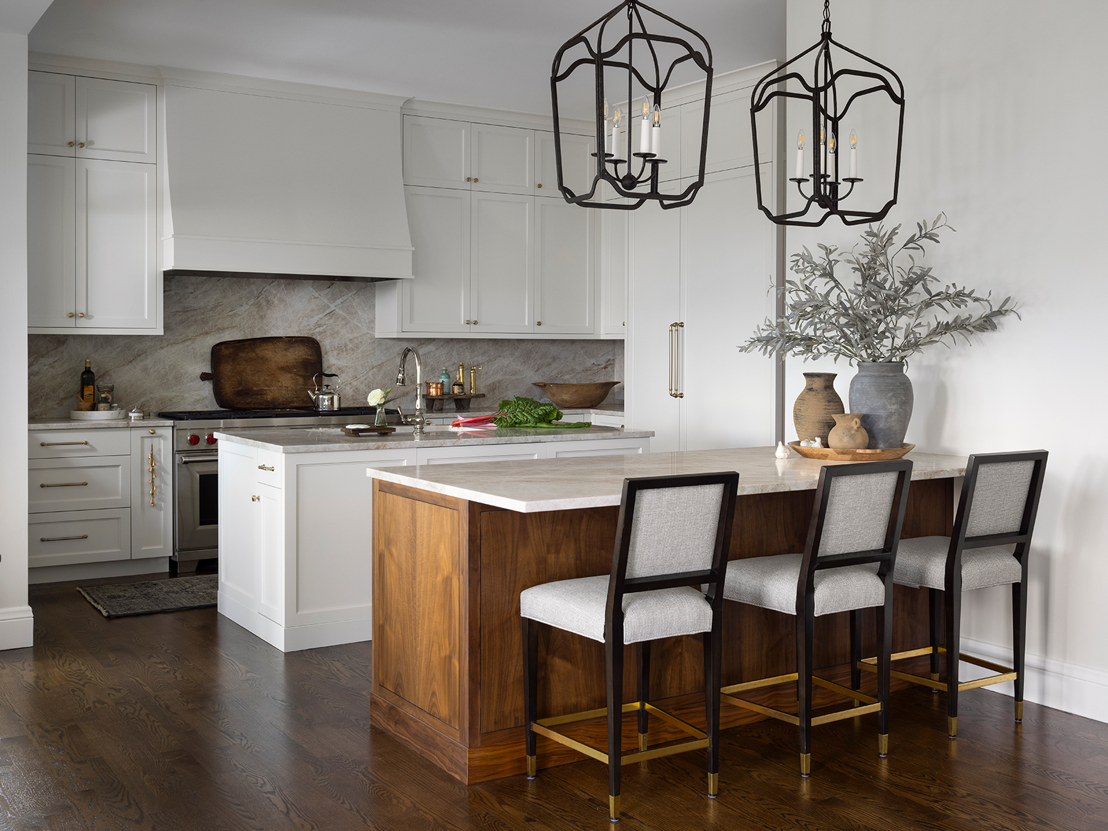
The original kitchen was dominated by a chunky square island in the center. “You had to maneuver around the island to get back to the fridge or to the seating; it felt like an obstacle,” Jacobs says. She replaced the piece with two elongated islands—one for the sink and prep station, the other for eating and entertaining—and removed a peninsula that separated the kitchen from the breakfast nook. New crisp-white cabinetry and a gray marble backsplash give the refreshed space a polished feel, while brass hardware, nickel plumbing fixtures, and dark iron pendants reflect the mixed-metals palette throughout the home.
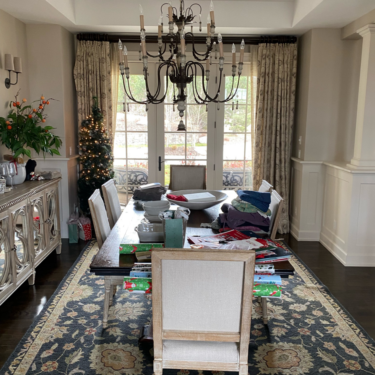
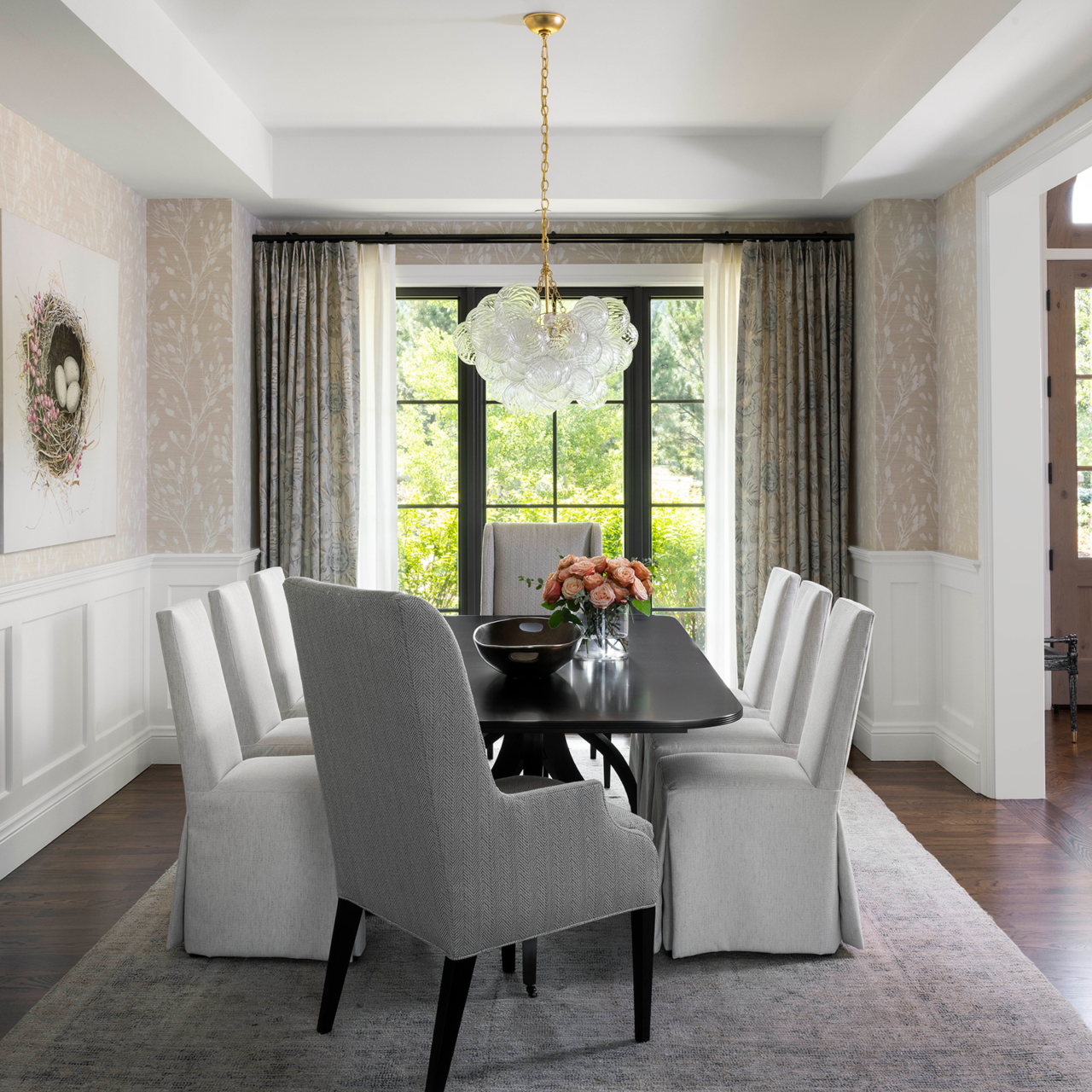
In the formal dining room, an exterior door that the homeowners never used was replaced with a floor-to-ceiling paned window. Jacobs softened and simplified the space, trading its dark, heavy elements for a bubble-like chandelier, white upholstered dining chairs, and a neutral grasscloth wallpaper in a subtle botanical print. “There were so many dark elements that were weighing different areas of the room down,” Jacobs says. “Now we have just one dark element, the table, to ground the space.”
Living Room & Study
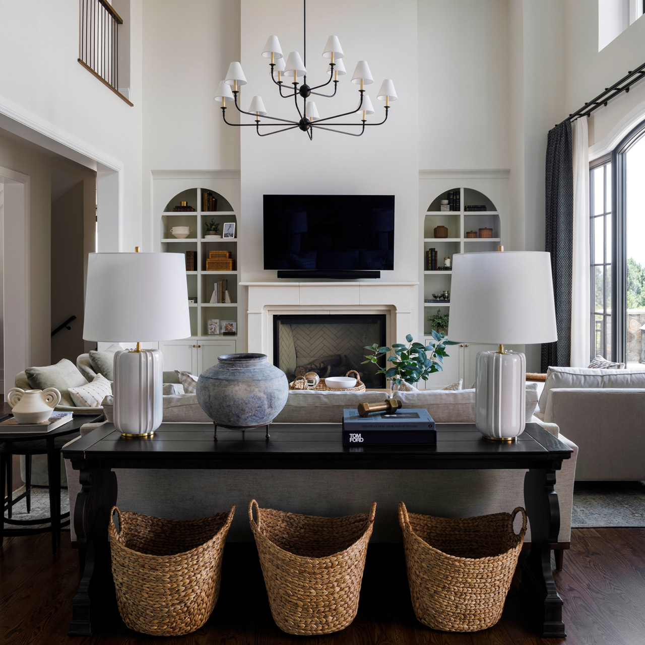
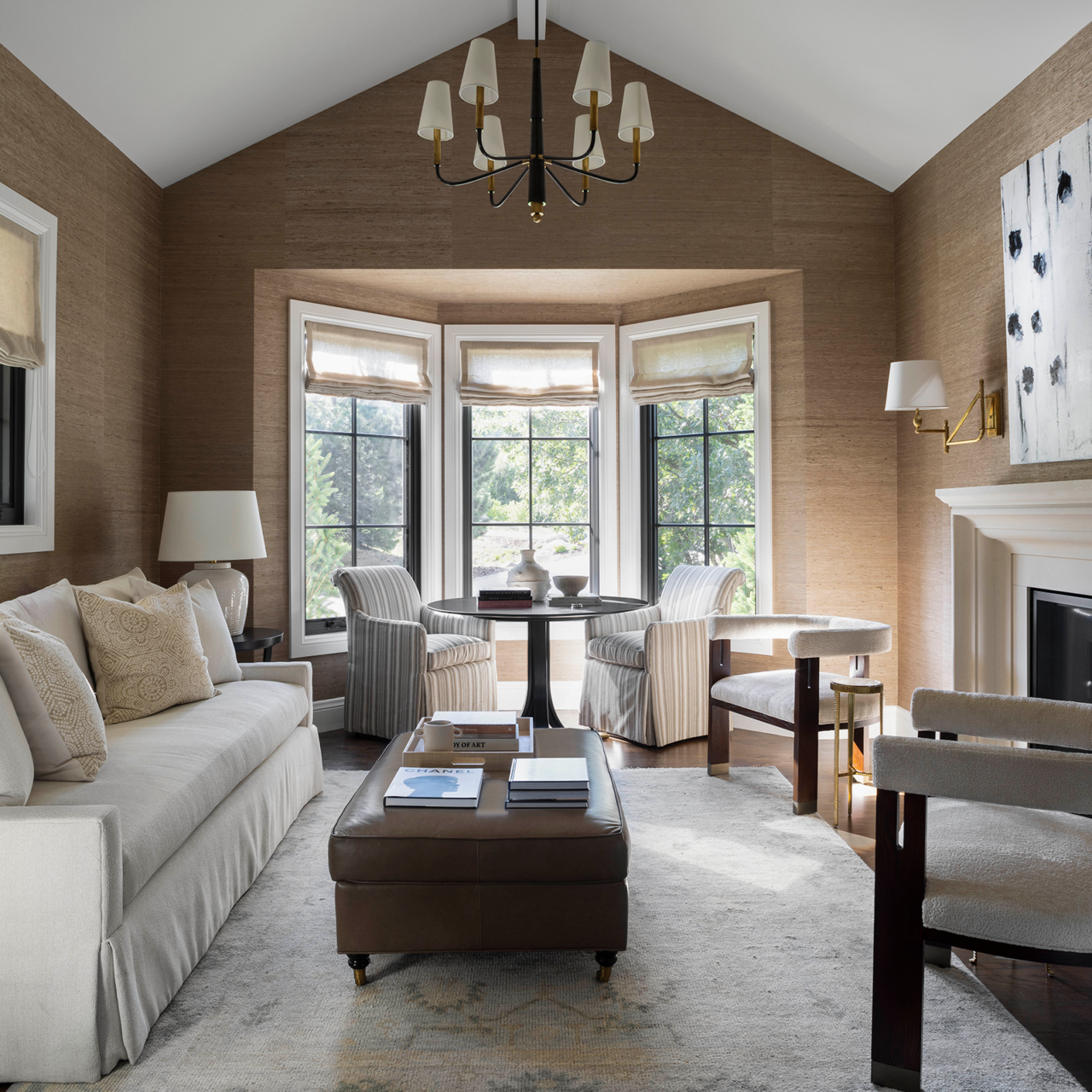
Small but impactful tweaks revived the living room: The top-heavy fireplace was replaced with a two-story bump-out that draws the eye upward; a dated ceiling fan was superseded by a fabric-shade chandelier that drops further into the space, providing more light and visual interest; and the curved railings of two Juliette balconies that jutted into the overhead space were pulled back for a more streamlined look.
More seating, including a creamy-white chaise, a pair of gray velvet swivel chairs, and a three-seater sofa, was added to the space to accommodate a crowd. “The goal of the new furniture was to create more seating because as the homeowners move into the next phase of their life and their kids get married, there will be more people in and out of the house.”
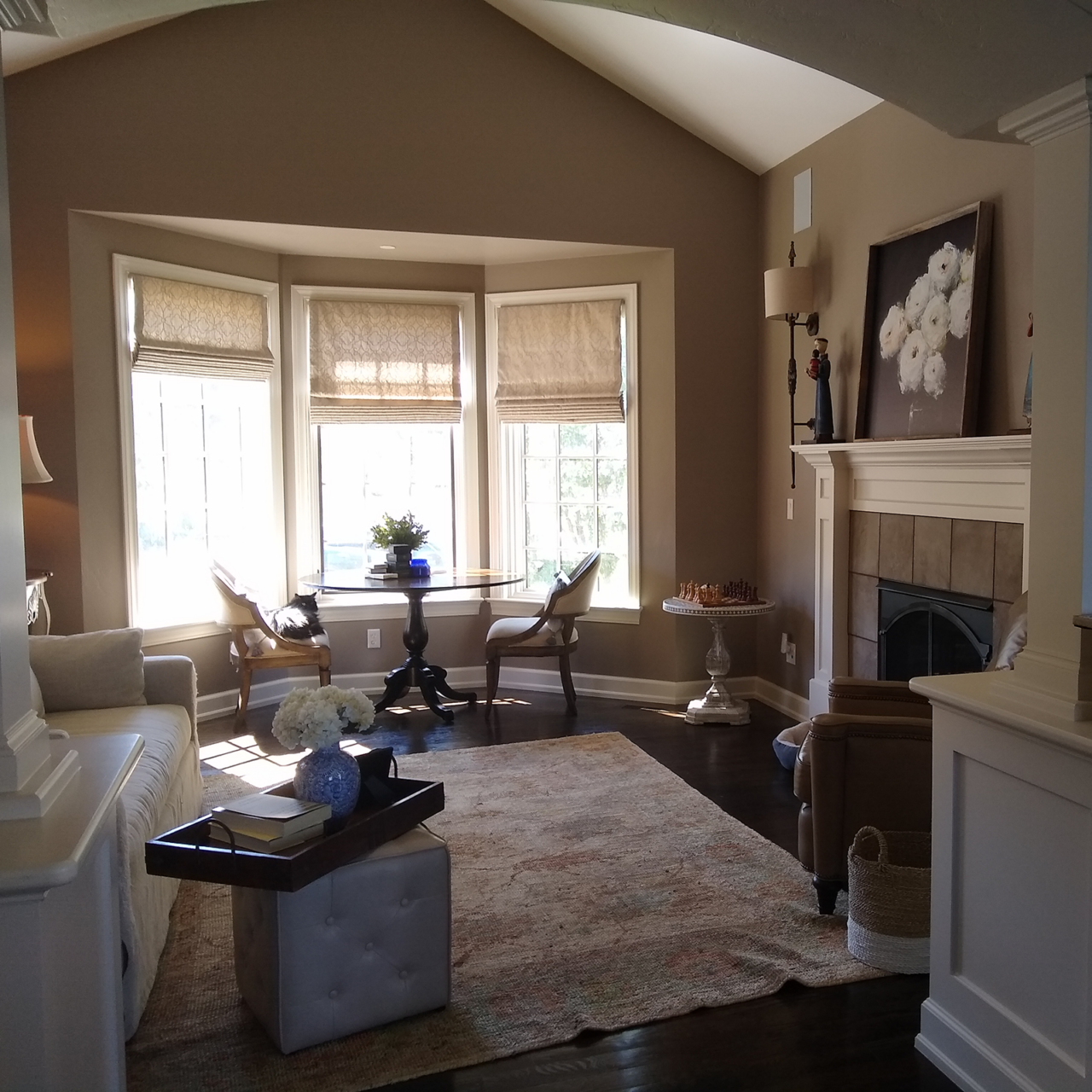
The adjacent study, a quiet space where the homeowners retreat for a daytime work session or a post-dinner cocktail, was also outfitted with new seating that’s scaled more appropriately for the space. While the color of the walls stayed a similar shade of taupe brown, Jacobs added a textured grasscloth wallpaper to give the room more depth and dimension.
Primary Suite
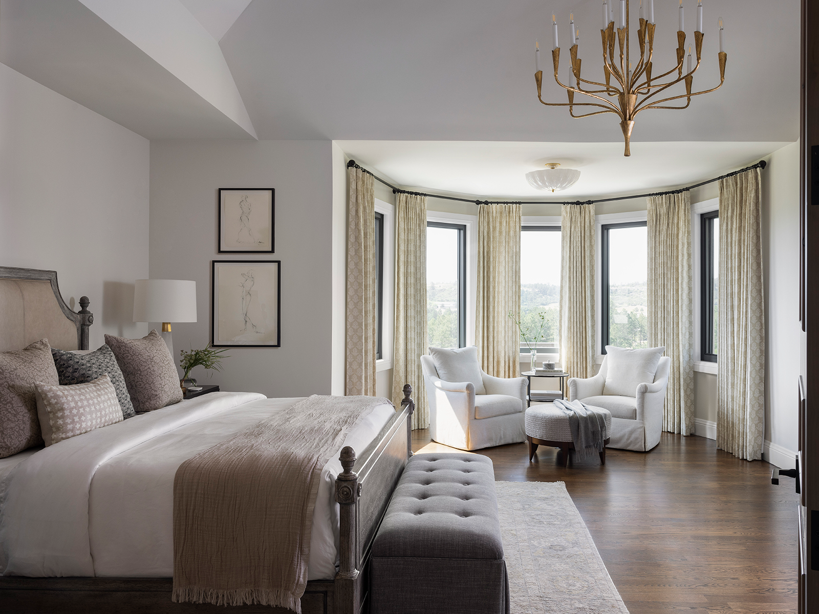
Once used as a place to store their dog kennel, the primary bedroom’s bay window area was outfitted with new drapery, upholstered armchairs, and a small side table. “The homeowners are big readers—the wife reads multiple books a week—so this created a really lovely space where they could read and have coffee together,” Jacobs says. A ceiling fan light was replaced with a brass chandelier that echoes the candelabra lighting silhouettes found in other areas of the home.
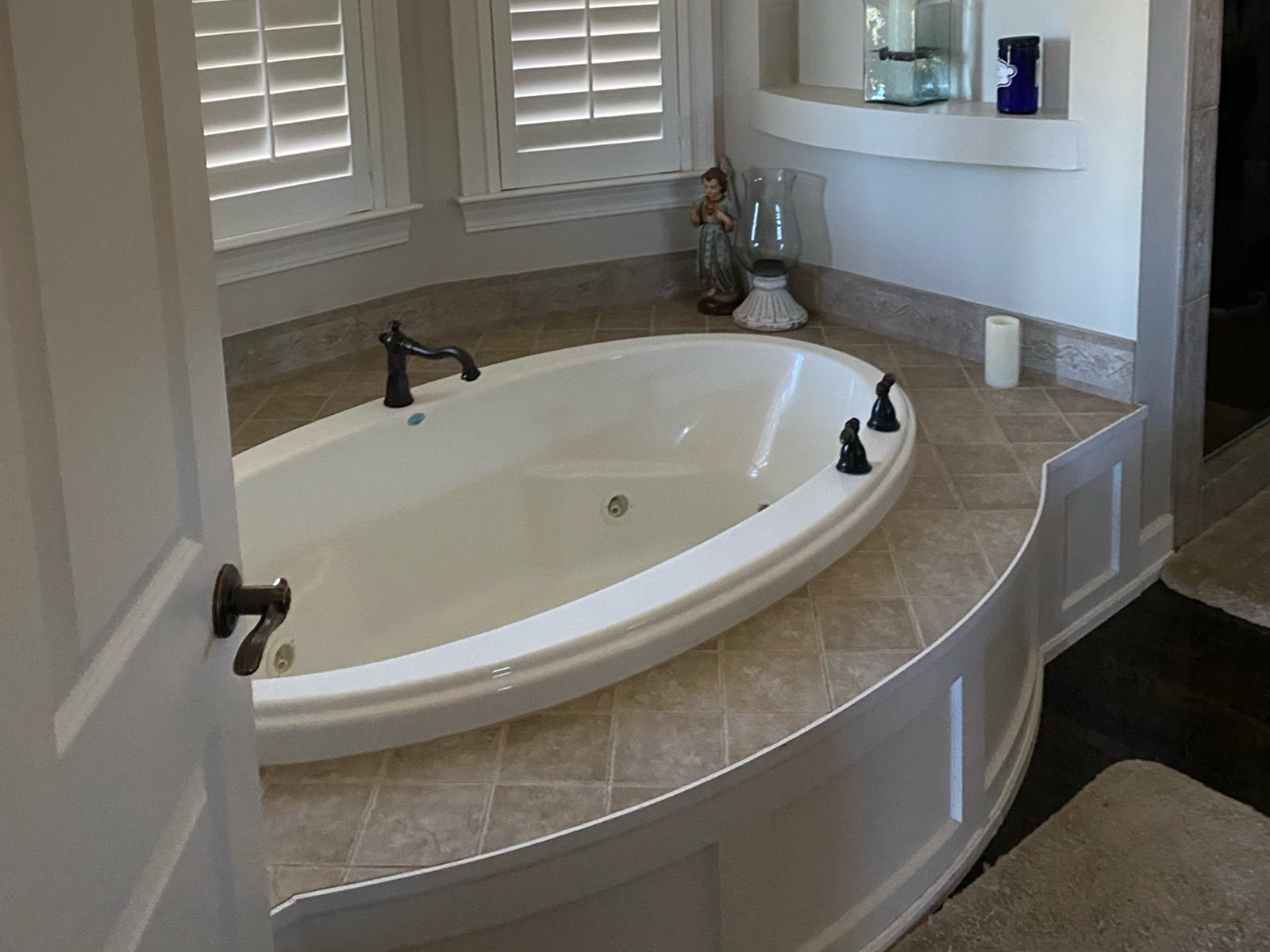
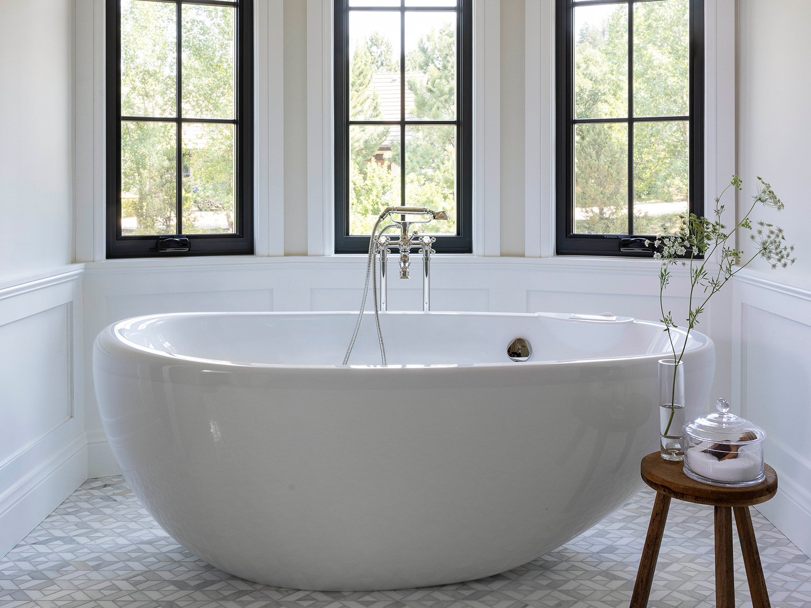
“We wanted to make this space light and bright,” Jacobs says of the en-suite bathroom, which was entirely gutted to make way for new mosaic tile floors, slate-blue lower cabinetry with brass hardware, a freestanding jetted tub, and layers of elegant lighting.