The Local newsletter is your free, daily guide to life in Colorado. For locals, by locals.
As soon as Lesley DeFrees first laid eyes on this park-like property in northwest Boulder, she knew it was the perfect spot for her family’s new home: Hemmed in by tall evergreen trees, it offered built-in privacy and great mountain views. But deciding what to build on it wasn’t so easy, she says, “so we just sat on it for a couple of years, waiting to figure out what we wanted to do.”
When she finally sat down at her drafting table, DeFrees began sketching something familiar: a brick American Foursquare like her childhood home in Washington, D.C. And though she added plenty of classic details—elaborate moldings, a formal courtyard, and hundreds of manicured rose bushes—she balanced the look with a breezy vibe inspired by her family’s love of the seaside. “I never wanted it to be over the top, just comfortable and fun,” she says. Here, she tells us how she made it so.

5280 Home: Your home feels so open and inviting.
Lesley DeFrees: I like to walk into a house and see right to the back. I designed each room so that when you enter, you see right through to a view. It’s like living in a tree house.
The color palette really amplifies the effect.
Everything is light with accents of color. That’s been my go-to since my very first design job, when I worked for [Los Angeles-based] interior designer Barbara Barry. She was really into muted tones, and I’ve always kept that palette in the back of my mind.

Do I spy a pink theme?
I love pink, so if there’s somewhere I can put it—where it makes a pop—I will. It’s in our bedroom, and our yard has more than 200 rosebushes, all pink. They remind me of vacation.
What inspired the finishes you chose?
My husband and I moved here from Manhattan Beach, California, 23 years ago, and once we arrived, we missed the water. So we used organic materials that make us feel like we’re still on the beach. The limestone floors look like sand, and the wall paneling in the kitchen and family room reminds us of beach cottages.
The kitchen cabinets also have a beachy hue.
It’s a custom neutral green that matches the veining of the Calacatta Gold marble countertops and backsplash. A light brown glaze applied over the paint adds visual texture.

It looks like you paid extra attention to the millwork in every room.
The house called for more substantial trim that matches the scale of the space, so we did plinth blocks on all the doorways. The 11-inch crown molding is much thicker and bigger than normal, and the trim around the staircase is really detailed. The tops of the jack-mitered newel posts connect seamlessly to the handrails—your hand just glides all the way up.
Do your furnishings hew to a particular style?
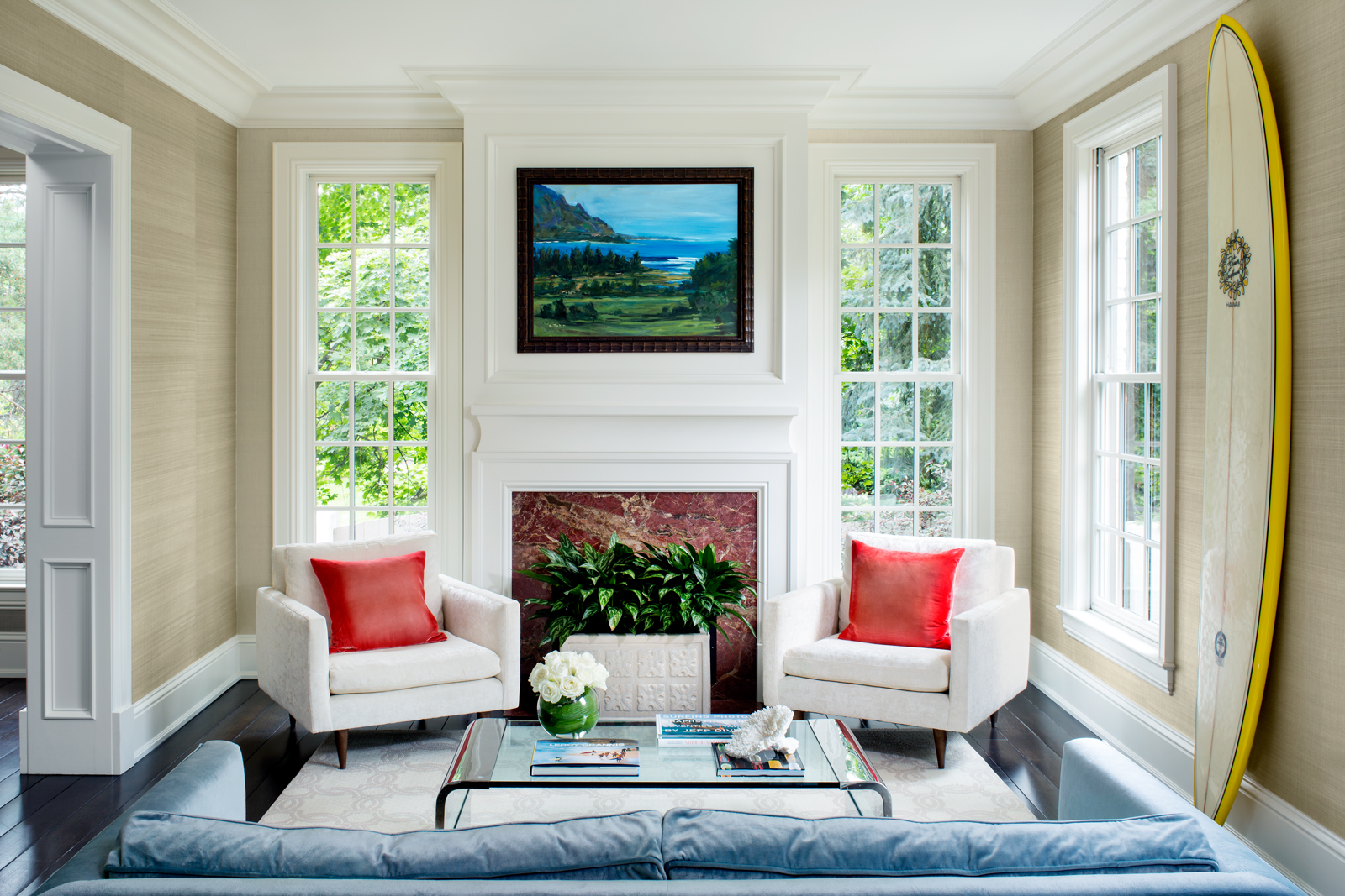
I grew up with modern furniture in a traditional home, so I learned early that you can mix the two styles. For example, the living room rug has a traditional pattern, and the glass-and-chrome coffee table is a modern piece that my parents had in their living room.
Any other family heirlooms?
The original Barcelona chairs in the den are from my childhood home, and the sofa was our very first one—I slept on it with all my babies. I would never buy another sofa with rolled arms, but I just can’t part with this one.

“The pool is centered on the rear courtyard.” Photograph by Kimberly Gavin
And…is that a surfboard on the living room wall?
That room was originally an entire gallery of surfboards. (My husband probably has 100 of them.) After about five years, I said, “We’re grownups; we need to make this a living room.” But my husband loves looking at them, so we kept one and furnished around it. It’s part of our connection to the water.

