The Local newsletter is your free, daily guide to life in Colorado. For locals, by locals.
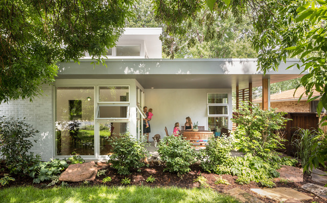
Neighbors often wonder if this sleek North Boulder home could really be a carryover from the area’s midcentury days. In Boulder-based architect Renée del Gaudio’s book, that’s a compliment. Del Gaudio worked with the owners of the uninspiring 1,700-square-foot ranch to transform it into a sun-filled home with an additional 1,000 square feet—while preserving the home’s original character. We caught up with her for the details.
5280 Home: Give us the “before” in a nutshell.
Renée del Gaudio: It was a typical 1950s ranch house with low ceilings, dark spaces, and a cramped floor plan. There was nothing valuable, architecture-wise. What was valuable was what it could have been. In the 1950s there were so many cool flat-roofed houses. That inspired the three layers of the flat roof, almost as if it were built in the ’50s, but with a modern intention.
Why did the homeowners choose to remodel and not start over?
The owners are longtime Boulder residents. She grew up down the street. In this area, people are coming in and ripping out these houses. They’re building homes that don’t necessarily reflect the history and culture of Boulder. She felt strongly about keeping the spirit of the house intact.
Tell us about your aesthetic. What inspires you as an architect?
I look into the history and context of each project for design inspiration, and I have an affinity for simplicity. For a remodel project like this, I’m inspired to do one bold architectural move as opposed to five or six moves. For this project, that meant ripping off the roof and replacing it with a series of flat roofs. This is what a modern architect might have done in the 1950s, when this house was originally built.
The footprint is small, even with the addition. How did you maximize space?
We saved the exterior envelope and created an open floor plan; there used to be a lot of dead-end hallways. The floor-to-ceiling glass makes the space feel expansive and sun-filled, bigger than it really is.

Tell us about the window choices.
We kept all of the original window widths and just cut the brick to extend their heights. The upper clerestory windows not only bring light into the upstairs playroom but also into the kitchen below. When you walk around the core of the house, you’re always being followed by intentional light. Those windows face southwest, so they bring in a lot of light without sacrificing privacy; it’s a really dense neighborhood. And since heat rises, the owners can open them and release the hot air.
What’s the best part of a remodel project like this?
Accepting and working within the constraints of an existing building can yield a more interesting design than taking the easy way out, which is scraping and starting over. The other big thing is the reduced impact on the environment. You scrape a house, and much of it goes into a landfill. I call this project “Reduce, Reuse, Remodel.” We built upon the history of the North Boulder neighborhood instead of just erasing it.

