The Local newsletter is your free, daily guide to life in Colorado. For locals, by locals.
You could call it a classic case of “opposites attract.” The owners of this Hilltop house left an art deco–style home in Miami when they moved to Denver—and brought an eclectic mix of midcentury furniture and ’70s art with them. As they scouted Denver’s neighborhoods, they rented a place four houses down from this classic colonial, built in 1922, and admired its architectural integrity and spacious yard. They watched as it came on the market. They watched as two contracts fell through. And when it finally came onto the market again, they decided they could blend their funky belongings with the home’s formal good looks. They made an offer.
From the start, the new owners knew the home’s compartmentalized layout—with its traditional boxlike rooms—wouldn’t suit their two young boys, who love to run free. So they recruited custom home designer Stephen Hentschel of Hentschel Designs to help them rethink the space. “Every room was a dead end,” says Hentschel, who’d worked on nearby homes and earned a reputation for saving, rather than scraping, houses with character.
He talked the owners out of an addition they’d envisioned for the back of the house, instead helping them edit the space within. Hentschel and contractor Gary Fuller of Synergy Partnerships opened up walls, shuffled rooms, and corrected the flow of the main floor. They added built-ins to boost storage and installed French doors to connect the home to the terrace. They created a more spacious landing upstairs and lifted the basement ceiling’s pipes and ductwork. Space was salvaged, rather than added.
With the heavy lifting done, interior designer Sean Hughes of Mandil Inc. took charge of the details: painting, arranging, decorating, and finishing touches.
“The [owners] wanted this house to feel old but also wanted to inject it with some life using their eclectic midcentury pieces,” Hughes says. “That was my starting point: to be respectful of the house.” He and his colleagues, principal Eric Mandil and project manager Jenni Pruett, played up the home’s history by framing rooms with additional molding, crowns, and pediments. He connected the public spaces with a gray-green hue that reads as neutral—and doesn’t interfere with the owners’ smart art collection—and saved bolder tones for the upstairs bedrooms.
While most of the midcentury pieces Hughes gladly integrated are from Miami, he collaborated (and shopped) with the owners to fill in a few gaps. They found vintage gems at Denver’s Mod Livin’ and Black Tulip and picked up brand-new items from Jonathan Adler and Arteriors. For deals on coveted pieces that were hard to find locally, they trolled eBay.
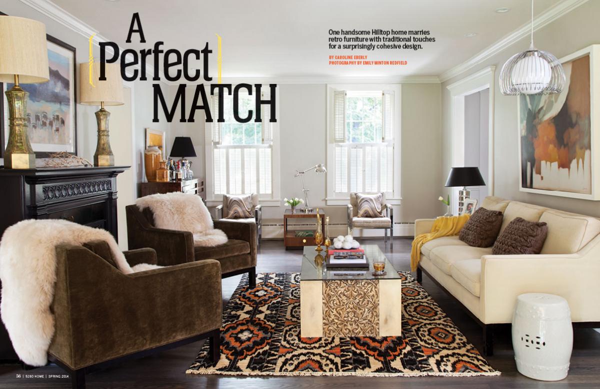
This dance of classic and modern is everywhere throughout the home. In the powder room, wallpaper that puts a hip spin on a familiar apex pattern pairs with a vintage pedestal sink and a white octagonal mirror. In the living room, a traditional fireplace mantle (painted dark to ground the space) opposes a shiny, angular Phyllis Morris coffee table and a ’70s pendant lamp. In the kitchen, new cabinetry with a traditional sensibility faces off with sleek hardware, and a farmhouse-style sink shows off clean lines. In the boys’ rooms, built-in shelving with modern overtones stands on Chippendale-esque feet.
The couple loves the way the pieces work together—and how the designer found new uses for familiar favorites. “You come to think pieces belong together or should go in a certain room. But Sean mixed things up,” the owner says. Case in point: An Asian cabinet they’d used in their bedroom now offers extra storage in the bathroom.
Still, it all works. “When we moved in,” says one of the owners, “the very first day, it already felt like home.”
Design Notes
Custom home designer:
Stephen Hentschel
Hentschel Designs, 303-506-9225, hentscheldesigns.com
Interior Design:
Mandil Inc., 303-892-5805, mandilinc.com
Builder:
Gary Fuller
Synergy Partnerships, 303-229-4130, synergypartnershipsllc.com
Exterior: Pre-makeover, the home was all white. Now, the gray exterior makes a refined, masculine statement.
Kitchen: Custom home designer Stephen Hentschel removed walls to open up the kitchen, which shows off new cabinetry (by Preferred Craftsman in Denver), Bosch appliances, and granite countertops. French doors open to the backyard.
Kitchen detail: An added bay window welcomes light into the kitchen—a space that looks classic but functions like new.
Living room: A traditional rug with tribal flair (from Gump’s in San Francisco) plays well with colorful abstract artwork.
Living room: The owners’ Milo Baughman chairs—favorite pieces brought with them from Miami—sit next to a clean-lined sideboard and retro art.
Powder room: Cole & Son wallpaper energizes the powder room, and a geometric Jonathan Adler mirror plays off the lines of the print.
Kitchen: French lottery posters and a metal-and-marble table (“I’ve never seen anything like it,” Hughes marvels) furnish the breakfast nook. The kids love the new open space.
Seating area: Artwork found during a trip to Argentina (and made out of torn bits of colored paper) adds some history to a modern seating arrangement in the owners’ bedroom.
Master bath: In the Carrera marble–clad master bath, an Asian cabinet (far right) offers extra storage.
Master bed: At first, the owners were a little leery of the cinnabar red wall color (Kwal’s Rusty Nail). Now they love it.
Entry: The entry hints at the home’s blend of styles with an unusual pairing: a driftwood lamp and an industrial table from Watson & Co.
Family room: Casual, chunky pieces and cowhide rugs are perfect for climbing, crawling boys. The sofa is from Jonathan Adler; the side table is from Arteriors.
Kid’s room: In the kids’ rooms, built-ins help keep items off the floor and add height to a space that’s typically “short” because of its inhabitants. Simple white, ruched bedding plays well with the large striped rug from Dash & Albert, and the fish mounts give a subtle nod to high-country fun.
Terrace: Outside, a Restoration Hardware sofa, covered with Perennials’ Textured Linen Weave in Fog, and a West Elm coffee table give the grown-ups room to relax while the kids play on the lawn.
—Photography By Emily Minton Redfield

