The Local newsletter is your free, daily guide to life in Colorado. For locals, by locals.
What do you get when you cross a plum corner lot in Boulder’s Lower Chautauqua neighborhood with a design-minded couple in the market for a new home? A lot of potential—and that’s exactly what these homeowners took advantage of in razing the dated, pre-existing residence. Through a family connection, the couple brought on Emeryville, California–based ODS Architecture to design a new home that suited their needs with modern amenities like radiant heating and a strong interplay between privacy and views. The result? A 2,900-square-foot contemporary sanctuary with understated aesthetics that reflect the owners’ desire for simplicity. We caught up with ODS Architecture principal Alan Ohashi for a peek at the project.
5280 Home: What was the owners’ vision for their new home?
Alan Ohashi: They both have a strong interest in design and in keeping things simple, which goes a long way in creating livability. One of our main tasks was coming up with a clean, contemporary design with dramatic elements. They wanted a view of the Flatirons, an open floor plan, something conducive to an active lifestyle that’s low-maintenance and sustainable, and a natural color palette. They love neutral tones.
Talk to us about the exterior vibe.
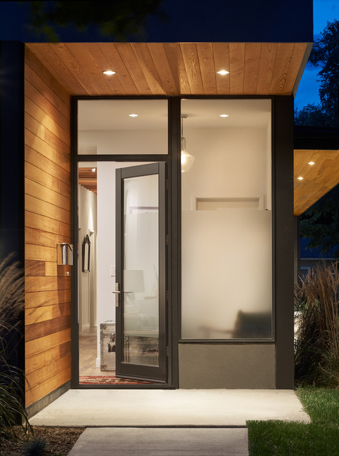
It’s almost retro. We committed to that with the breezeway, which presents a strong horizontal line as you view it from the street—pretty unusual for this area. It adds a midcentury modern look.
And what about the window placement?
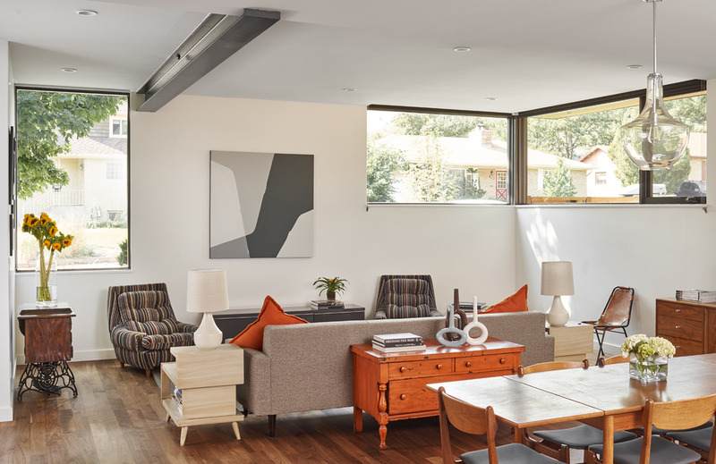
We were very cognizant of bringing sunlight in as much as possible, but also of controlling the amount of privacy. Each window serves a different purpose: In the living room, one gives a view out to the street, but we placed it so the large tree at the corner filters any views people might have looking in. The house is responding in every direction to the views, the light, the privacy, and the openness.
Which all combine to make this house unusual—and unusually lovely.
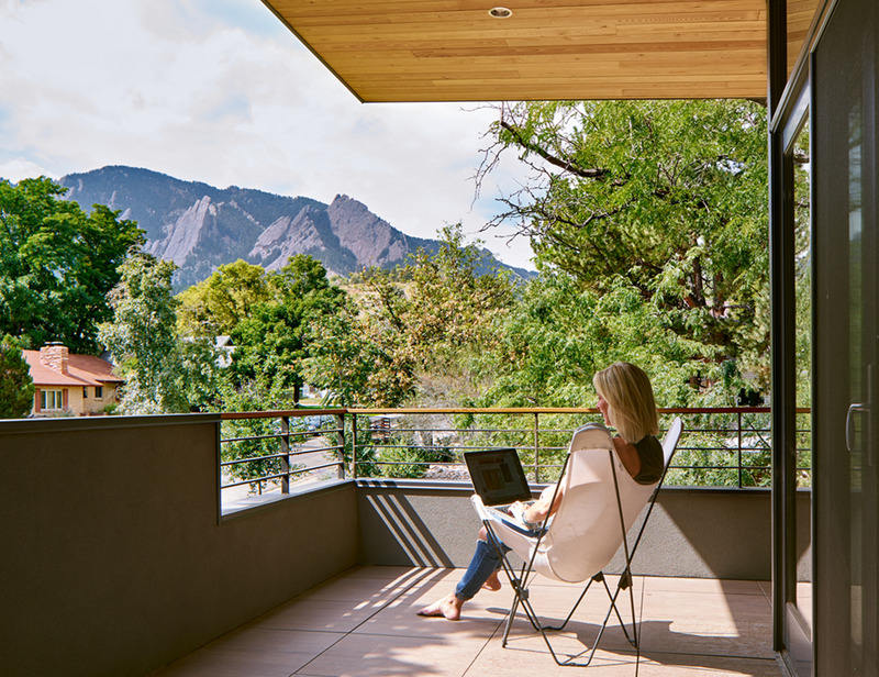
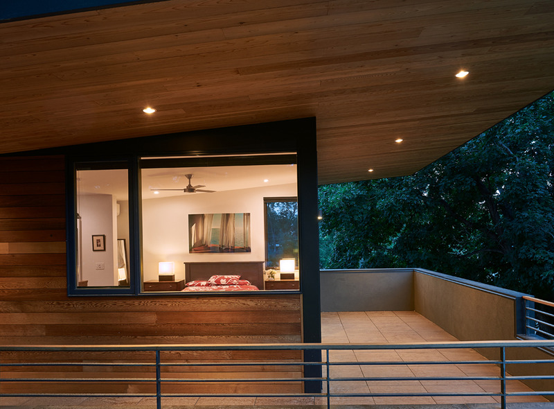
Yes, within the neighborhood context, we tried to modernize the scale and feel, but also added to it in terms of design expression. The master bedroom and living room at the corner of the house look at the Flatirons, and we acknowledged that view by flipping the roof upward, so the ceiling angles up, giving it nontraditional, modern [character]. We added our own twist to contemporary.
The twist is evident in the juxtaposition of materials, too.
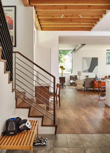
That combination is something we embraced: Exposed beams, steel, and concrete are things we celebrate in this house rather than trying to conceal them. The cedar siding on the underside of the roof—we also clad the master bedroom in it—creates a really warm aesthetic, while most of the rest of the house is stucco. It creates a feel that’s architecturally adventurous, but cozy.
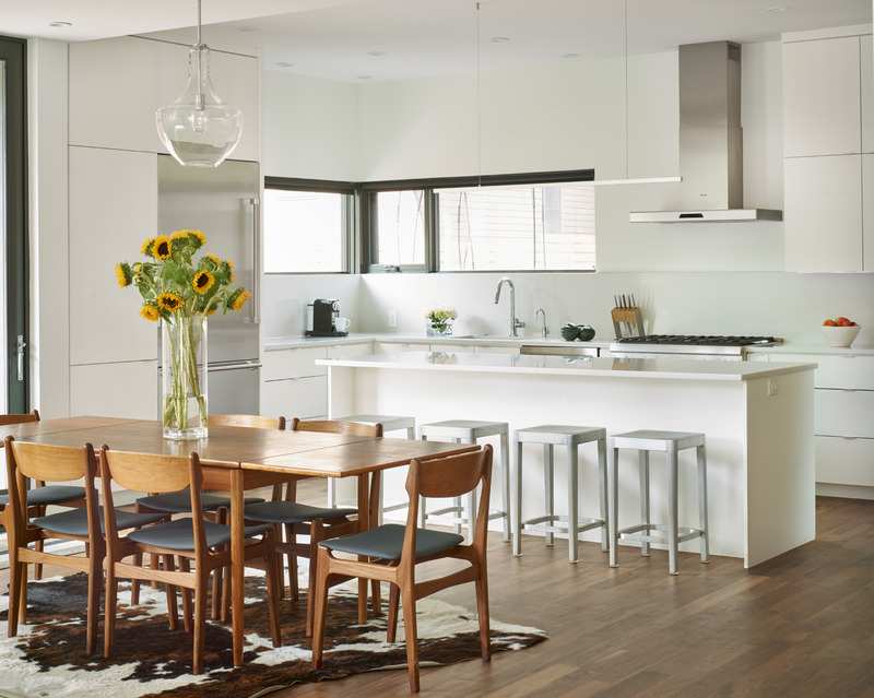
And the kitchen is so sleek—and white! Does that affect functionality?
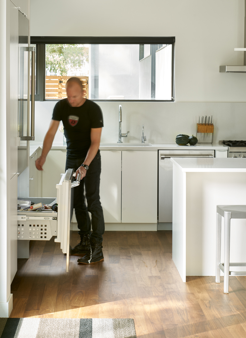
We kept it simple in the kitchen: free of clutter to let it be light. The quartz countertops are durable, and the white lacquered finish [on the cabinets] is dense, so it doesn’t chip easily. There aren’t a lot of cabinets; those around the fridge are basically the pantry. The high windows provide some privacy from the neighbors.
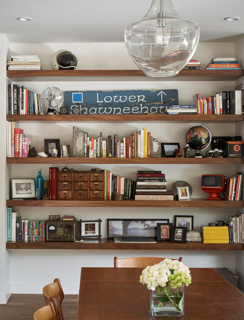
Give us the vision for the interior decor.
The clients did most of the furnishings. They have a really keen eye. The orange in the [living room] pillows is mirrored in the chest and the lounge chairs. Very subtly, [they] worked with the color palette we started. You know, design and architecture from a distance can be difficult and risky, but this home was easy. Good clients make good projects, which is a big reason this home turned out so beautifully.
Design Pros
Architecture: Alan Ohashi, ODS Architecture
Construction: Kevin Morningstar, Morningstar Homes

