The Local newsletter is your free, daily guide to life in Colorado. For locals, by locals.
The house had what architecture geeks like to call “good bones,” which the current owner noticed the first time he saw the structure from afar, 20 years ago. A fan of midcentury-modern design, he admired the 1960s-era, split-level, ranch-style house for its low profile from the road; what he couldn’t yet appreciate were the floor-to-ceiling windows that give every room in the back of the house a west-facing view of the High Line Canal and the mountains beyond.
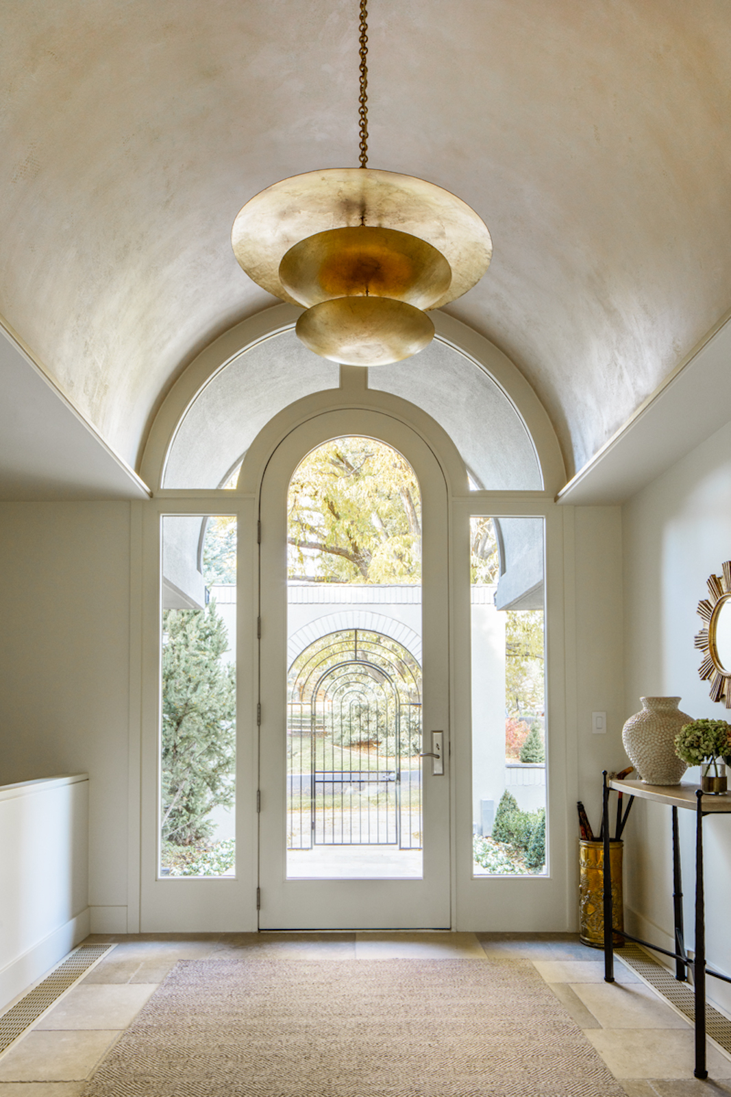
Two decades later, he bought the home with the intention of renovating it. His goals: keep the impressive bones while modernizing the space to better suit his family’s needs. Sure, there was ample square footage and a beautiful entryway with an arched doorway, but the rooms were small and closed off. “It had an old-school, teeny mudroom and a teeny bathroom—as all houses from that time do,” he says. In short, it just wasn’t functional, especially for a homeowner with a fondness for entertaining.
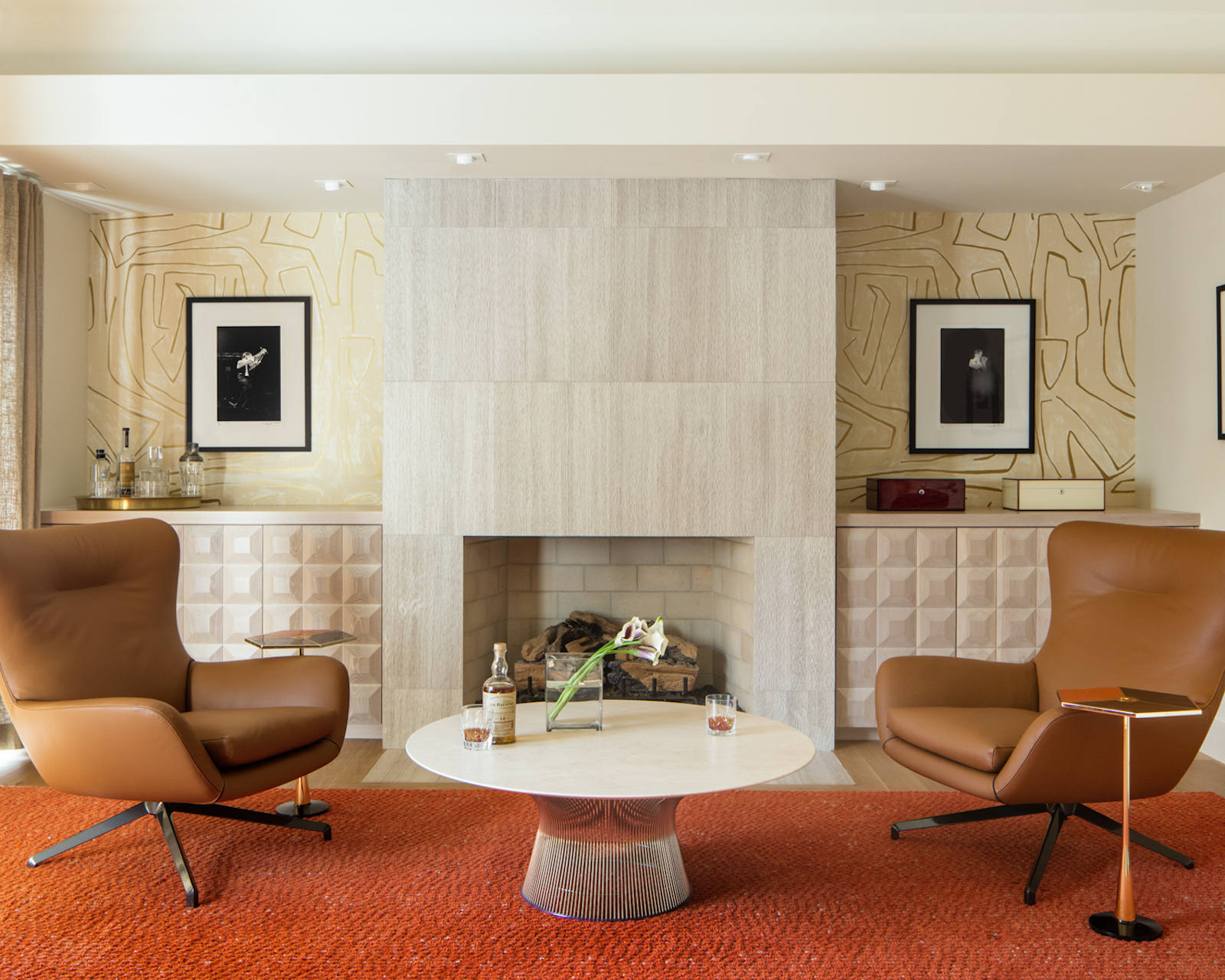
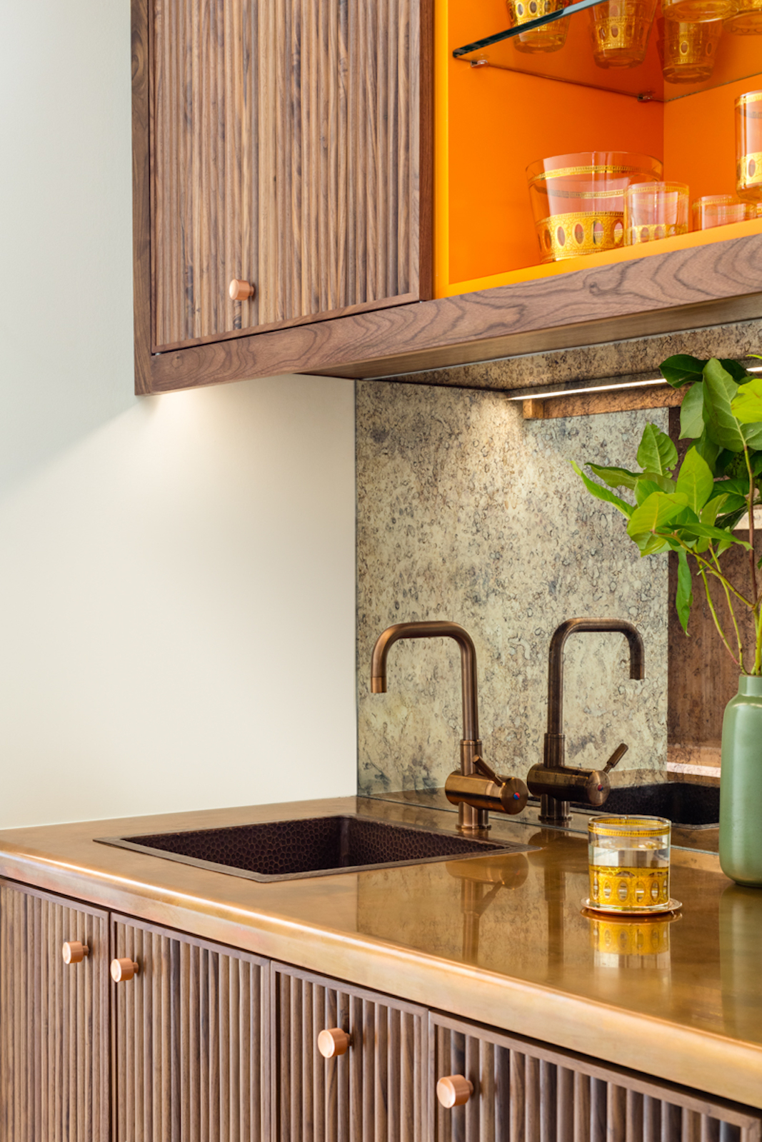
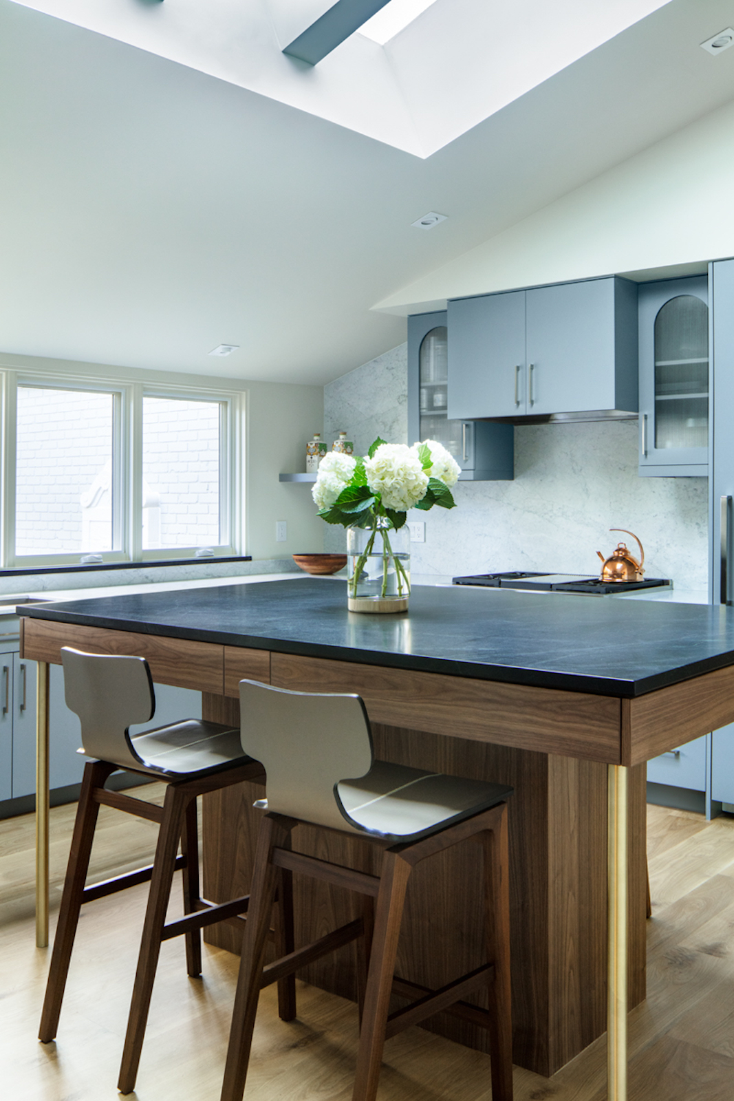
To improve its function and style, he embarked on a thorough remodel, headed up by interior designer Megan Hudacky Larabee and architect Larry Cohen, both based in Denver. “We wanted to bring a bit more modern [style] into the home—without going over the top,” Hudacky says. “A lot of our work was about blending the original architecture and details into the design.” The duo began by reconfiguring the layout to better serve the family’s needs: A wider kitchen opens up to the dining room and great room for better flow, the great room includes a handsome bar for easy entertaining, and a second-level addition accommodates a home office.
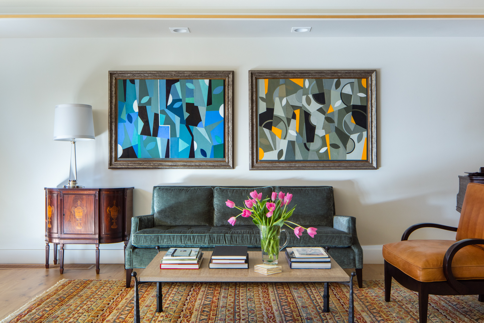
The interiors take cues from some iconic mid-mod designs, including Frank Sinatra’s 1947 Palm Springs home, a structure the homeowner has long admired. Hudacky and Cohen wove in throwback design elements while still modernizing the look. “We wanted to keep a consistency to the project and not just add modern to add modern,” Hudacky says. “We wanted to keep the aesthetic clean and simple while picking up things the owner wanted.”
Sinatra famously loved the color orange, which became central in this home’s palette. It makes appearances in fabrics in the great room, on the new bar’s cabinets, and in the office’s carpeting. “That space had to feel a little bit ‘executive,’ but not so much that people were uncomfortable,” Hudacky says. Leather accents add warmth, while a chiseled-stone fireplace and a custom, beveled cabinet door add texture. “It’s unique and a little more high-end, a great backdrop to the owner’s artwork,” Hudacky says.

More artwork—most of it handpicked by the owner, an avid collector—gives the rooms extra personality. Some pieces, like those on the dining room’s gallery wall, were inherited, while others—like the graphic paintings above the living room sofa—are souvenirs from trips to fine-art meccas including New York City and London. “He has such good taste and is open to new concepts and ideas,” Hudacky says of her client’s collection—and his home’s fresh design. “The end result feels livable and not so ‘designed’ that it can’t be used.” Sinatra would approve.
Design Pros
Architecture: Larry Cohen, LGC Architect
Interior design: Megan Hudacky Larabee, CKY Design
Construction: Paul Veno, Summit Construction Services

