The Local newsletter is your free, daily guide to life in Colorado. For locals, by locals.
Most design pros who are updating a space would experiment with one, maybe two, of the following style moves: Mix pieces from different periods. Combine unexpected colors. Juxtapose unlikely patterns. But for this home in Boulder’s Mapleton Hill neighborhood, designer Andrea Schumacher—a self-professed “risk taker in life and design”—fearlessly embraced all three. Collaborating with her team at Andrea Schumacher Interiors, the designer worked with the homeowner to remodel the ’90s residence in stages over nearly a decade. (They joke that the home is their Golden Gate Bridge: “When you get finished painting, it’s time to paint the other side again,” Schumacher says.) The vibrant result—an interplay of saturated hues, lively prints, antique touches, and modern surprises—vividly rewards their perseverance. Here’s how they did it.

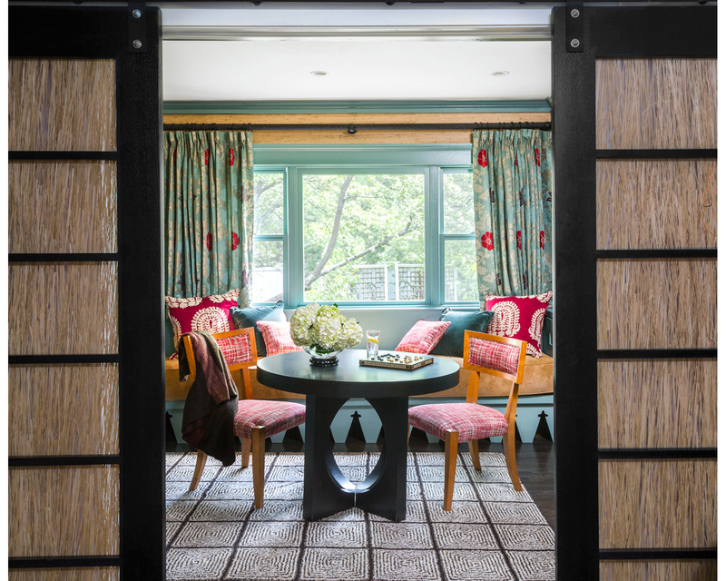
The trim in the study shows off a more subdued shade of blue (Benjamin Moore’s Wythe Blue) than other parts of the house. The back of the built-ins are covered in grasscloth wallpaper (Harshaw Pinstripe Sisal by design house F. Schumacher) to add texture and warmth. The sculptural table was custom-made to suit the space.
5280 Home: Take us back to the beginning. What exactly did this home’s “before” look like? Andrea Schumacher:
It had white walls, typical oak floors, and laminate cabinets and countertops in the kitchen and baths. The furniture was disjointed and didn’t reflect the homeowner’s personality. She’s sort of a hippie; bohemian in her style and also daring. A couple of the bathrooms had floor-to-ceiling galleries of Grateful Dead posters—that kind of daring. That quality also made her open to being really creative.
Now the home is color-soaked and pattern-happy, in a gorgeous way. How did you go about the transformation?
We adhered to the homeowner’s laid-back style, and we kept the color flowing throughout the house. She loves pattern, and we found bohemian prints, mostly ikats and paisleys, that we mixed together in large and small scales to create a modern look. We also weaved antiques into the interiors, which keep the look timeless.

The kitchen pairs clean-lined cabinetry with antique inspiration. Designer Andrea Schumacher devised the custom island to look like an antique Asian buffet (bonus: it fits the space like a glove) and repurposed an antique Asian window, which is hung from the ceiling, to display the homeowner’s collection of pendant candles.

The backsplash is a custom design trick: Made of wallpaper (Flame by F. Schumacher) set between glass, it slides open to reveal kitchen storage.
So where did you begin?
With any project, we come in with bags of fabric. We always try to find a print that has a lot of color and that the client loves, like the Darya ikat (by Schumacher) on the family room’s tufted coffee table. This favorite fabric set the palette for the home and became a springboard for a lot of design decisions. This homeowner loves blues, greens—really, anything but pink and purple. The family room, for example, has blue, teal, and mustard. That trio informed the other rooms, though some spaces play up one of those colors over the others.
How did you create a lavish, layered look while still making it feel cohesive?
By customizing a lot of pieces. For the island in the kitchen, which was designed to look like an antique Asian buffet, we selected all the hardware, made sure the stain was the exact color we wanted, and worked with the builder so it functioned perfectly. The mantel in the family room is made from a Balinese panel I found at Scandinavian Antiques, and above it, we engineered the TV area so it hides behind a wallpapered wall when not in use. The backsplash in the kitchen is another custom detail: We found wallpaper and had it sandwiched in between glass.
That backsplash pattern is one of many fabulous prints in the space. What are your tips for working with patterns?
Typically we start with big pieces, such as sofas, that are solid. Then we add pattern through layers—window treatments, pillows, other accessories—to leave options open. That way you’re not stuck with a crazy patterned sofa, and if you want to freshen up a space years later, you only have to spend a little on paint and pillows. Our approach is analogous to getting dressed to go out. You put on your basic pieces first—your jeans and your top. Then you put on your boots, maybe a vest, a bracelet, a necklace. You keep layering.
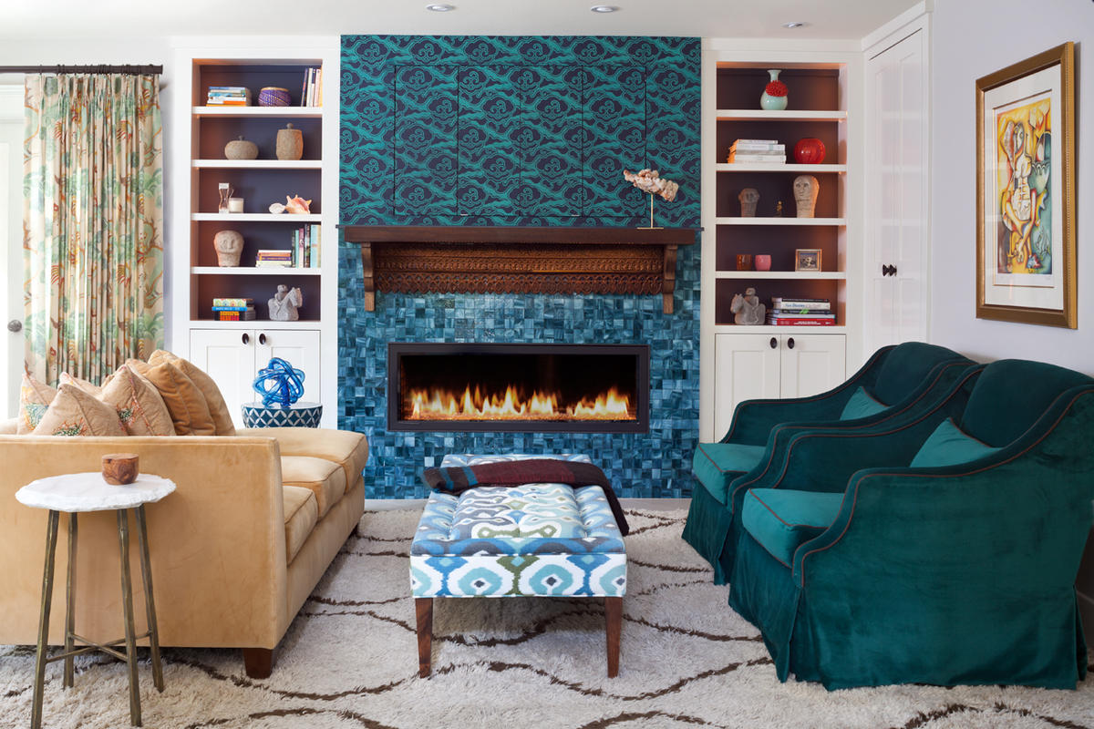
Schumacher used color and pattern in an easy-to-update way, upholstering large furniture in solid colors (such as the custom yellow velvet sofa) and layering on pattern. “If you changed the window coverings and switched up the wallpaper,” she says, “you’d have a whole different look.”

The powder room is an ode to the homeowner’s love of dogs, complete with matching pooch-centric wallpaper and window treatments (in Osborne & Little’s Best in Show) and puppy-inspired artwork. Other new touches include freshly painted beadboard and an Uttermost mirror.

To transform the mudroom, Schumacher called for simple, budget-friendly changes: repainted woodwork in the home’s signature blues, a coordinating rug from Shaver-Ramsey, and window treatments in bright Kravet fabric.
And how do you know when to stop?
I just keep going [laughs]. With interior design, you can always revise. But you have to decide when you’re done. It’s kind of like an artist walking away from her canvas and saying, “I need to stop. This work is finished.” Sometimes the reasons are budgetary, and sometimes it’s about knowing the client’s style. At the end of the day, it’s about how they live in their home and how the style reflects them.

Working with the homeowner’s existing bed and bench, the designer rounded out the master bedroom with a built-in reading nook, midcentury modern pendants, and an array of easy space-brighteners: accent pillows.


Schumacher updated the master bathroom without overhauling it, calling for painted beadboard, fresh accessories, and new window coverings. The tile flooring is original.

A multicolored ikat pillow helps tie together a reupholstered midcentury modern chair and a bright yellow side table. The designer left the quartersawn oak fireplace untouched.?
—Photography by Emily Minton Redfield

