The Local newsletter is your free, daily guide to life in Colorado. For locals, by locals.
The silver lining of being cooped up for nearly two years? All that time at home gave way to some seriously stylish and multifunctional interiors, as the winners of our sixth annual Top Denver Design contest prove. Read on for six design-savvy residential spaces and a whole home worthy of a standing ovation.
Den

What was once a catchall space that lacked coherent design and function has been transformed into this modern, slightly cheeky version of a den you’d find in an English manor house. “We didn’t want this to be typical of anything else in the house, which is fresh and light,” says designer Miranda Cullen, principal of Duet Design Group. “This room is really a destination, kind of set apart stylistically from the other spaces.”
Inspired by the client’s childhood in England, Cullen and her team created a moody space anchored by a custom built-in, complete with an Avocatus fireplace surround. Dentil molding and beefy door-knocker hardware on the pull-down desks flanking the fireplace provide a European flair. The dark paint that extends across the ceiling (crowned with a textural chandelier) “gives the room such a cozy feel,” Cullen says, pointing out that the palette works because a giant window brings in abundant light.
Even better, the design combines tradition with a little sass. For example, the artwork over the fireplace (by Washington, D.C.–based artist Josh Young) looks like a typical old-world portrait—except that the artist added a dash of paint across the subject’s eyes. The whitewashed hoof legs on the leather ottomans are another playful addition. “Design is personal,” Cullen says. “This family doesn’t take itself too seriously, and we wanted the den to feel like a reflection of them.” No doubt they’re chuffed to bits by the result.
Design Pros
Interior Design: Miranda Cullen of Duet Design Group
Construction: K.F. Bacher Construction
Dining Room

“Nobody uses a traditional dining room anymore,” says designer Andrea Schumacher, who skipped the formality and bestowed multifunctional good looks upon this space in the House Beautiful show home in Frederick. “You can host dinner here, but you can also pull down a book and have a cup of coffee, or use [the room] as a bar.”
Without a client to offer opinions, the designer took inspiration from the home’s small-town surroundings (“lots of tumbleweeds and gorgeous 180-degree views of the mountains,” she summarizes) and the room itself: The modest footprint and tall ceiling led her to paint the entire space a single, striking hue—Sherwin-Williams’ Cascades in high gloss—and accent the upper reaches in a custom wallcovering. “I used every single inch of the walls,” she says, noting the sky-high built-in shelves (accessed by a sleek ladder). The integrated bar underneath the shelves comprises a vintage dresser topped with Caesarstone quartz.
To fill the lofty ceiling volume, Schumacher chose a multitude of Visual Comfort chandeliers from Circa Lighting that are “representative of the tumbleweeds outside,” she says. (Kudos to the electrician, who had to put 1,400 brass petals into the fixtures before hanging them!) Metal Craft, a local maker, created the dining table’s base from a tree root, which was bleached then paired with a custom copper tabletop. Vintage chairs, warmed up with sheepskins for a Colorado vibe, finish the look—a triumph of modern, Centennial State–inspired style.
Design Pros
Interior Design: Andrea Schumacher Interiors
Home Office

In an era of endless Zoom meetings and on-again, off-again virtual schooling, a spacious home office might be as coveted as a luxury kitchen. And this walnut-paneled beauty in Broomfield—with a handsome workspace, a steel spiral staircase leading to a loft library, and glass doors that open to a patio for outdoor meetings—is the stuff of quarantine dreams. The office is part of a 9,000-square-foot residence (designed 15 years ago by Denver architects Brad Tomecek and Christopher Herr) that recently underwent a renovation by Boulder’s Rodwin Architecture and Kimball Modern Design and Interiors.
“We rearranged the layout and added contemporary finishes to redefine the very soul of the home,” says architect Scott Rodwin. But before the renovation even started, the designers and homeowners agreed: The bones of the original, old world–inspired library would remain intact. “We decided to keep the existing wood paneling because of its craftsmanship—despite it not being some-thing the homeowners would have chosen themselves,” says interior designer Kate Van Sluyter, principal at Kimball Modern Design and Interiors, who tackled the task of complementing the paneling with a mix of clean-lined office furniture from Blu Dot, Design Within Reach, and Room & Board. “In this case, the traditional styling balanced beautifully with the much more modern style that the owners wanted.” To a home office that looks this good, we say: Work from home forever!
Design Pros
Interior Design: Kimball Modern
Construction: Skycastle Construction
Architecture: Rodwin Architecture
Exterior
Incredible views of the Flatirons and downtown Boulder were lost on this South Boulder property’s original home, whose architecture did little to capitalize on the stellar hillside site. So the owners called in Chris Gray and Steve Perce of architecture firm Bldg Collective to redesign the structure and maximize the views. The team preserved the old home’s foundation, “but even that wasn’t ideally located, so with some structural gymnastics, we cantilevered the main floor at an angle to better accommodate the connection between the interiors and the outdoors,” Gray says. One outcome of their work is this striking outdoor deck (built, along with the rest of the home, by local contractor Buildwell).
Accessed from the dining room through large sliding doors, the area is made of batu hardwood decking and topped by a slatted pergola, “so we didn’t limit the amount of natural light [coming] into the home,” Gray says. Limestone, steel, stucco, and fire-treated clear vertical grain cedar complete the materials palette, which is both contemporary and warm, and aligns beautifully with the landscape design by Hidelly Kane of Kane Hanson Architects. The architectural feat here is that “we gave [the owners] intimate space without the sense that they’re in a fishbowl,” Gray says. The east-facing deck makes the most of the views and the natural topography—which is steep on this side of the lot—and showcases how to marry form and function to maximum effect.
Design Pros
Construction: Buildwell, Squibb Estates
Landscape Design: Kate Hanson Architects
Architecture: Bldg Collective
Kitchen

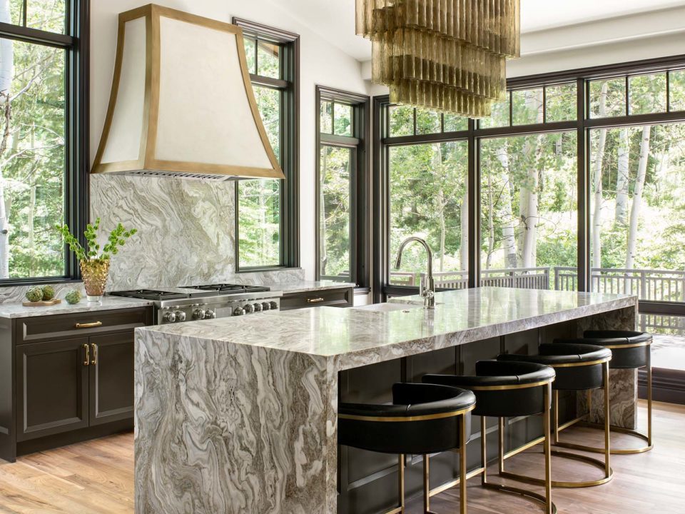
Those of us of a certain age might cringe to classify anything built in the 1990s as vintage, but 30 years of home-decor evolution can’t be denied. Back then, kitchens were often small, isolated spaces, while voluminous dining rooms with oversize tables and chandeliers were the fashion. This Snowmass Village retreat—with its secluded kitchen, colossal dining room, and timber and moss-rock accents—once epitomized ’90s design. So when architect Flynn Stewart-Severy, principal of Snowmass Village’s F&M Architects, was hired to reimagine the house for today, his first instinct was to convert the dust-collecting dining room into a functional and eye-catching kitchen/great-room core.
“This home was built before kitchens were celebrated public spaces,” Stewart-Severy says. “The hierarchy of rooms has evolved, and we felt it made sense to reevaluate the layout and push the kitchen forward, connecting it to the living room.” Clean white walls and bleached walnut floors replace the original mountain-lodge finishes, and dark trim and cabinets (painted Sherwin-Williams’ Sealskin) offer an elegant contrast. Atlanta-based interior designer Jason Mitchell’s selects—including a waterfall-edge Brazilian marble island, Francois & Co. brass-trimmed hood, and shimmering. Restoration Hardware chandelier—add a bit of glam that feels right at home in the mountains, creating a house that honors how its owners live now, and for the next 30 years.
Design Pros
Interior Design: J. Ansel Designs
Construction: Beck Building Company
Architecture: F&M Architects
Living Room

When it comes to just-right houses, this contemporary stunner in the Polo Club neighborhood would get Goldilocks’ seal of approval. Credit that to the homeowners, a couple who love to entertain and know exactly how they want a house to function—and who, at the first meeting with their architecture team at Semple Brown Design, laid out sugar packets on the table to represent their ideal floorplan.
For the home’s centerpiece, a sunken living room with 32-foot-wide sliding glass doors that open to a patio and pool, the goal was gathering: “They wanted it to function like a boutique hotel, with multiple seating areas, some more intimate than others,” says interior designer Danielle Wallinger, principal of Studio D Interior Design. A tufted, two-sided, custom sectional sofa (which the designer describes as “Harvey Probber–meets–Minotti”) was “designed to offer different configurations throughout the year, depending on the season or the occasion,” Wallinger says.
A grand piano in one corner of the room and a built-in bar with a hidden television in the other take the space from game-day hub to holiday sing-along headquarters in an instant. And overhead, a trio of Gallotti & Radice’s Bolle Orizzontale chandeliers adds some fairytale magic. Just like Goldilocks, we’d like to stay awhile.
Design Pros
Interior Design: Studio D Interior Design
Construction: Squibb Estates
Architecture: Semple Brown Design


