The Local newsletter is your free, daily guide to life in Colorado. For locals, by locals.
As evidenced by all your friends suddenly shunning alcohol, sugar, dairy, and/or gluten as an antidote to weeks of holiday indulgences: January equals cleansing time. Our homes are no different. Now that the halls have been undecked, it’s a good time to consider a design detox. We asked some of our favorite Denver interior designers what trends we should eliminate from our design diet in 2016.
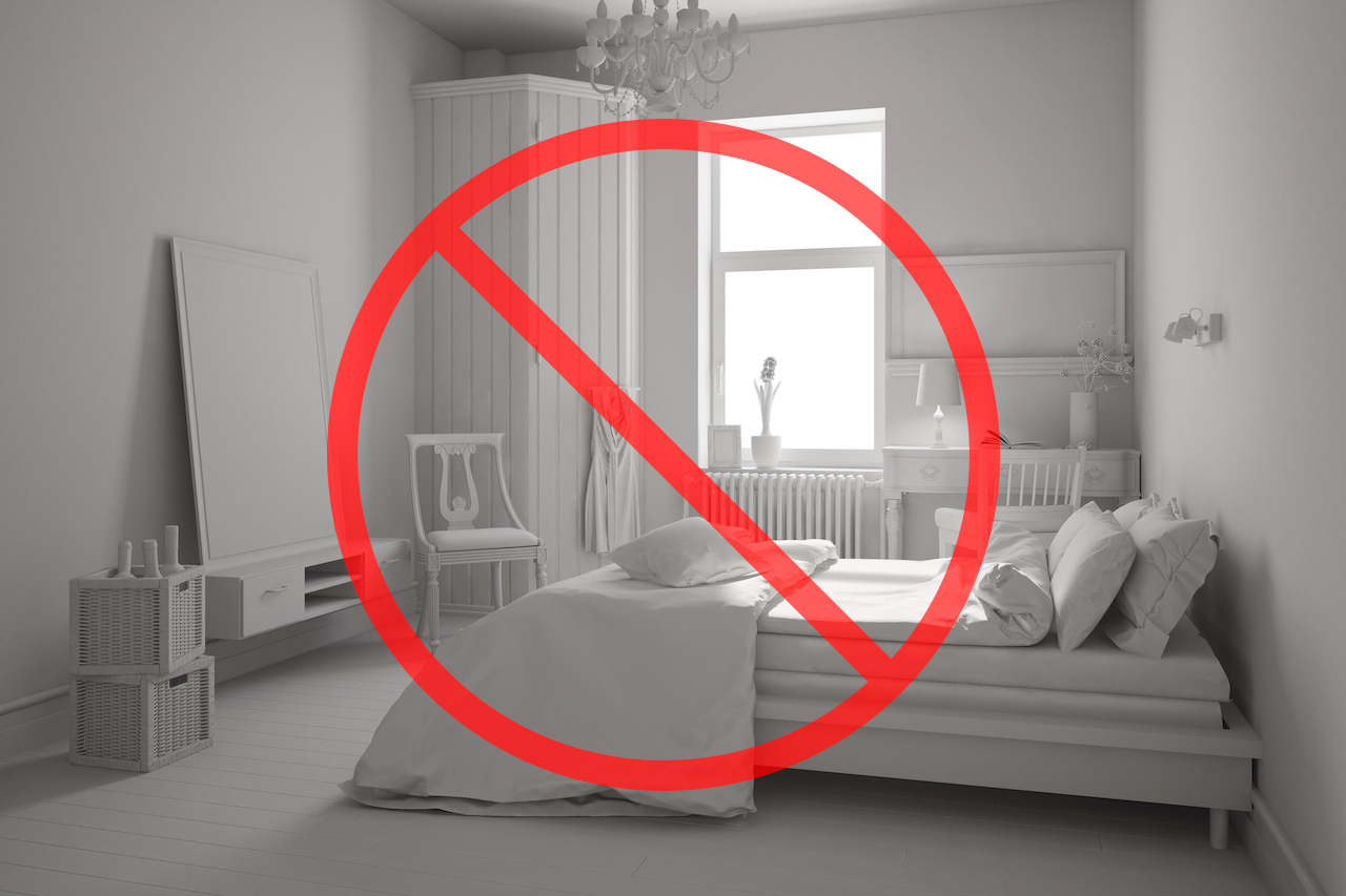
White Bedrooms
“I get it; I’m totally an advocate of a bedroom being a serene place, an oasis where you escape and catch some z’s. But there are ways to add pattern with beautiful bedding. Keep the sheets white and punch it up with red, navy, or kelly green.”
—Megan Kane, principal designer, Megan Kane Interiors
Played-Out Patterns
“Overdoing ikat or whimsically geometric patterns. There’s nothing wrong with a little bit of geometrics with the right usage, but we’re seeing it at Target, we’re seeing it at Starbucks; these patterns have had their moment. An evolution needs to happen.”
—Jeffrey P. Elliot, principal designer, Jeffrey P. Elliott Interior Design
Farmhouse Influences
“Farm-to-table design is starting to look sad. I know everyone loves it, but it’s become overdone.”
—Elliott
Hollywood Glam
“It’s time to move away from that ‘Hollywood glam’ look of Lucite and mirrored furniture, like nightstands and end tables. I think it’s on the way out.”
—Andrea Monath Schumacher, ASID Allied, principal, Andrea Monath Schumacher Interiors
Painted Accent Walls
“Not only does a bold color tether you to a certain color direction, but it can be an aesthetic distraction that often highlights the wrong wall as a focal point. All too often, people paint their TV or bed wall an accent color when they could very well let a luxurious bed or a striking piece of art be the statement.”
—Ashley Campbell, principal/lead designer, Ashley Campbell Interior Design

