The Local newsletter is your free, daily guide to life in Colorado. For locals, by locals.
Rec Room Revival
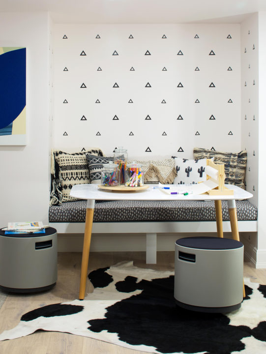
Basement playrooms don’t have to be an afterthought. Case in point: This cheerful, imaginative space created by Studio LW is the perfect blend of whimsical fun and practical details. The design firm’s co-owners, Liz Lorentzen and Marcy White, began with a blank canvas of white walls, light flooring, and a neutral rug already in place—all courtesy of Alvarez Morris Architectural Studio, which designed the Hilltop house. To this, Lorentzen and White added pieces with fabrics and patterns that would hold up well to little hands, including a daybed from Design Within Reach in dark Pebble Weave upholstery, stools in a wipeable polyester, and a patterned bench cushion in the craft nook. The triangle wall decals break up the swath of white walls and, Lorentzen says, draw attention away from the inevitable kids’ fingerprints. “The triangles on the wall hide dirt, in a way, because your eye isn’t drawn to it,” she explains.
For major creative bonus points, Studio LW transformed an adjacent nook into a puppet-show theater with custom curtains—a cozy escape for a creative kid.
Bright splashes of color—including a gallery wall of kids’ artwork—breathe playfulness into the room. Throw pillows in vibrant hues are meant to be tossed around and used as fort cushions. “[The room] doesn’t have to be all ‘in place’ for it still to look cute,” Lorentzen says. In other words, when thinking about your youngest family members, you’re better off designing a place that accommodates play; leave the fuss for more formal spaces.
Get Creative: A DIY project made with plywood, black paint, cut aspen logs, and epoxy glue fills an unusable fireplace.
Keep It Light: Basements almost always come with recessed lighting; enhance it with additional fixtures like this Palecek pendant from CAI Designs.
Showcase Talent: For this colorful playroom, designers at Studio LW created a gallery wall from framed kids’ art—an easy and affordable way to decorate and to inspire young Picassos’ creativity.
Pretty in (Not Just) Pink
Feminine, but not too girly; baby-chic, but not too infantile; fun, but not too distracting—this clever combination comes to life in a nursery designed by Jodi Cook, principal and owner of Cook Design House. “It’s a charming little space,” Cook says of the top-floor room with angled walls, which was previously a home office.
While many designers develop a color palette by starting with the rug, Cook took the opposite approach and created the wall scheme first: “I love a crisp white paired with saturated colors,” she says. “We wanted it to be girly, and the bright pink grasscloth feels fresh and playful.” But, she adds, the room was starting to skew “a little monotone,” so when she stumbled across a feminine rug with a darker base, she knew it was just the thing to pull the room together and tie in other hues for more dimension (see: denim pouf and beige grasscloth shades). “It’s amazing what a rug can do to make everything jibe.”
 Cook’s strategy for dreaming up young kids’ rooms: Consider how long you want—or expect—furnishings or decor to last. Choose investment pieces that can be reassigned to other rooms or work as the bedroom changes, and don’t stress about less-pricey items lasting only a few years. “People get hung up on making sure it’s completely bulletproof,” Cook says. “This client’s attitude: By the time the kids ruin this grasscloth, it’ll be time to change it anyway. Kids’ rooms grow and change as kids grow and change.”
Go Bold: A grasscloth wallcovering (designer Jodi Cook used Phillip Jeffries’ Manila Hemp in Honeysuckle) is an easy way to add texture and color.
Reimagine: Reupholstering the vintage chair (with fabric from Pindler) and painting its wooden legs white transformed it into the perfect nursery accent.
Spend Strategically: The framed Cartier hearts from Natural Curiosities were an investment, but they can easily carry through many iterations of a feminine bedroom.
Tie It Together: A bright rug with a large-scale pattern like this one from Caitlin Wilson (Kismet in Navy) can ground a room and give the eye a lovely landing place.
Splash Zone
Making three teenagers happy is tough. Making three teenagers happy in one bathroom? Nearly impossible. Nonetheless, when Littleton-based Duet Design Group pitched in on an in-progress renovation of this kids’ bathroom—taking cues from the existing wallpaper and sink—co-principal Miranda Cullen embraced the challenge.
The main problem, Cullen says, was the organization of stuff. “When you’ve got multiple children sharing a bath, you can’t put one towel in there or they freak out,” she says. “But there was nowhere to put three sets of things.” The solution: a smart storage strategy in a custom-designed vanity built around the already-installed Kohler Brockway triple sink. Painted in Benjamin Moore’s Hale Navy to complement and ground the hand-painted wallpaper, the vanity has three towel racks and three drawers for toiletries, plus under-sink bins for extra towels and a utensil holder for the hairdryer and other tools. A multi-globe light fixture from Visual Comfort contrasts nicely with the walls. “I gave it an aesthetic boost,” Cullen says of the space, “but more importantly, I created a functional aspect.” The result: a youthful, cheery place where siblings can rub elbows in the morning—and still make it out of there alive.
Singin’ the Blues

Walking the line between a space for a kid and a young adult, this bedroom strikes the right balance of boyish fun and understated style. The standout feature here is a grasscloth wallpaper on the ceiling—where it’s less likely to show wear and tear from a 13-year-old. “We call it the ‘fifth wall,’” says designer Andrea Schumacher of Andrea Schumacher Interiors. “It’s a nice way to give the ceiling some attention.” A pinwheel-esque light fixture helps too.
Schumacher carried the blue theme throughout the room, with a dirt-concealing headboard and nightstands, plus ocean-themed and nautical art—a nod to the family’s East Coast origins. “To keep it masculine, we used a wooden desk, shelving, and art,” Schumacher says, “but a mid-mod look makes it playful.” The minimalist desk and neutral print curtains temper the more colorful touches, including a surfer-vibe comforter, hanging hammock chair, and patterned pillows.
One key to designing space for an older child, Schumacher says, is to look ahead. For instance, if you changed out the bedding and pillows here, “the room could work all the way into adulthood,” she says. “We designed it to last through the transition of growing up.”
Pick a Theme: This room’s coastal motif is subtle but consistent, from the nautical pillow and wall art to an ocean photo and seashell paperweight.
Make a Statement: Grasscloth wallpaper on the ceiling (from Winfield Thybony Design) is unexpected and eye-catching.
Mix It Up: Layering patterns—plaid and camouflage accent pillows atop a striped bedspread (Fabricut’s Tucker fabric in Navy)—adds depth and enhances the color scheme.


