The Local newsletter is your free, daily guide to life in Colorado. For locals, by locals.
The Classic Update
Cook Design House modernizes an outdated Greenwood Village kitchen in ways that are obvious and, perhaps more important, in ways that aren’t.

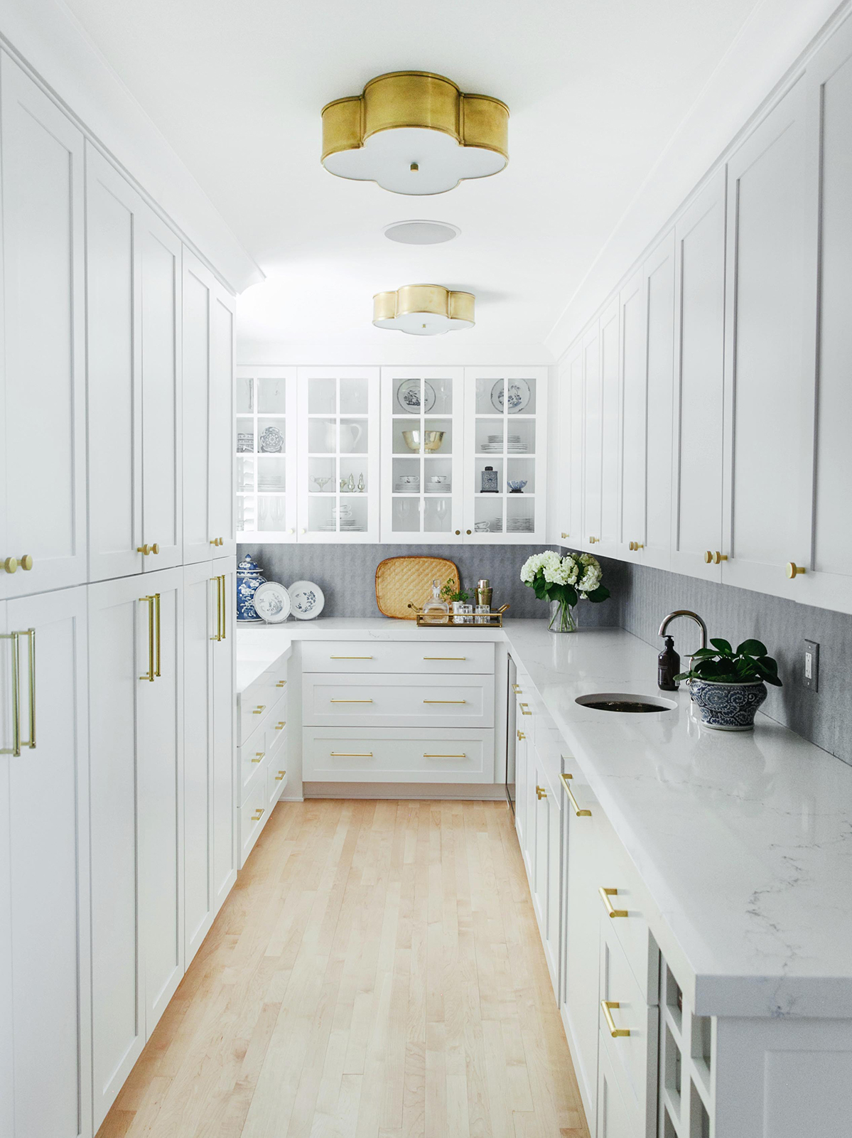
When the family of five living in this 11,000-square-foot Greenwood Village home was just renting the place, the oh-so-’90s green granite countertops and orange-toned cabinets were bothersome. Once they bought the house, the dated design became unbearable. So, the owners called in Jodi Cook, owner and principal of Cook Design House in Denver, to help them bring the kitchen (above) into the 21st century—and she quickly realized that the outdated finishes weren’t the only problems she needed to solve. “The range faced the fridge,” Cook says, “so if someone was cooking, you couldn’t comfortably open it.” Moving the range from the island to the back wall allowed Cook to rotate the island 90 degrees and extend it. Nixing the perimeter soffits, which Cook says made the kitchen feel “chopped off at the knees,” opened up the space. Once the layout was fixed, it was time to have fun with the finishes. That meant gleaming subway tiles with beveled edges to “keep it from pulling too farmhouse,” Cook says; extra-thick, family-friendly quartz counters; and a polished nickel Rohl faucet paired with brass pendants and hardware. “My steadfast rule is you don’t mix brass with chrome,” Cook says. “Use polished nickel instead; chrome has blue undertones that feel amiss with brass.” And even though it’s a more utilitarian area, the existing butler’s pantry got a glow-up as well, with wipeable vinyl wallpaper from Innovations, a hammered-metal sink, and glass-front cabinets to showcase the owner’s collection of blue-and-white china. Yet, Cook reiterates, the jewelry is all for naught if the setup doesn’t work: “Above all else, it has to function.”
The Total Overhaul

A collaboration between architect and designer results in a midcentury ranch kitchen with gorgeous materials on the front burner.
Where most people would have seen a 1960s ranch that hadn’t been updated since the ’70s, Laura Medicus, owner and principal of her eponymous Denver-based design firm, saw a blank canvas. “These homes tend to have clean palettes and to be pretty well-made,” she says. “You can kind of take them anywhere you want, design-wise.” When the homeowners and architect Ernest Cordova decided to move the kitchen from the back of the Cherry Hills Village home to a galley layout adjacent to the front door, Medicus worked closely with Cordova to blend simple midcentury-modern design elements with nods to the homeowner’s Japanese heritage (see: several slatted-wood installations, reminiscent of shoji screens). A flat-front profile and minimalist edge pulls allow African mahogany to shine in cabinets by Oak Tree Classic Woodworks in Sterling, Colorado, and the light Nurazzo terrazzo tile floor contrasts with Absolute Black granite countertops, a relatively budget-friendly, classic choice that Medicus notes can lean more “farmhouse” if honed instead of polished, as it is here. With windows serving as the backsplash, Medicus had to get creative with outlets, embedding them on the undersides of the upper cabinets. She also realized Cordova’s vision for an enveloping “cloud structure” to conceal the range hood. “As you walk in through the front door, everything is low and lean, encircling you,” Medicus says—which means the space feels as good as it looks and cooks.
The Chic Face-Lift

A Virginia Village kitchen proves that little changes can go a long way toward making you feel at home.
“The existing tile was what started the whole project,” says Anna Elyce Smith, founder of Golden’s Annabode interior design firm. Even though the house was brand new, the developer-chosen cyan backsplash was “too much, too bright” for the owners, recent transplants from the East Coast, who wanted a warmer, more neutral aesthetic. Step one, of course, was swapping out the offending backdrop for skinny, stacked, gray-with-just-a-hint-of-blue tiles—in keeping with the home’s mid-mod vibes—handmade by Northern California’s Fireclay Tile. Unglazed ceramic pendants from Folk in Portland, Oregon, introduce a rough texture, while wood stools crafted by Boulder Furniture Arts add another organic element. And, although a custom wood treatment on the island (designed by Smith and built by Lakewood cabinetmaker Jeff Faine) was conceived as an eye-catching focal point, it’s also functional: One of the squares is a removable cover for an electrical outlet. Those updates aside, the room remains mostly the same—and that’s OK by Smith. “You can totally transform the look of your kitchen without gutting everything,” she says. “Our company is all about reducing waste and maximizing design with minimal interference and buying of new materials.” Less time, less money, and less impact on Mother Earth? That’s three key ingredients for a winning kitchen.


