The Local newsletter is your free, daily guide to life in Colorado. For locals, by locals. Sign up today!
The best things come in little packages, and the powder room is no exception. While its origins are utilitarian (long ago, this was the room in which people freshened up their wigs using—you guessed it—powder), this tiny space is now designers’ favorite spot to have fun with finishes. Check out these three style ideas for some daring design inspiration.
Garden Party
Bright, updated riffs on botanical patterns can bring the oomph to your home’s tiniest room.
There’s no better room in which to try out bold wallpaper than the powder—where the commitment is tiny and the impact huge. If the idea of a floor-to-ceiling floral print gives you flashbacks to the stuffy, don’t-touch-anything living rooms of your childhood, let us stop you right there. “The wallpapers of the 1980s and ’90s were mostly reproductions of iconic patterns from historical architecture and design,” says Cassy Kicklighter Poole of Kaleidoscope Design. “Today, we are seeing more indie artists using their talents to design wallcoverings, and the sky is the limit with patterns”—meaning you can go traditional or contemporary, Scandinavian or Southwestern, or even a bit whimsical. Kicklighter Poole’s tips for choosing a floral paper you’ll never tire of? “Make it relevant to you,” she says. “Look for patterns that are reminiscent of a flower you love or a botanical that is related to your hometown or places you’ve traveled.”
Young At Heart
Playtime in the powder room? Go for it—with a few tips from the pros on how not to go overboard.
Another way to approach the powder room is to consider it a billboard for your personality—or, as is the case with these youthful half baths, their owners’ wild sides. It’s the place to try something a little more daring than you would in, say, a vaulted living room. “I’ve always thought of the powder as a great place to express who you are as a family or a person,” says designer Katie Schroder of Atelier Interior Design. “I think it’s fun to walk into someone’s powder and be like, ‘What?!’ Everyone likes that element of surprise.” But, the designer cautions, it’s good to know when to stop; you can have too much of a good thing. “When I do a bold wallpaper, I like to select more refined light fixtures and finishes to make the room look well-curated,” Schroder says. “If I were to, say, put in a painted metal light, too, then the room goes more whimsical than elevated.” Simply put: Design is best when it’s balanced.
Easy Elegance
For those with a more reserved style profile, classic patterns and a few shimmering details are the way to go.
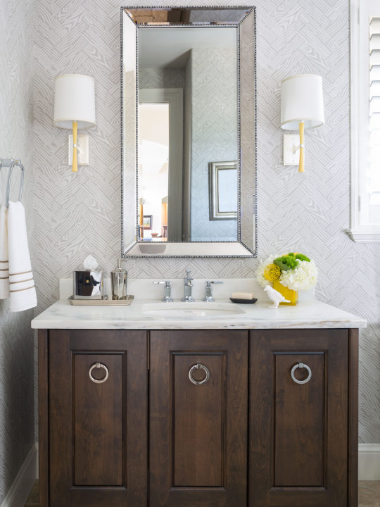
If you subscribe to the perennial, powder-room-as-a-jewel-box line of thinking, you might gravitate to a more sophisticated and toned-down aesthetic for your space. This timeless look rarely disappoints. But to make it work, there are some design guidelines to follow: In a successful classic-style powder room, the colors are typically neutral and the wallcoverings subdued or linear. It’s in the finishes, not the patterns, where you add your panache. “We make this style work by using a variety of materials in the room—a mix of wood, metal, and marble,” says Nadia Watts, principal of Nadia Watts Interior Design. “[The goal is] to make you feel calm when you enter the room.” And don’t forget to add a touch of sparkle (a must in elegant powder rooms), which Watts says she achieves with a sprinkling of reflective, metallic surfaces—hardware, pendants, and mirrors. Allow yourself to indulge in more luxurious materials and treatments, since the square footage is smaller. (As in: Go ahead, take that marble up the walls!)
Unconventional Wisdom
Designer Sarah Lewis of Sarah Noel Interiors in Denver shares five unexpected design ideas that will pack a punch in your powder room.

Add a Gallery Wall
Why should living rooms and hallways have all the fun? Adding a cluster of framed art prints and photos—like the one in this LoHi bathroom (pictured above) that Lewis designed—is a great way to give the half bath a personal touch. To avoid overwhelming this small space, Lewis stuck with white frames and mats for each element. “You want to offer a good chunk of impact without being too intense,” she says.
Play With Shapes
When it comes to mirrors for the half bath, Lewis encourages clients to think beyond traditional rectangular and round forms. Crescent, teardrop, and half-moon mirror shapes from shops such as Arteriors and Scout & Nimble have recently caught her eye. “You could even stack two half-moon mirrors on top of each other for more drama,” she says, adding, “It’s the powder room—you can be a little more playful because you don’t need that mirror to get ready every morning.”
Make a Mural
Creatively inclined DIYers can give blank walls a boost by hand-painting simple, abstract shapes or arches, as well as patterns like dash marks or dots. For the art-school dropouts, Lewis suggests stick-and-peel mural decals from online shops like Society6 and Etsy (or hiring a local pro like Magik Studios.
Invert Your Approach To Painting
For an element of surprise that still feels tailored, Lewis suggests painting the walls of your powder room white or a soft neutral and saving the high-contrast hue for the ceiling and trim. Her current favorite shade for this technique: Urbane Bronze by Sherwin-Williams.
Try New Tile Tricks

This fundamental bathroom material isn’t just for the floor and shower, Lewis says. For added impact, she suggests creating an accent wall by applying tile in a graphic print or bold color from floor to ceiling, or running the floor tile halfway up the wall as a play on traditional wood wainscoting.


