The Local newsletter is your free, daily guide to life in Colorado. For locals, by locals. Sign up today!
Elizabeth Bear has an intuitive vision for the way spaces come together—as evidenced by her Instagram following of nearly 24,000 devotees, who are hooked on the fresh, modern decor she dreams up for her suburban Denver home and shares on her Instagram feed, @elizabethbeardesigns.

Bear’s design cred grew organically from modest retail beginnings: After leaving a corporate gig, she sold her own handcrafted home accessories online and at pop-up markets. When she and her husband purchased their home in Centennial nearly 10 years ago and began fixing it up, friends noticed her skill in creating gorgeous interiors. They began asking her for design advice, and a business was born. The Instagram feed—on which Bear showcases her home-turned-design-lab—and all those followers are just happy byproducts.
When Bear first set eyes on her 4,600-square-foot house, it was far from a dream home—but she immediately recognized its potential. “I knew it was the home, but it was dated,” she says. “It had a closed floor plan, and many people would have said it looked overwhelming [to remodel]. But it had the bones: tall ceilings, big windows, and tons of light.”

The couple began the renovation process by modernizing the home’s shell: peeling off wallpaper in almost every room and painting the walls Benjamin Moore’s warm-gray Balboa Mist; ripping out first-floor carpeting and replacing it with hardwoods; vaulting the ceiling on the porch to add vertical dimension; and knocking down the wall between the family and dining rooms to open up the layout. The kitchen was a gut-it-to-the-studs redesign, executed with the help of Aspen Leaf Kitchens, that yielded an expansive center island and a breakfast nook that doubles as storage space.

Bear’s love of symmetry and clean, modern lines is evident throughout the home: New cabinetry—the dining room hutch and the built-ins flanking the river-stone fireplace—was built to match the kitchen cupboards’ simple Shaker style. Bare windows—doable on a private, heavily treed lot like this one—emphasize the uncluttered vibe while maximizing natural light. The effect plays well with Bear’s signature color palette of crisp whites, soft grays, and light natural woods punctuated by carefully placed greenery—pure candy for Instagram followers.

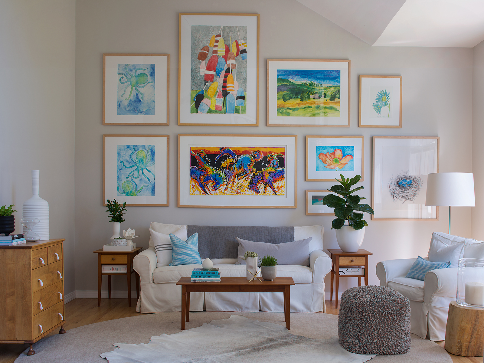
In the home’s current iteration (the accessories change often), splashes of coastal blues—including watercolor artwork by Memory Layne Creative and throw pillows from Hable Construction—create a summery vibe. “I like a peaceful room,” Bear says. “Neutrals [make a room feel] light, but I also like adding color or texture.”
As for her ability to choose furnishings, Bear chalks it up to, well, instinct. Take the small wooden dresser in the living room, which came from her parents: Instead of being deterred by its original red stain, Bear sanded it down and refinished the tiger-maple wood underneath, then added white fabric loops for drawer handles. “I can see the puzzle pieces like that,” she says. “I’ll know inside me if it doesn’t work.” And all those Instagram followers agree: That intuition is spot on.


Design Pros:
Interior design: Elizabeth Bear, Elizabeth Bear Designs
Kitchen design: Aspen Leaf Kitchens


